Data Visualization – ggplot2 📊
MATH/COSC 3570 Introduction to Data Science
Department of Mathematical and Statistical Sciences
Marquette University



gthemes, ggridges, ggbeeswarm, ggdendro, ggpubr, ggmap, ggradar, ggcorrplot, GGally, and more!
Visualizing Data
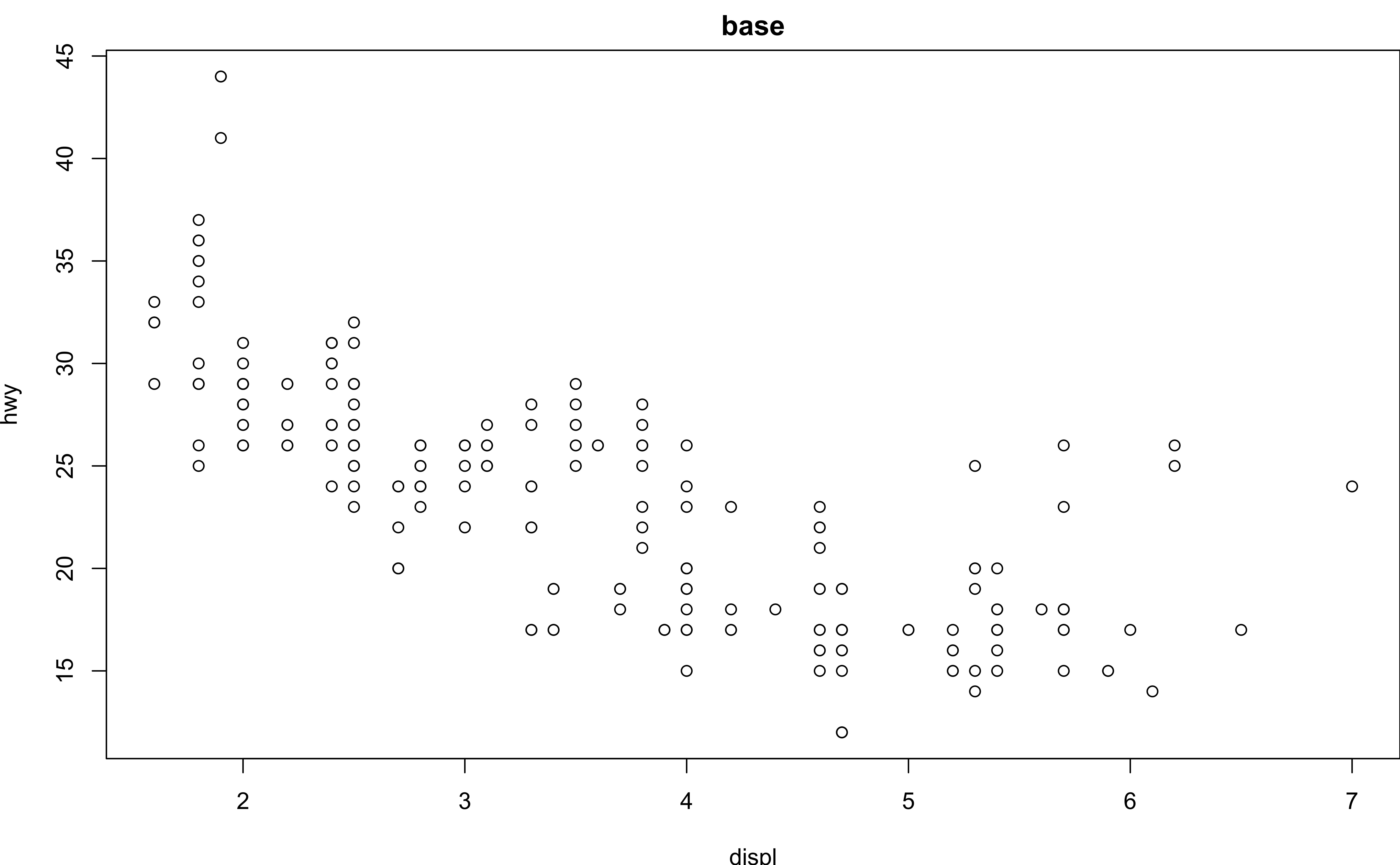
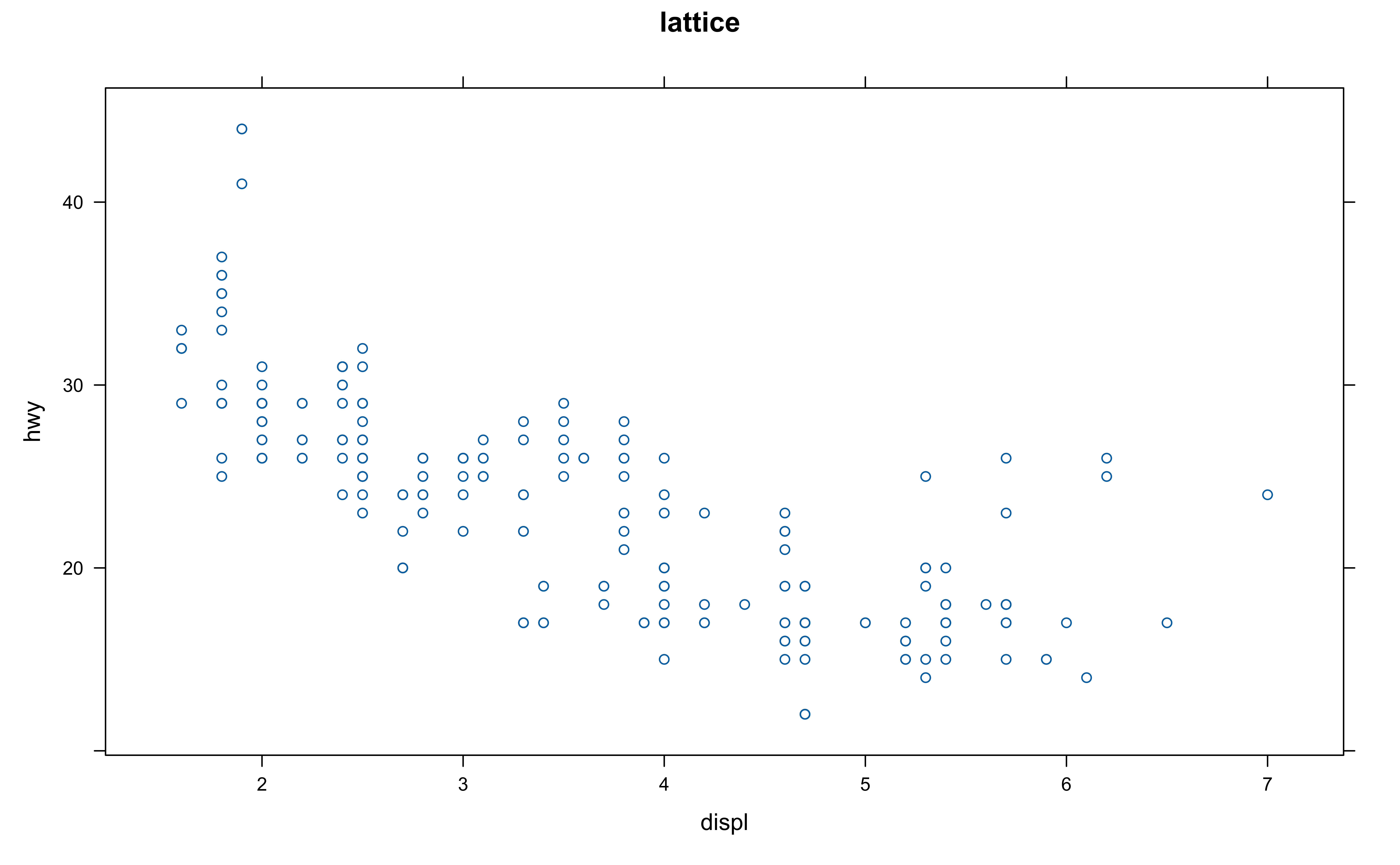
Plotting Systems: base, lattice and ggplot2
ggplot2
has the most powerful functionality.
is more beautiful?
has larger file size that occupies more memory space and has longer render time.
Elegant Data Visualisation
Using the Grammar of Graphics
The ggplot2 Grammar
- Three main components:
| Grammar element | What it is |
|---|---|
| Data | The data frame used for plotting |
| Geometry |
|
| Aesthetic mapping |
|
- How we define the mapping depends on what geometry we are using.
mpg Data
# A tibble: 234 × 11
  manufacturer model      displ  year   cyl trans  drv     cty   hwy fl    class
  <chr>        <chr>      <dbl> <int> <int> <chr>  <chr> <int> <int> <chr> <chr>
1 audi         a4           1.8  1999     4 auto(… f        18    29 p     comp…
2 audi         a4           1.8  1999     4 manua… f        21    29 p     comp…
3 audi         a4           2    2008     4 manua… f        20    31 p     comp…
4 audi         a4           2    2008     4 auto(… f        21    30 p     comp…
5 audi         a4           2.8  1999     6 auto(… f        16    26 p     comp…
6 audi         a4           2.8  1999     6 manua… f        18    26 p     comp…
7 audi         a4           3.1  2008     6 auto(… f        18    27 p     comp…
8 audi         a4 quattro   1.8  1999     4 manua… 4        18    26 p     comp…
# ℹ 226 more rowsCoding out loud 😃
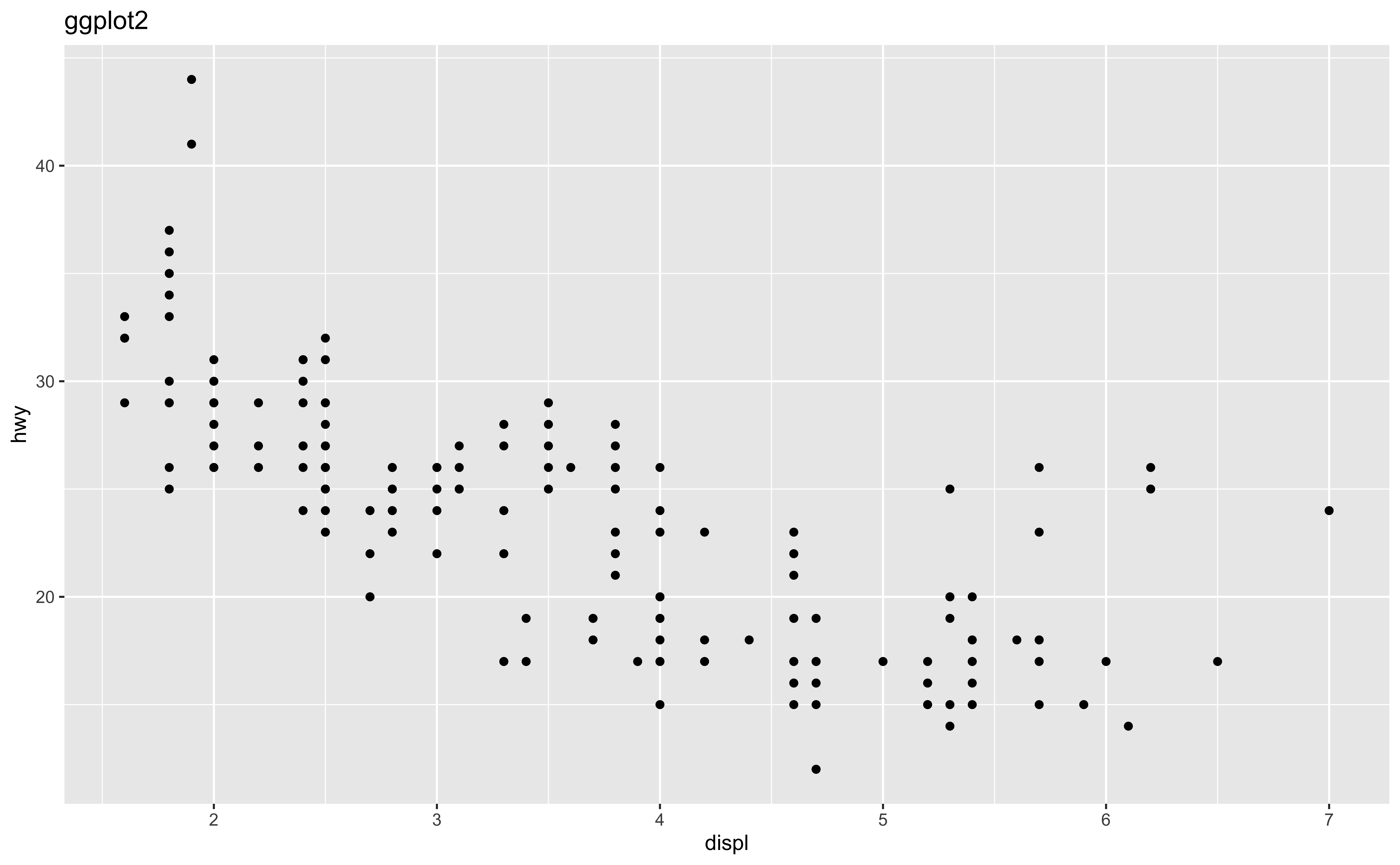
Start with the
mpgdata frame
Start with the
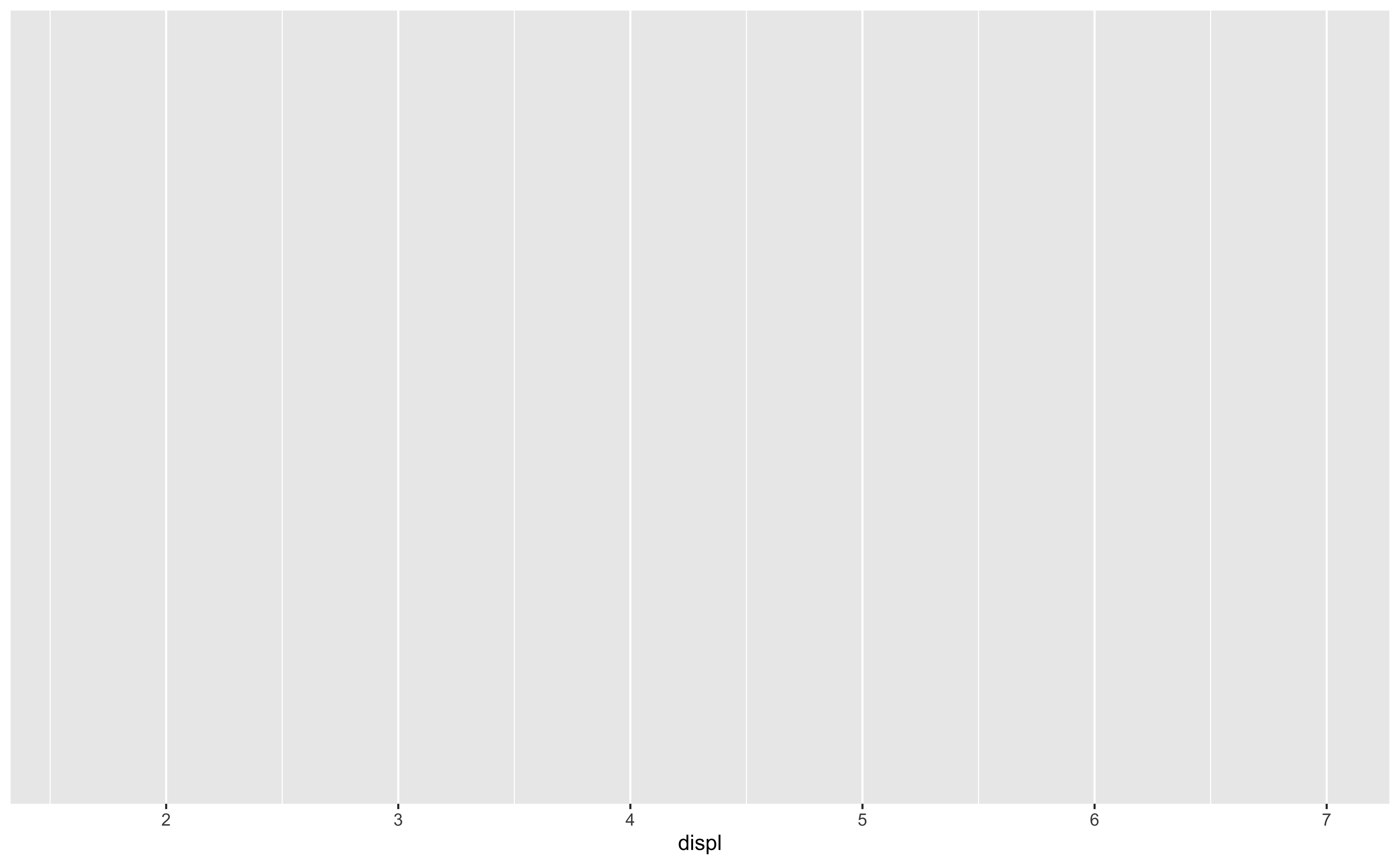
mpgdata frame, map engine displacement to the x-axis
Start with the
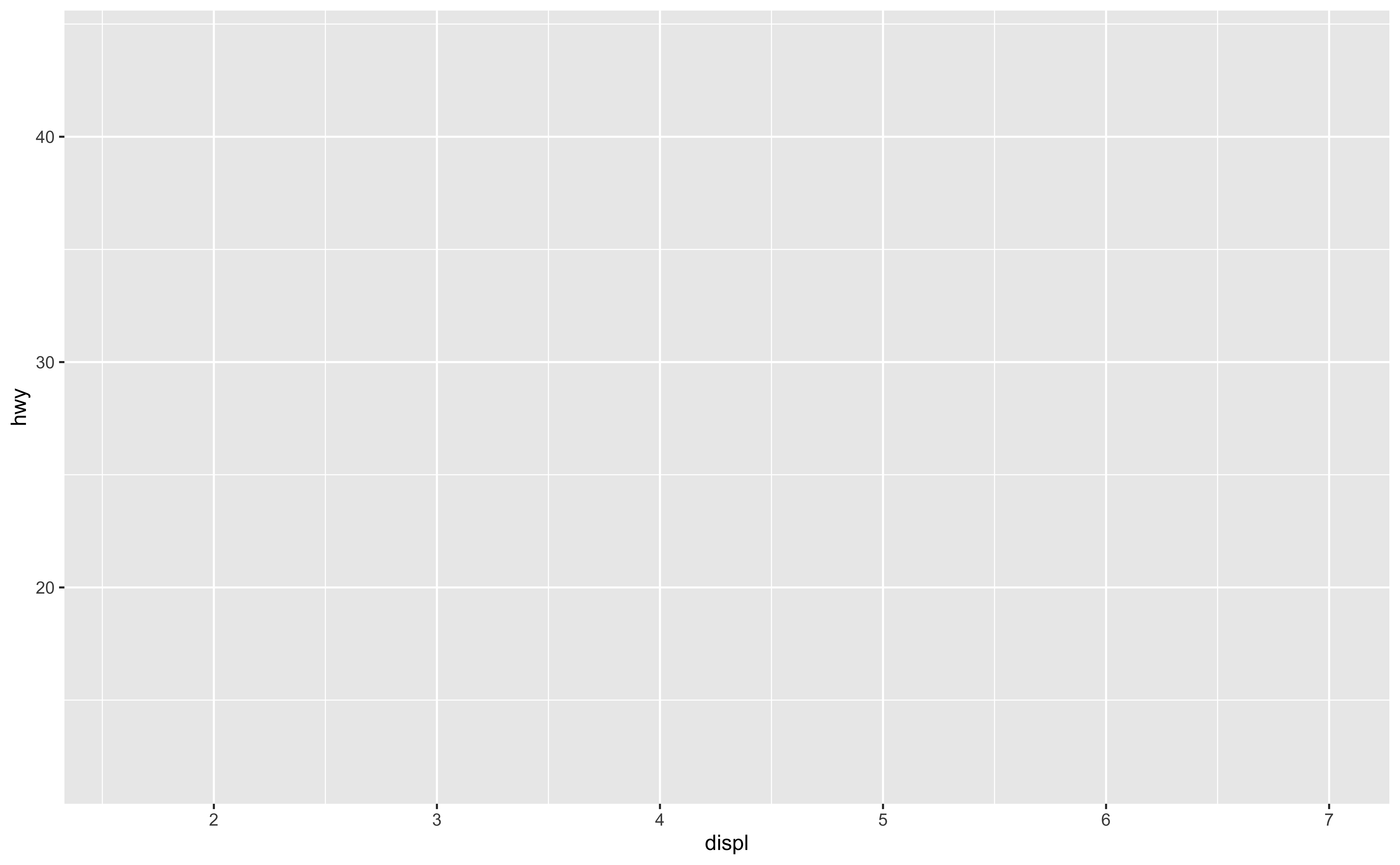
mpgdata frame, map engine displacement to the x-axis and map highway miles per gallon to the y-axis.
Start with the
mpgdata frame, map engine displacement to the x-axis and map highway miles per gallon to the y-axis. Represent each observation with a point
ggplot(data = mpg,
       mapping = aes(x = displ,
                     y = hwy)) +
geom_point() #<<- To define a geometry, add a geom layer.
Don’t miss + sign!
For scatterplots we add points, and use
geom_point()
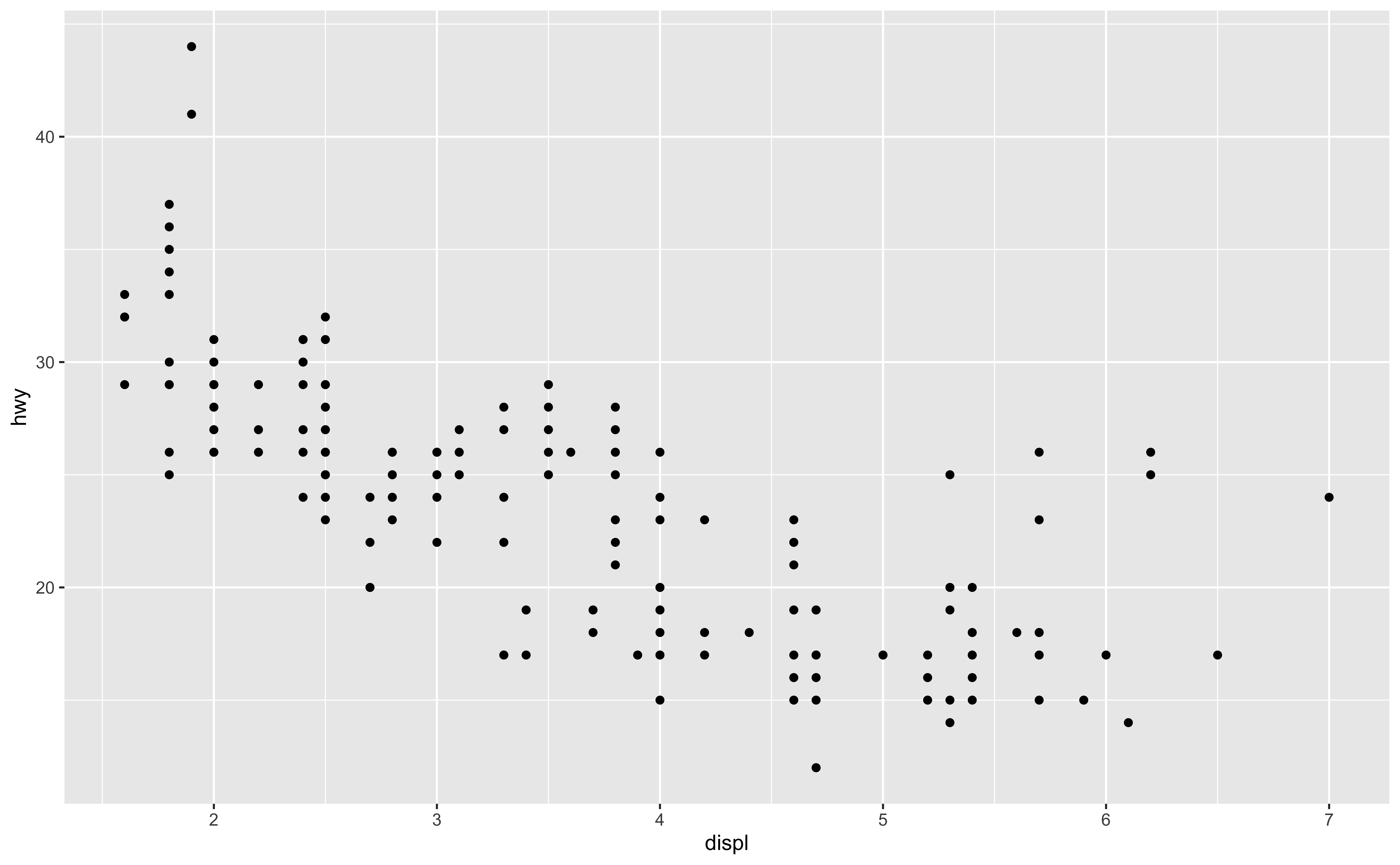
Start with the
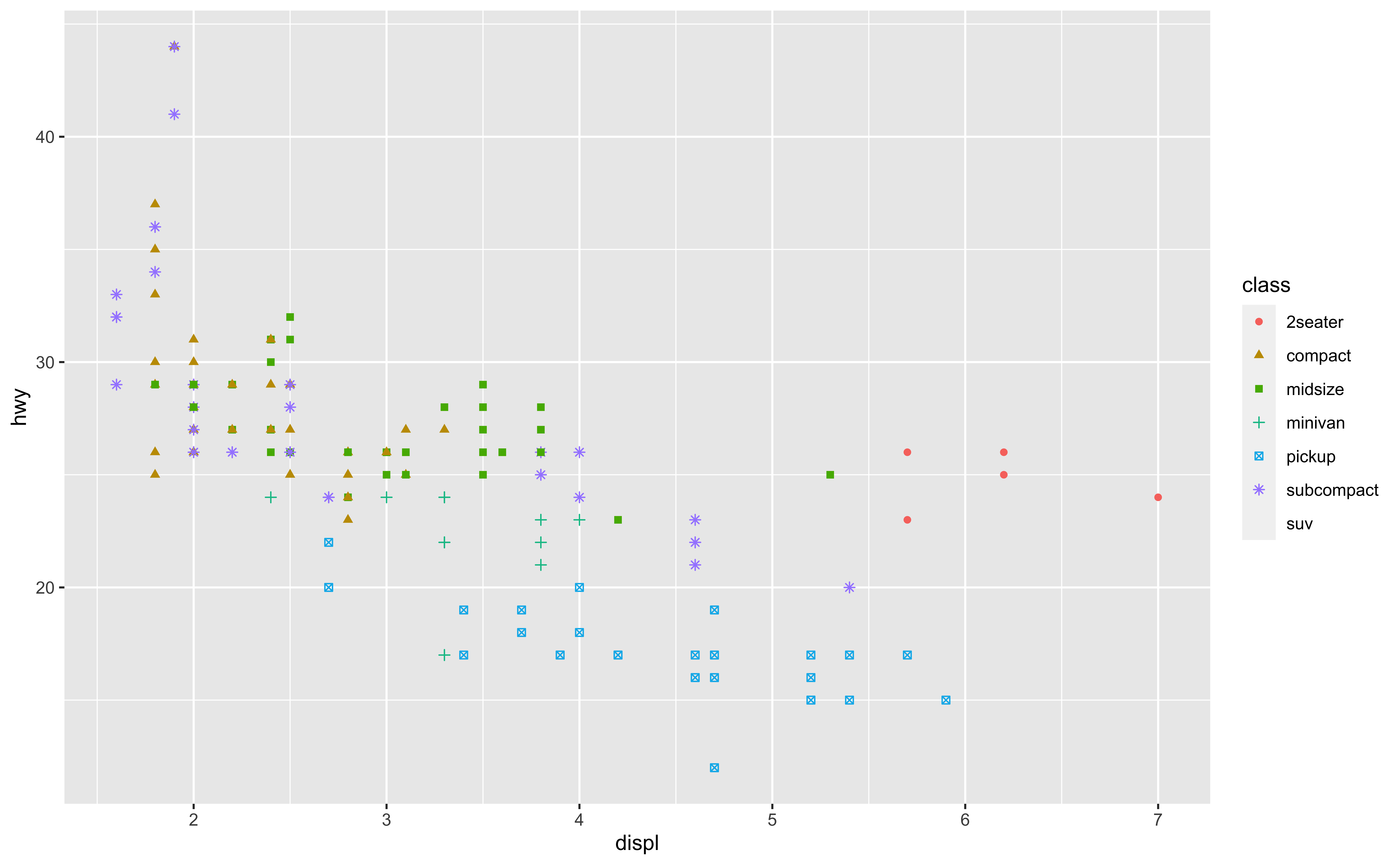
mpgdata frame, map engine displacement to the x-axis and map highway miles per gallon to the y-axis. Represent each observation with a point and map type of car (class) to the color of each point.
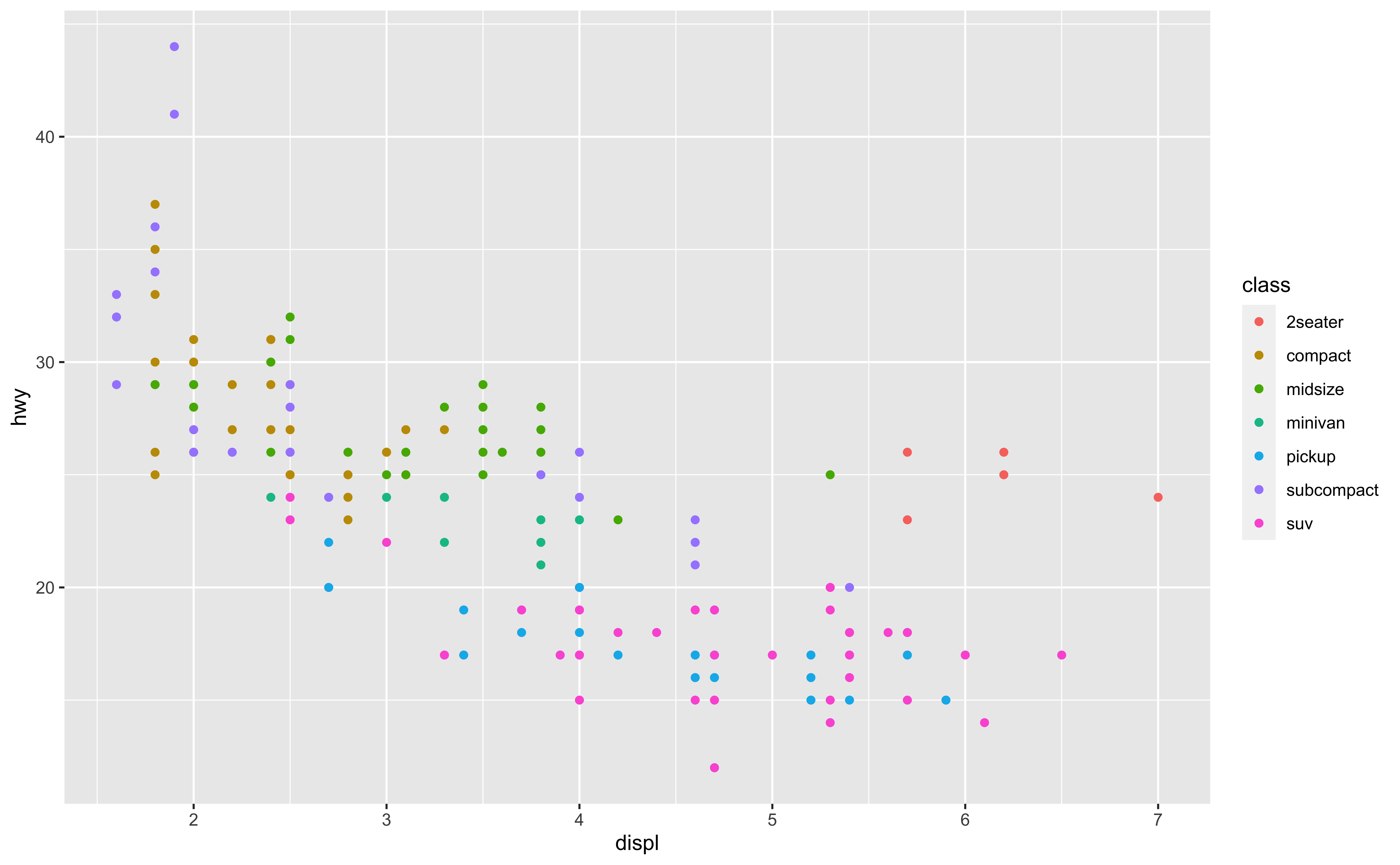
ggplot(data = mpg,
       mapping =
         aes(x = displ,
             y = hwy,
             color = class)) + #<<
  geom_point()
Add
color = classinaes()of themappingargument, whereclassis the variable name for type of car.ggplot automatically generates a legend on the right.
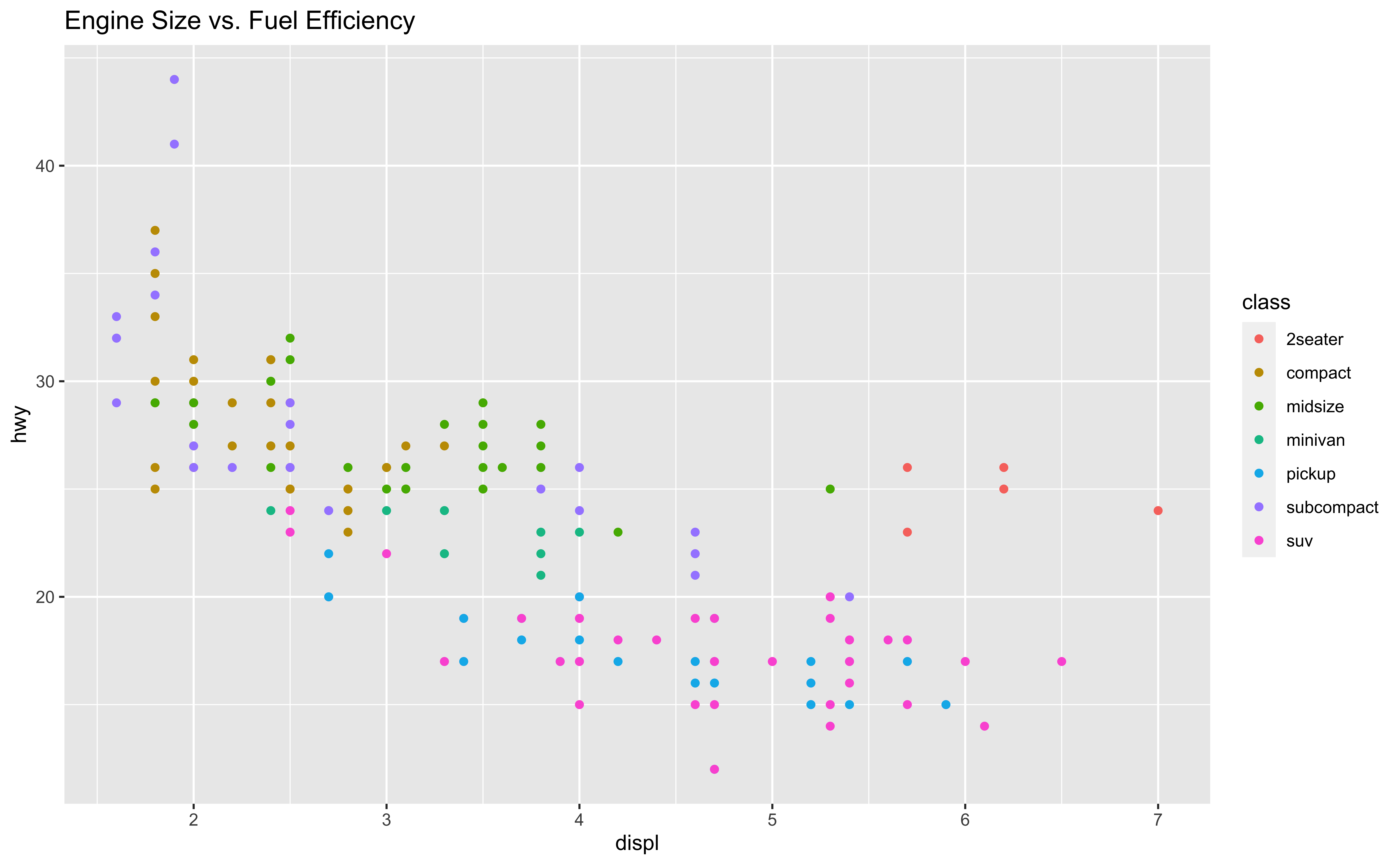
Start with the
mpgdata frame, map engine displacement to the x-axis and map highway miles per gallon to the y-axis. Represent each observation with a point and map type of car (class) to the color of each point. Title the plot “Engine Size v.s. Fuel Efficiency”
ggplot(data = mpg,
       mapping = aes(x = displ,
                     y = hwy,
                     color = class)) +
  geom_point() +
  labs(
    title="Engine Size vs. Fuel Efficiency" #<<
)- Add any labels in
labs()layer.
Start with the
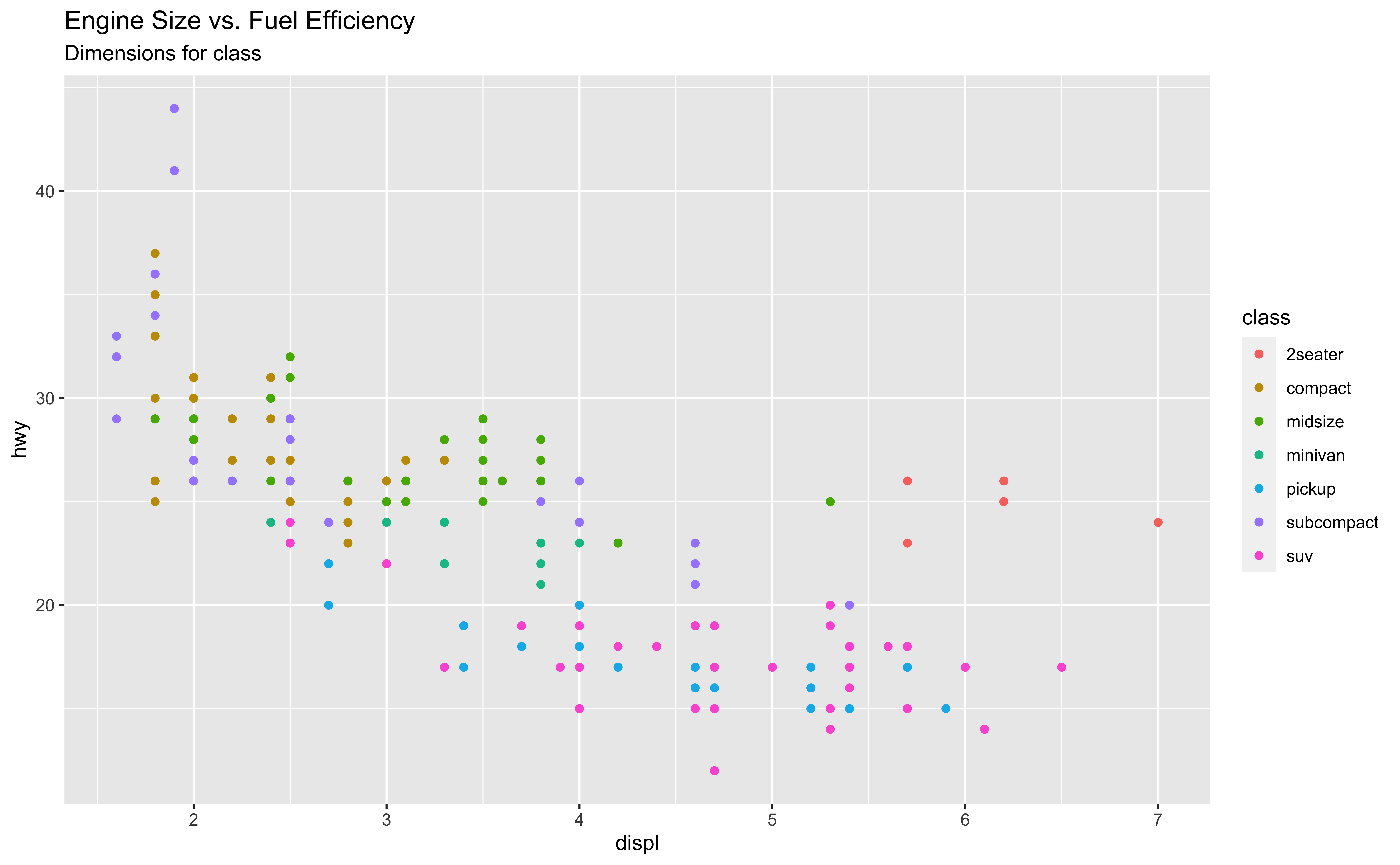
mpgdata frame, map engine displacement to the x-axis and map highway miles per gallon to the y-axis. Represent each observation with a point and map type of car (class) to the color of each point. Title the plot “Engine Size vs. Fuel Efficiency”, add the subtitle “Dimensions for class”
ggplot(data = mpg,
       mapping = aes(x = displ,
                     y = hwy,
                     color = class)) +
  geom_point() +
  labs(
    title="Engine Size vs. Fuel Efficiency",
    subtitle="Dimensions for class" #<<
) - Add a subtitle in
labs()
Start with the
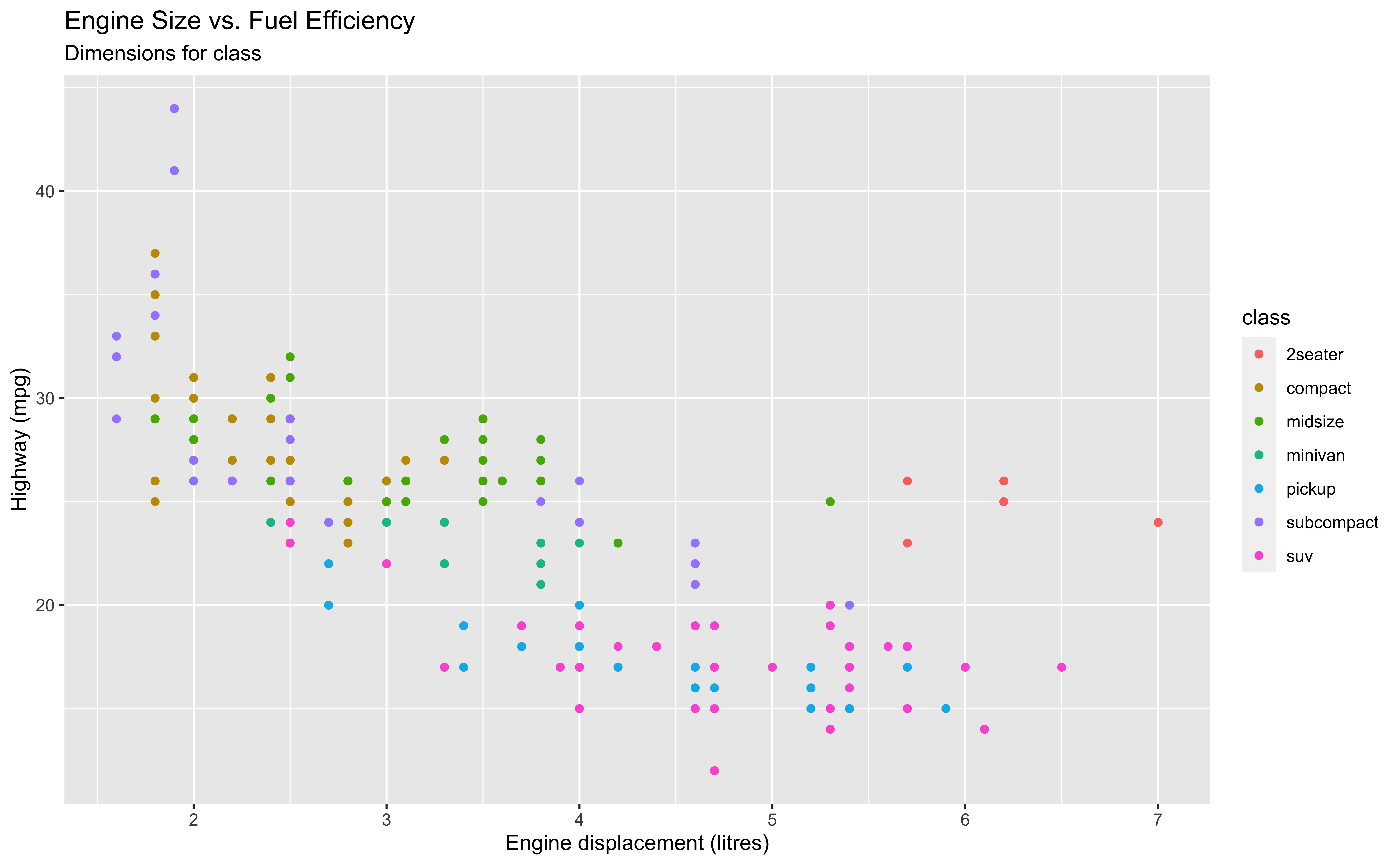
mpgdata frame, map engine displacement to the x-axis and map highway miles per gallon to the y-axis. Represent each observation with a point and map type of car (class) to the color of each point. Title the plot “Engine Size vs. Fuel Efficiency”, add the subtitle “Dimensions for class”, label the x and y axes as “Engine displacement (litres)” and “Highway (mpg)”, respectively
ggplot(data = mpg,
       mapping = aes(x = displ,
                     y = hwy,
                     color = class)) +
  geom_point() +
  labs(
    title = "Engine Size vs. Fuel Efficiency",
    subtitle = "Dimensions for class",
    x = "Engine displacement (litres)", #<<
    y = "Highway (mpg)" #<<
) 
Start with the
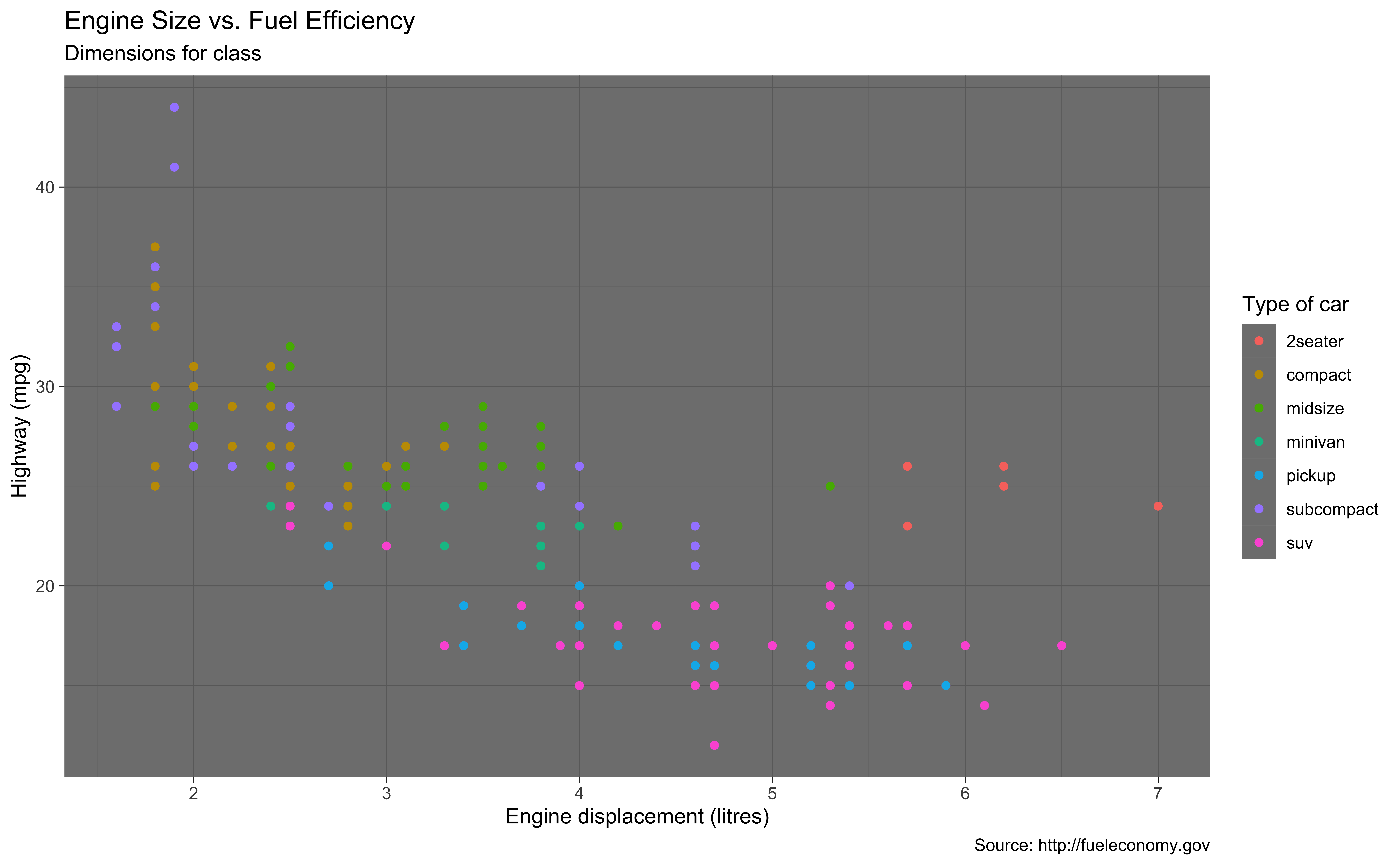
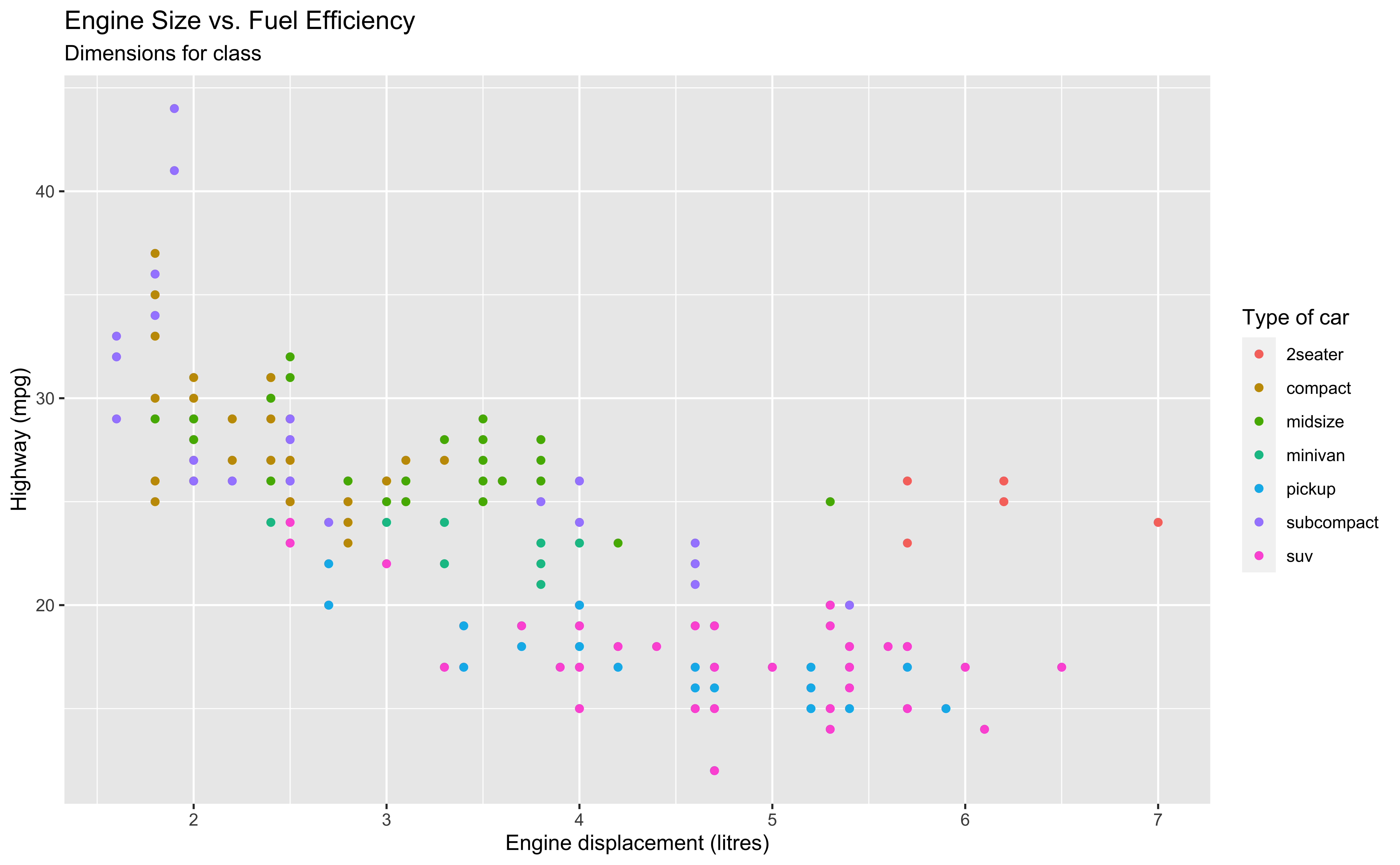
mpgdata frame, map engine displacement to the x-axis and map highway miles per gallon to the y-axis. Represent each observation with a point and map type of car (class) to the color of each point. Title the plot “Engine Size vs. Fuel Efficiency”, add the subtitle “Dimensions for class”, label the x and y axes as “Engine displacement (litres)” and “Highway (mpg)”, respectively, label the legend “Type of car”
ggplot(data = mpg,
       mapping = aes(x = displ,
                     y = hwy,
                     color = class)) +
  geom_point() +
  labs(
    title = "Engine Size vs. Fuel Efficiency",
    subtitle = "Dimensions for class",
    x = "Engine displacement (litres)",
    y = "Highway (mpg)",
    color = "Type of car" #<<
) - The legend is generated when we map type of car (
class) to color.
Start with the
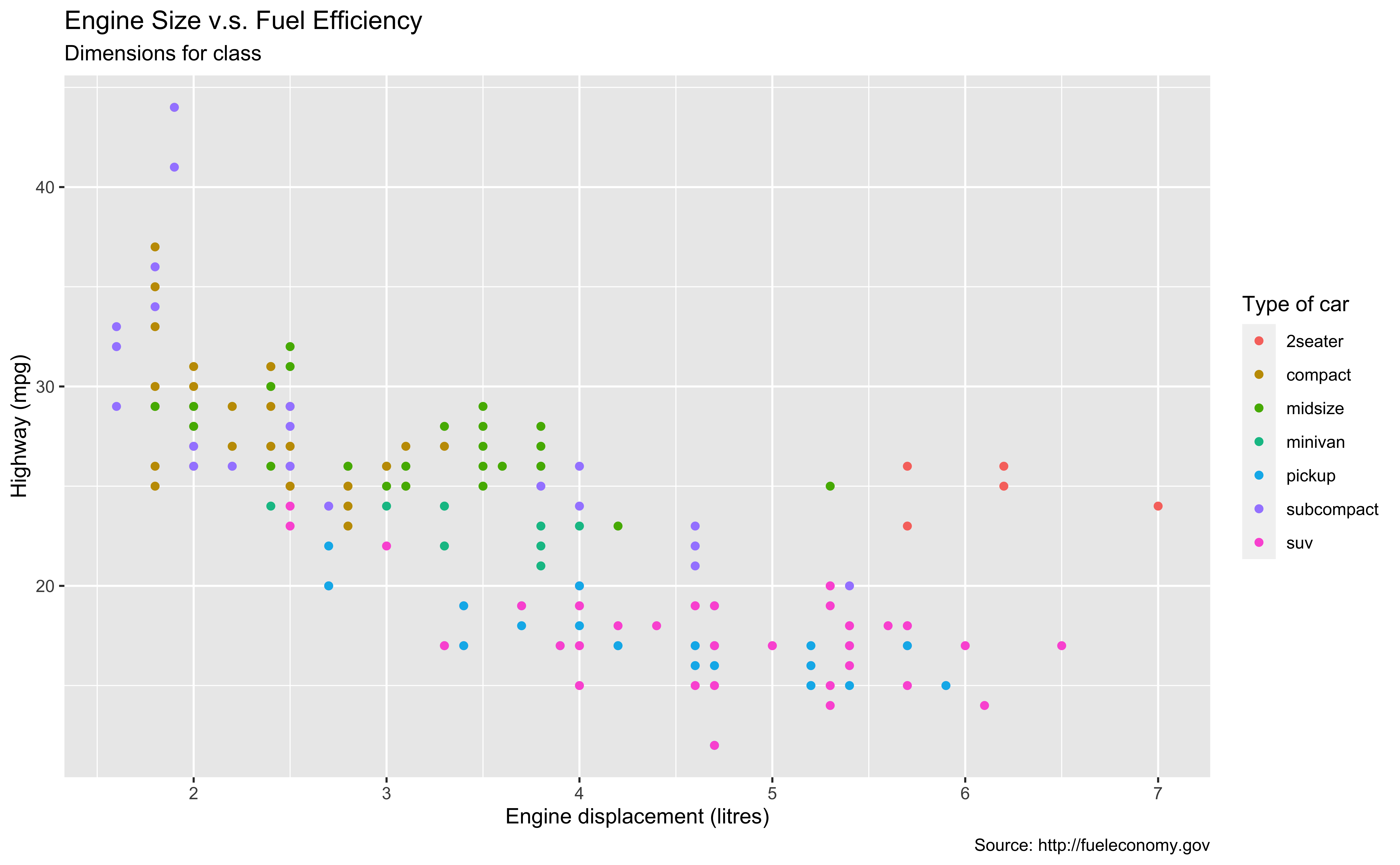
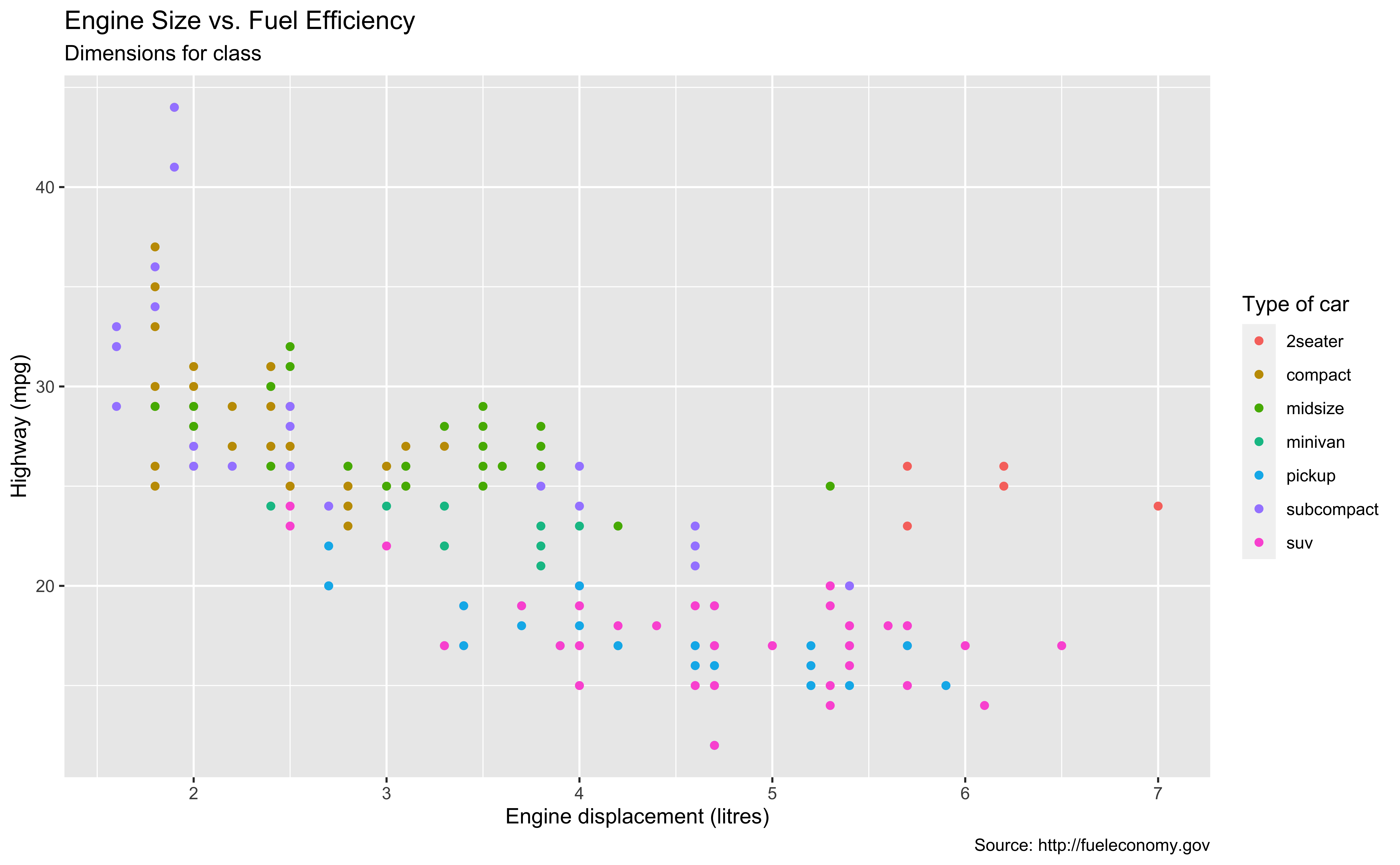
mpgdata frame, map engine displacement to the x-axis and map highway miles per gallon to the y-axis. Represent each observation with a point and map type of car (class) to the color of each point. Title the plot “Engine Size vs. Fuel Efficiency”, add the subtitle “Dimensions for class”, label the x and y axes as “Engine displacement (litres)” and “Highway (mpg)”, respectively, label the legend “Type of car”, and add a caption for the data source.
ggplot(data = mpg,
       mapping = aes(x = displ,
                     y = hwy,
                     color = class)) +
  geom_point() +
  labs(
    title = "Engine Size vs. Fuel Efficiency",
    subtitle = "Dimensions for class",
    x = "Engine displacement (litres)",
    y = "Highway (mpg)",
    color = "Type of car",
    caption="Source: http://fueleconomy.gov" #<<
) 
Start with the
mpgdata frame, map engine displacement to the x-axis and map highway miles per gallon to the y-axis. Represent each observation with a point and map type of car (class) to the color of each point. Title the plot “Engine Size vs. Fuel Efficiency”, add the subtitle “Dimensions for class”, label the x and y axes as “Engine displacement (litres)” and “Highway (mpg)”, respectively, label the legend “Type of car”, and add a caption for the data source. Finally, use a discrete color scale that is designed to be perceived by viewers with common forms of color blindness.
ggplot(data = mpg,
       mapping = aes(x = displ,
                     y = hwy,
                     color = class)) +
  geom_point() +
  labs(
    title = "Engine Size vs. Fuel Efficiency",
    subtitle = "Dimensions for class",
    x = "Engine displacement (litres)",
    y = "Highway (mpg)",
    color = "Type of car",
    caption = "Source: http://fueleconomy.gov"
    ) +
  scale_colour_viridis_d() #<<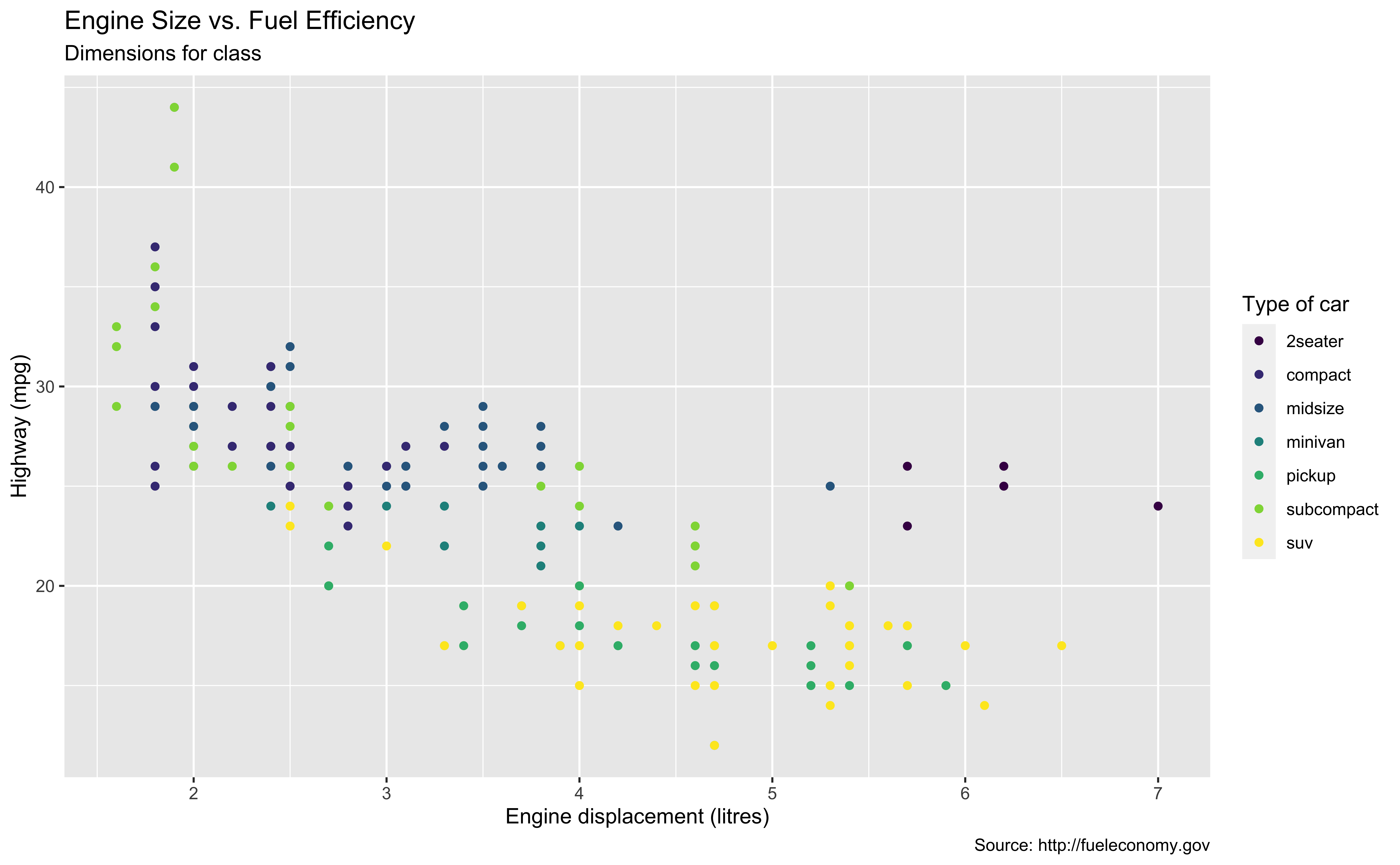
11-ggplot2
In lab.qmd ## Lab 11 section,
Use
readr::read_csv()to import the data penguins.csv into your R workspace.Generate the following ggplot:
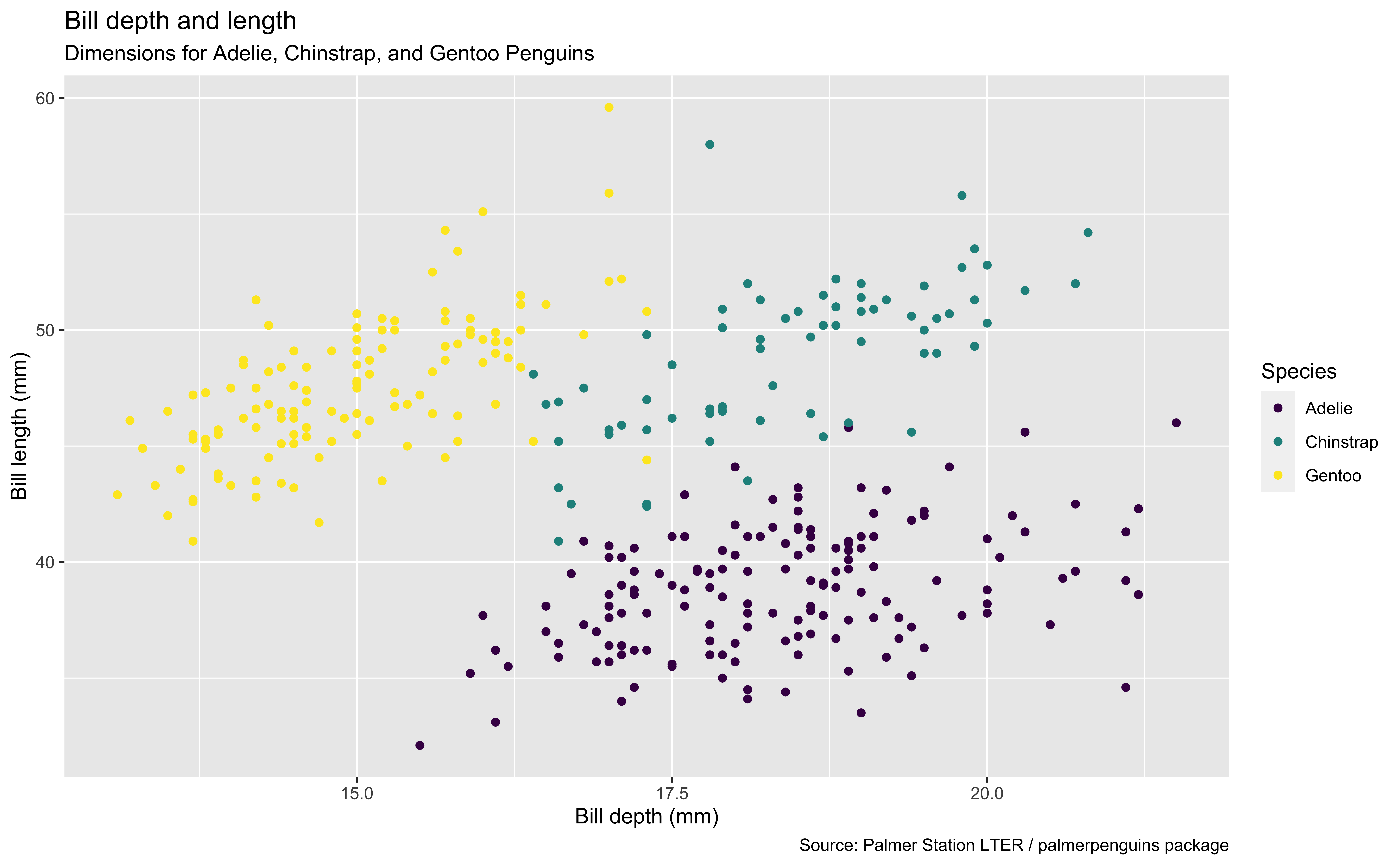
penguins <- read_csv(_________________)
________ |>
  ggplot(mapping = ____(x = ______________,
                        y = ______________,
                        colour = ________)) +
  geom______() +
  ____(title = ____________________,
       _________ = "Dimensions for Adelie, Chinstrap, and Gentoo Penguins",
       x = _____________, y = _______________,
       _______ = "Species",
       _______ = "Source: Palmer Station LTER / palmerpenguins package")
Assign a Plot to an Object
p <- ggplot(data = mpg,
            mapping =
                aes(x = displ,
                    y = hwy,
                    color = class)) +
    geom_point()
class(p)
[1] "gg" "ggplot"p
p + labs(
      title = "Engine Size vs. Fuel Efficiency",
      subtitle = "Dimensions for class",
      x = "Engine displacement (litres)",
      y = "Highway (mpg)",
      color = "Type of car",
      caption = "Source: http://fueleconomy.gov"
    )
Theme Options
Options include
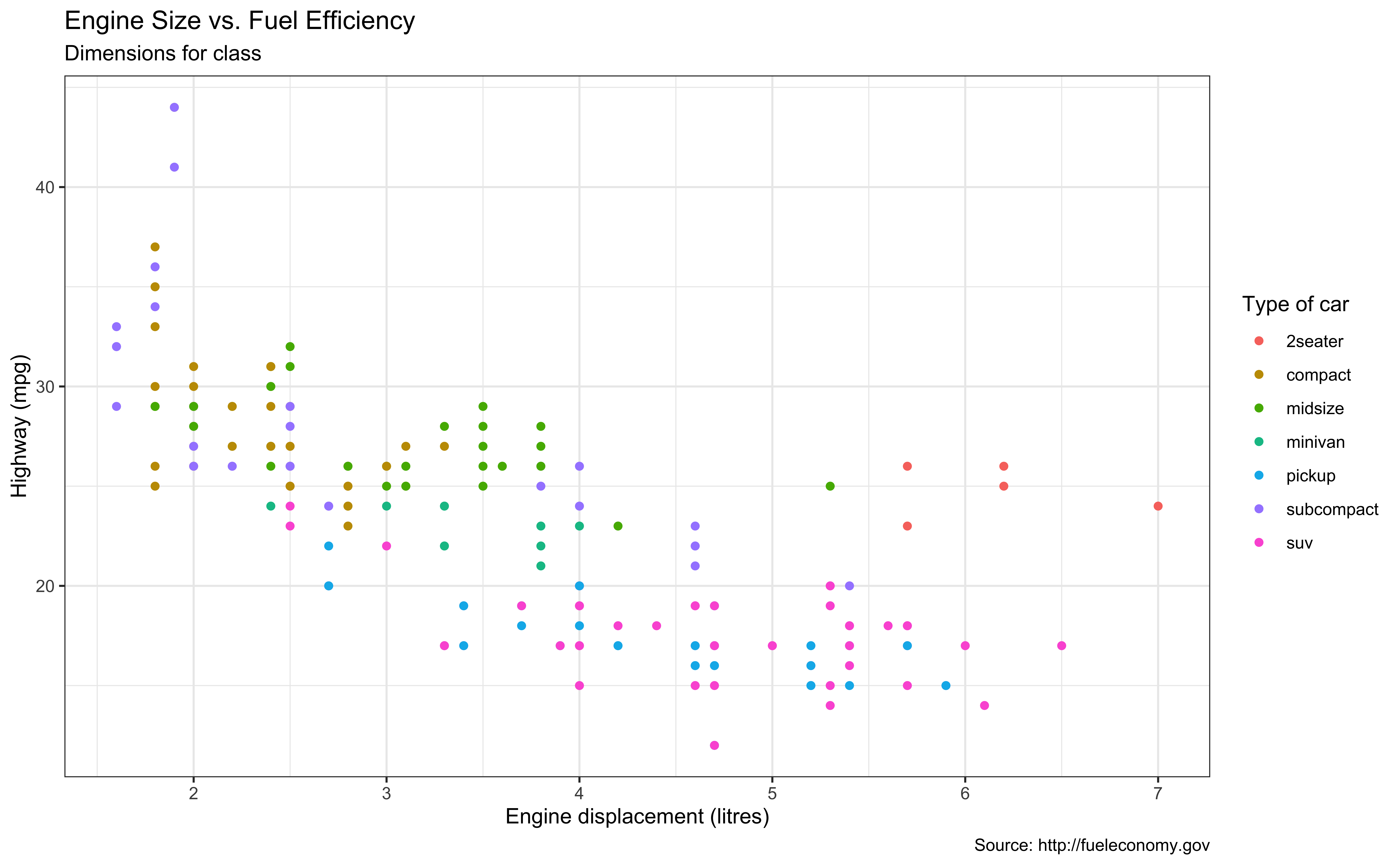
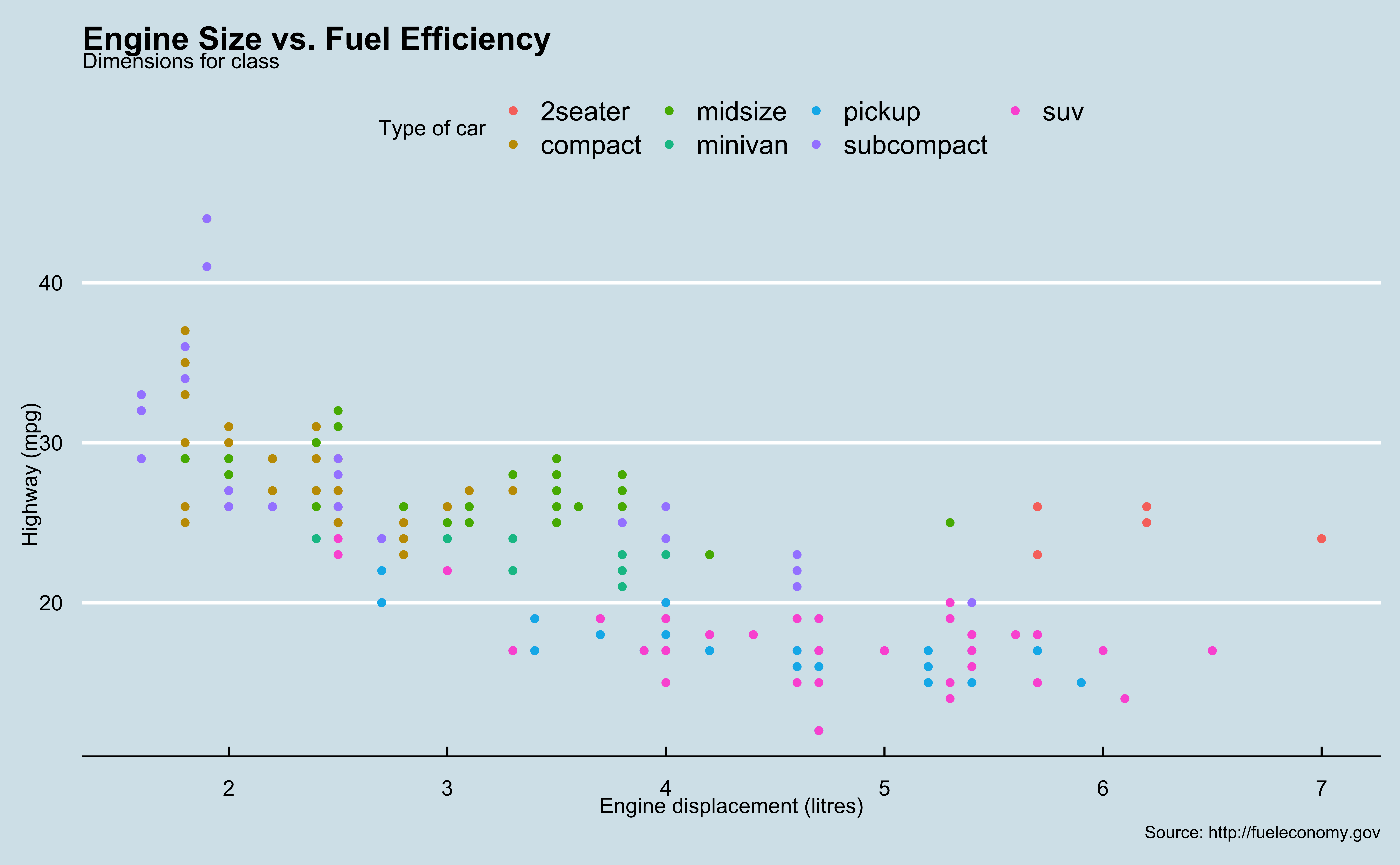
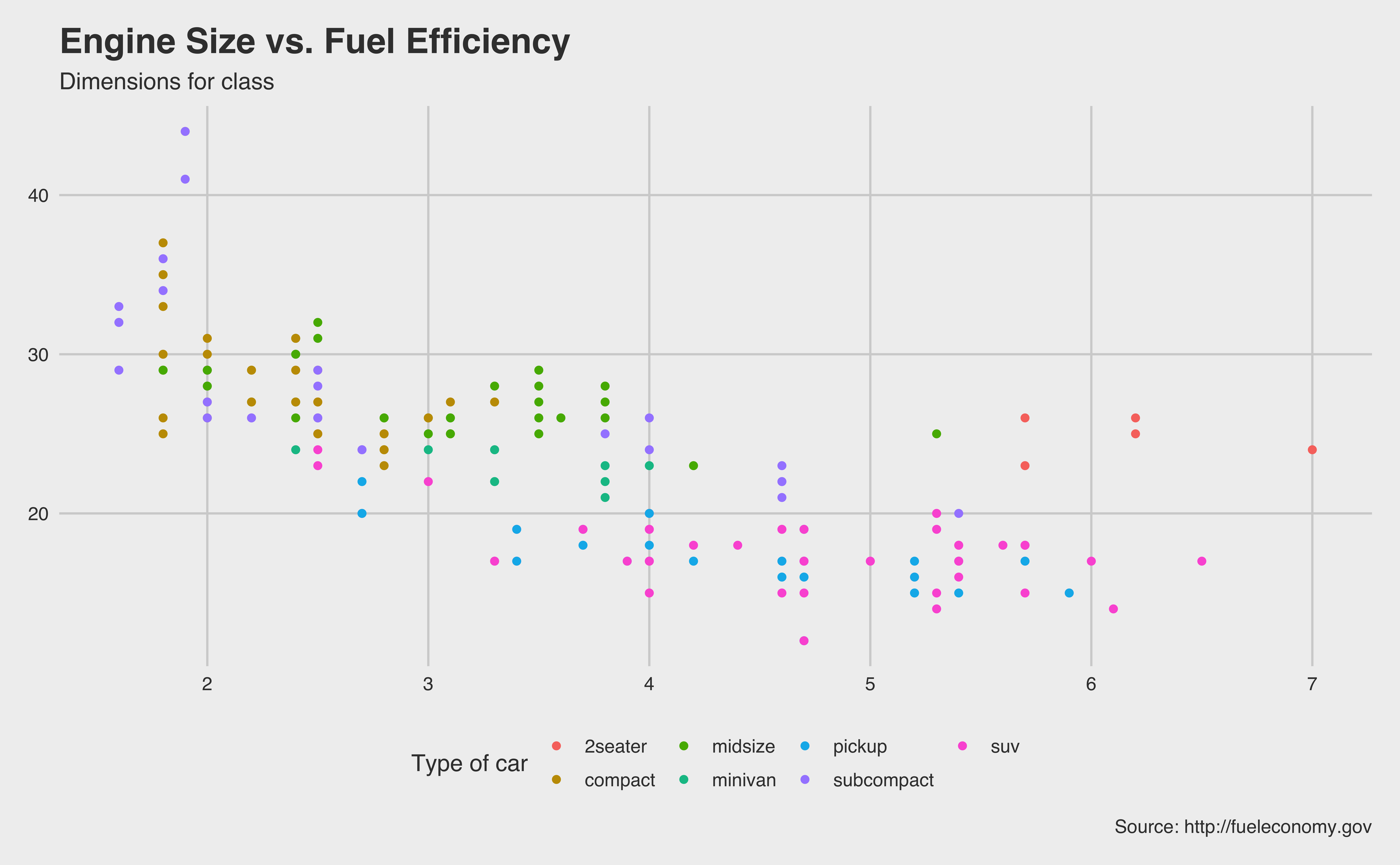
theme_grey() (default), theme_bw(), theme_dark(), theme_classic(), etc.
Add-on 📦: ggthemes
Many other themes are added by the package ggthemes.
Check package website, ggplot2 extensions, and ALL YOUR FIGURE ARE BELONG TO US for more themes.
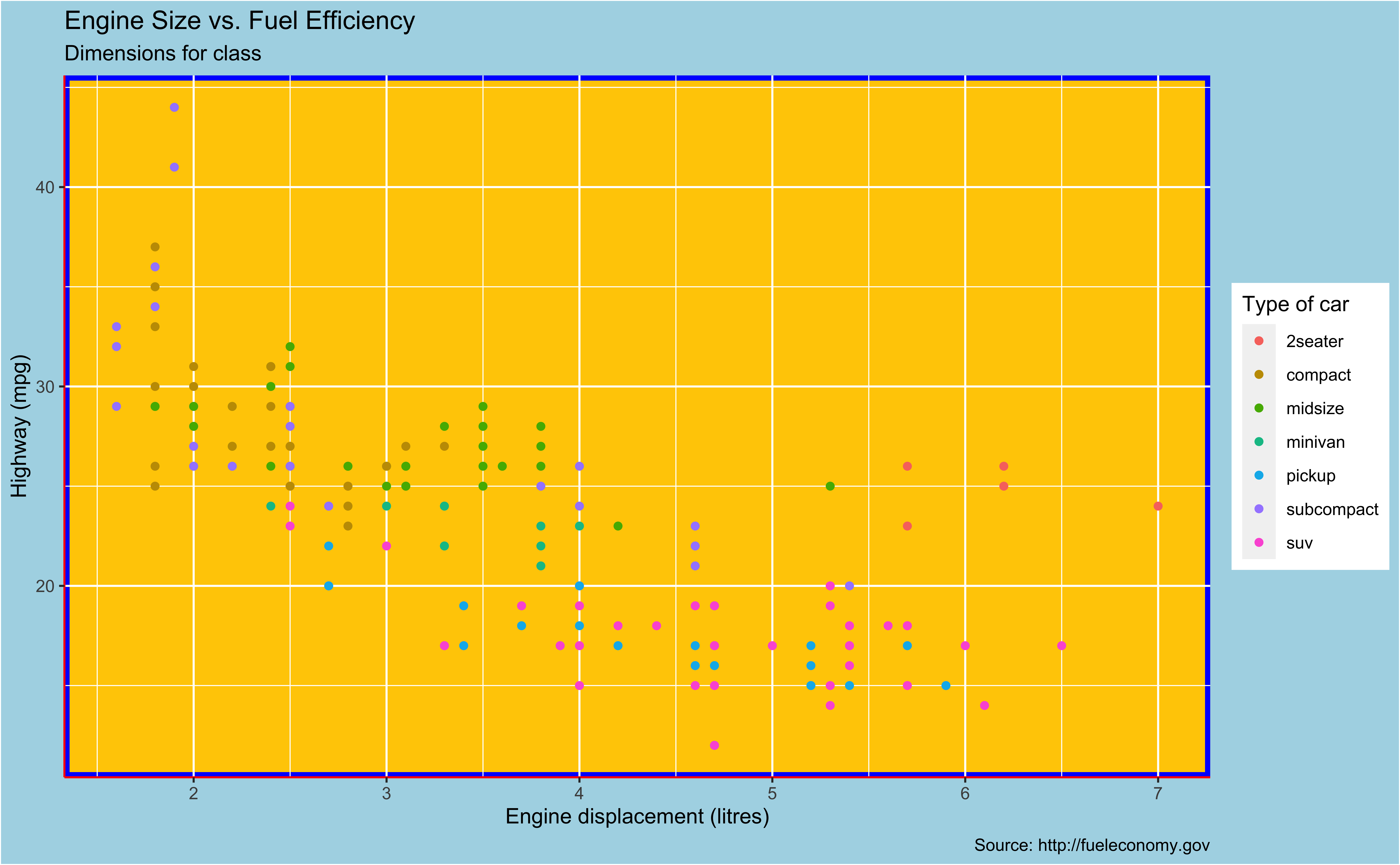
Customize Theme
- Use
theme()to tweak the display of the current theme, including title, axis labels, etc. Check?theme.
p + theme(
    panel.background =
        element_rect(fill = "#FFCC00",
                     colour = "blue",
                     size = 2.5,
                     linetype = "solid"),
    plot.background =
        element_rect(fill = "lightblue"),
    axis.line =
        element_line(size = 0.5,
                     linetype = "solid",
                     colour = "red")
    )
Aesthetics
Aesthetics options
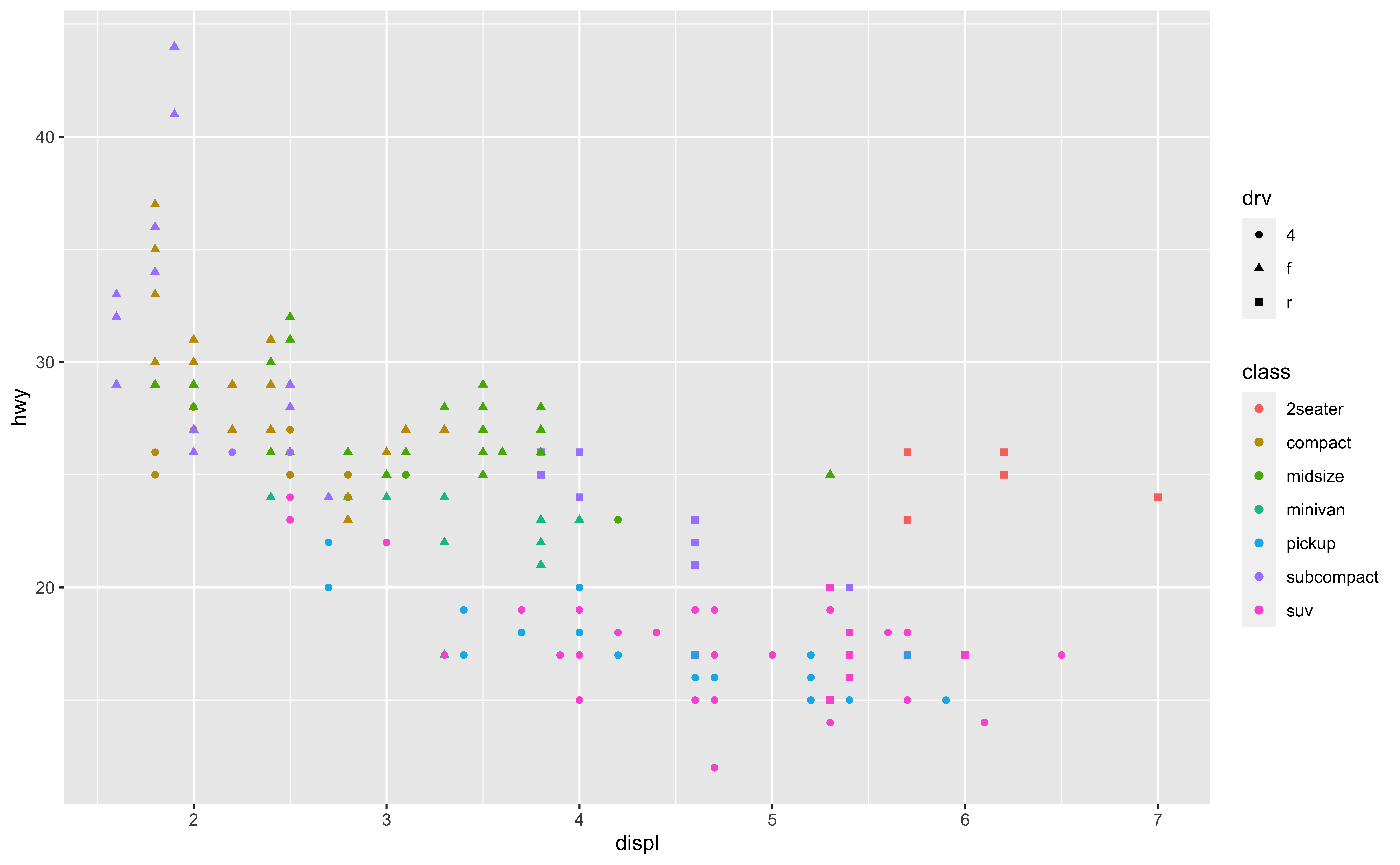
Commonly used characteristics of plotting characters that can be mapped to a specific variable in the data are
colourshapesize-
alpha(transparency)
Colour
Shape
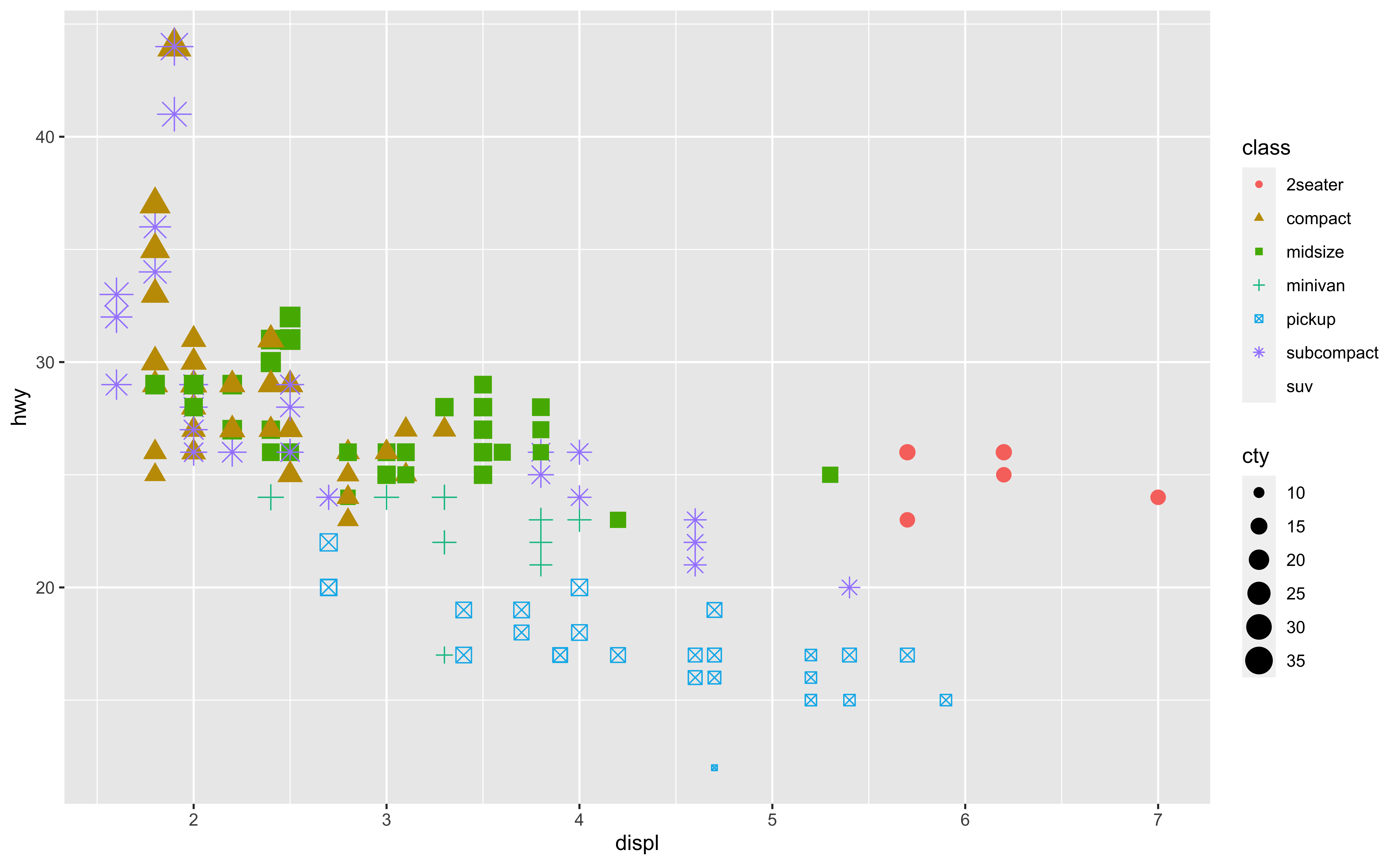
Mapped to a different variable than colour
Shape
Mapped to same variable as colour
Size
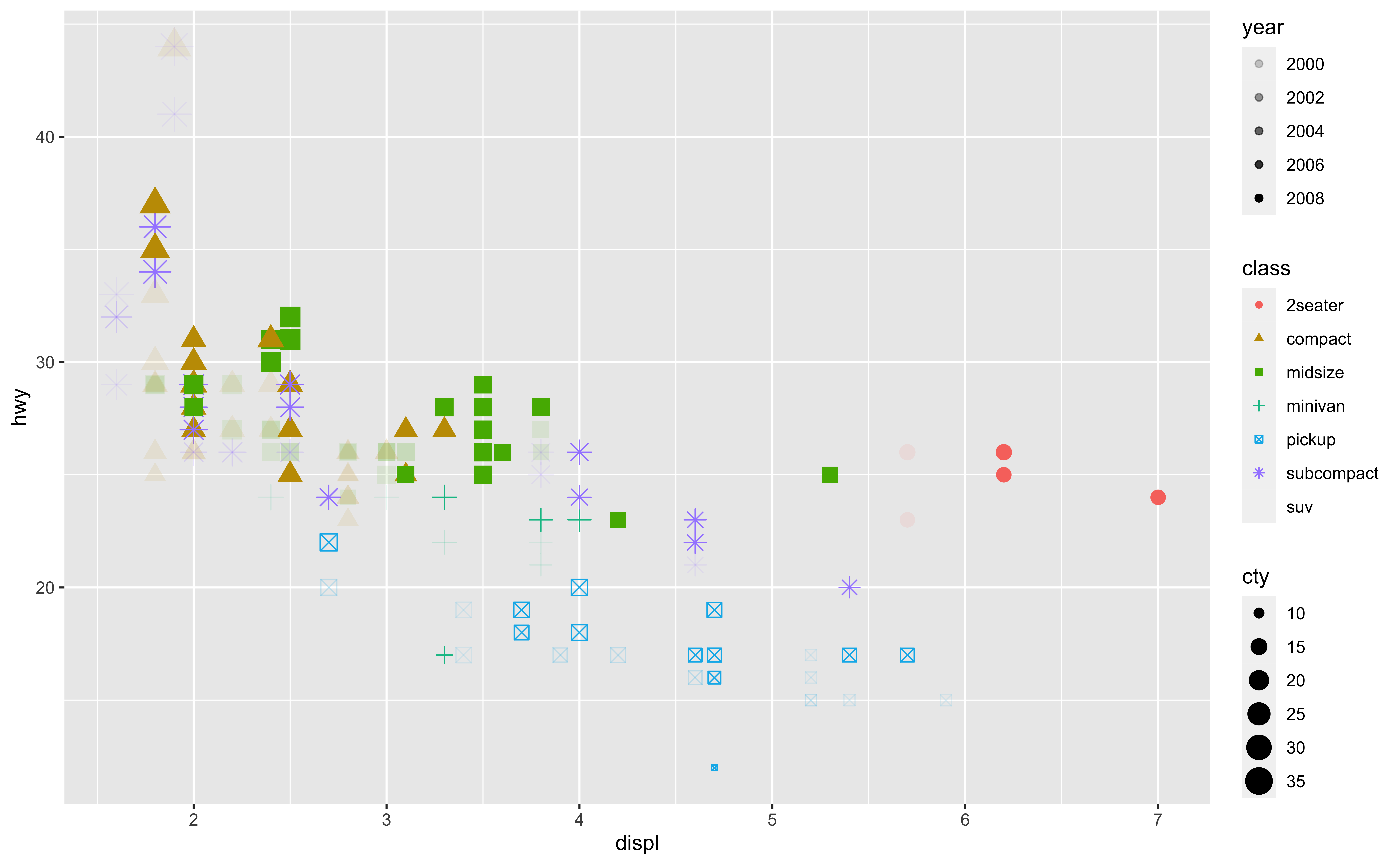
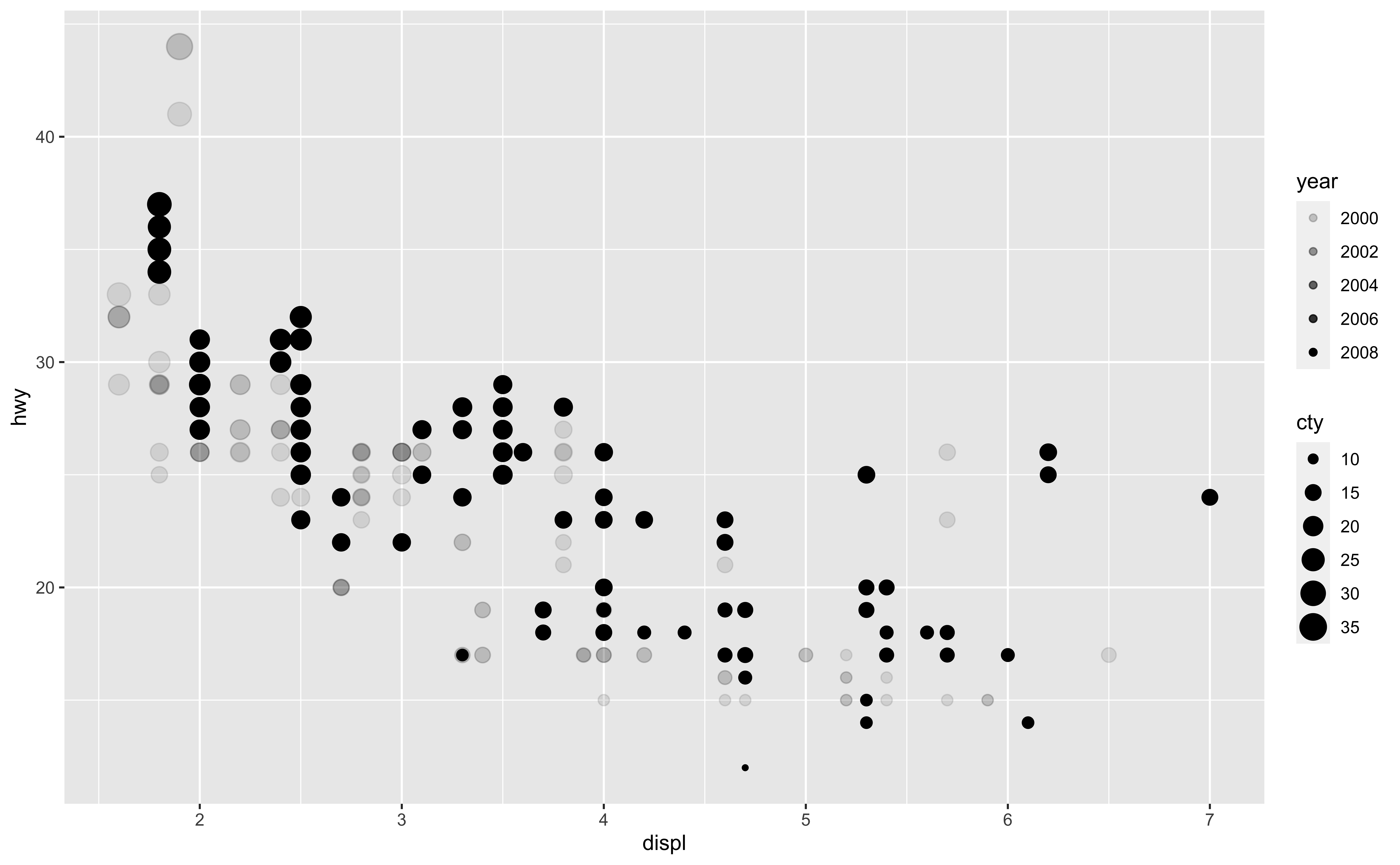
Alpha
Mapping vs. Setting
Mapping
- Determine the size, alpha, etc.
based on the values of a variable in the data.
- Goes into
aes().
Mapping vs. Setting
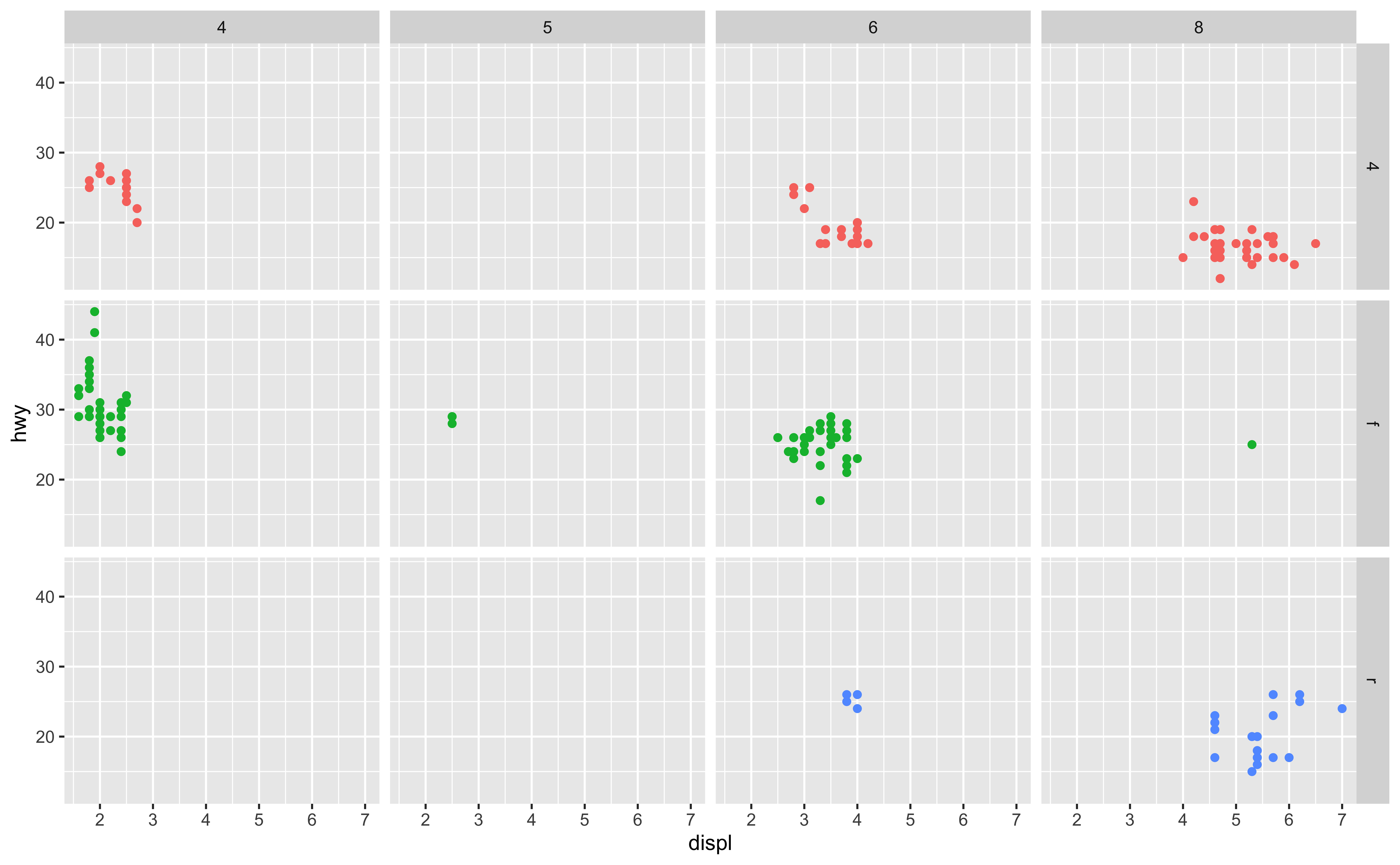
Faceting
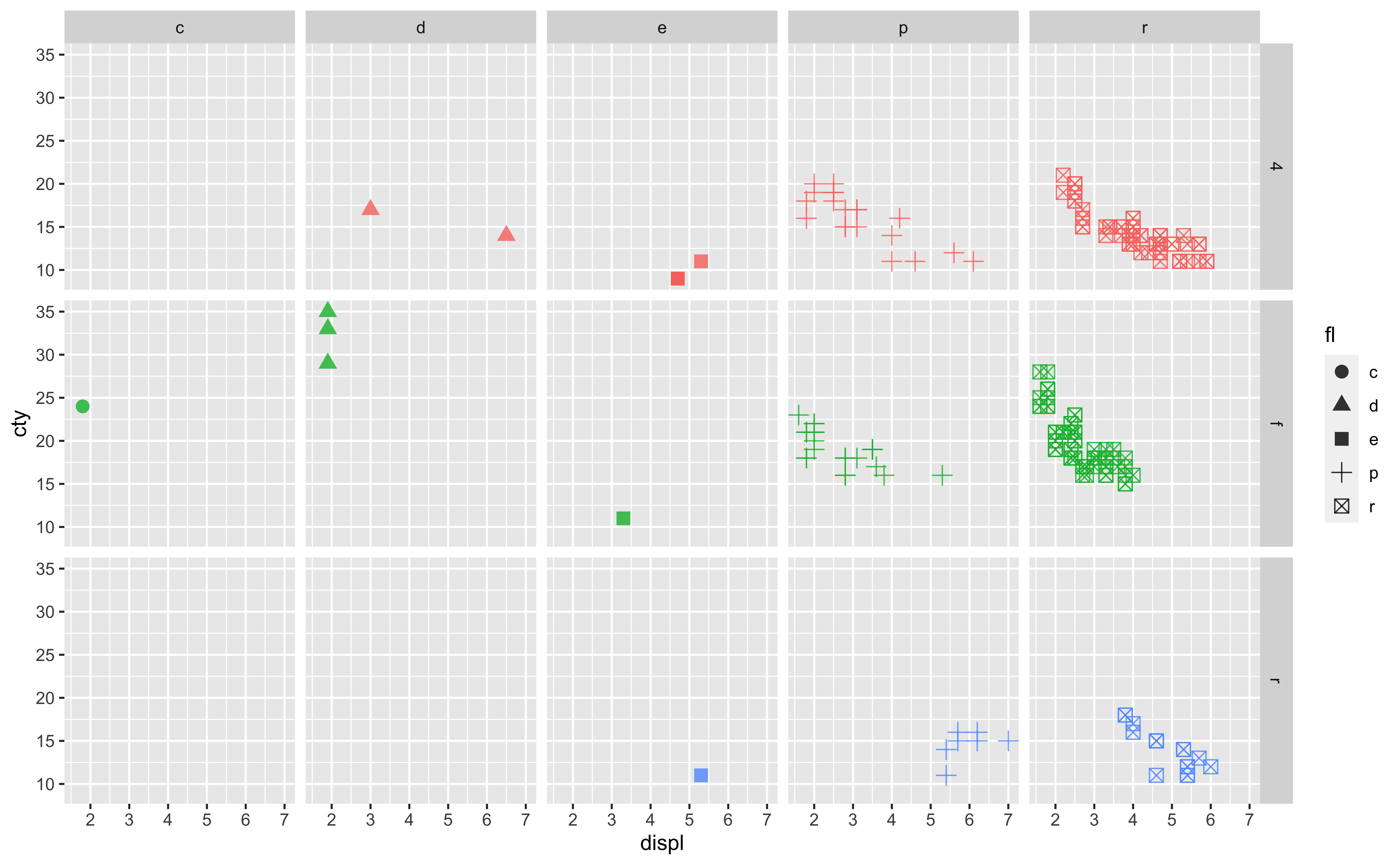
Faceting
One way to add additional variables’ information is with aesthetics. But we see that putting all information in one plot may not be a good idea.
Another way, particularly useful for categorical variables, is to
split your plot into facets, smaller plots that each display one subset of the data.
- Useful for exploring conditional relationships and large data.
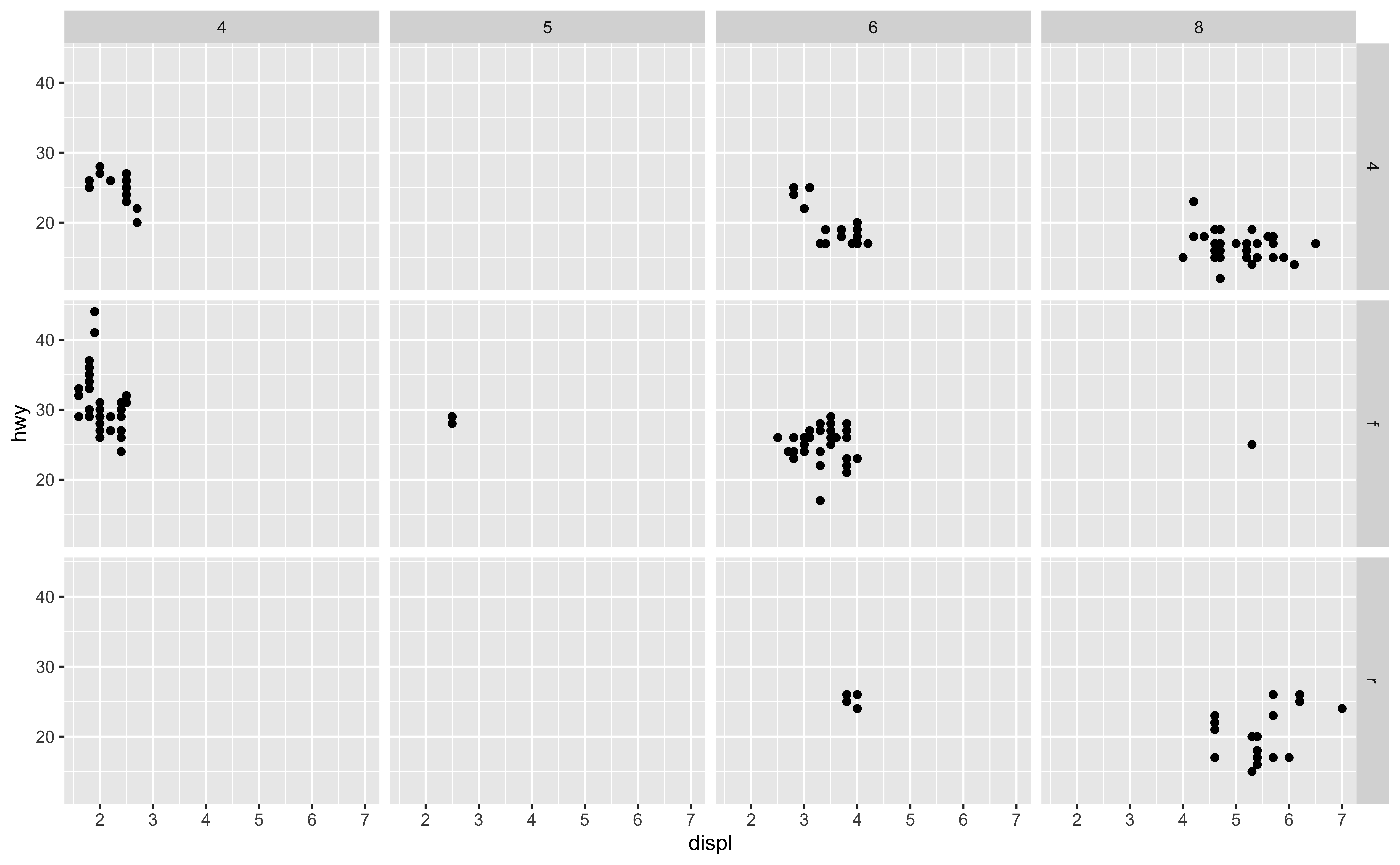

Facet and Color

Facet and Color with no Legend
ggplot for Python
plotnine package
Syntax are the same as ggplot in R.

