Rows: 10,000
Columns: 55
$ emp_title                        <chr> "global config engineer ", "warehouse…
$ emp_length                       <dbl> 3, 10, 3, 1, 10, NA, 10, 10, 10, 3, 1…
$ state                            <fct> NJ, HI, WI, PA, CA, KY, MI, AZ, NV, I…
$ homeownership                    <fct> MORTGAGE, RENT, RENT, RENT, RENT, OWN…
$ annual_income                    <dbl> 90000, 40000, 40000, 30000, 35000, 34…
$ verified_income                  <fct> Verified, Not Verified, Source Verifi…
$ debt_to_income                   <dbl> 18.01, 5.04, 21.15, 10.16, 57.96, 6.4…
$ annual_income_joint              <dbl> NA, NA, NA, NA, 57000, NA, 155000, NA…
$ verification_income_joint        <fct> , , , , Verified, , Not Verified, , ,…
$ debt_to_income_joint             <dbl> NA, NA, NA, NA, 37.7, NA, 13.1, NA, N…
$ delinq_2y                        <int> 0, 0, 0, 0, 0, 1, 0, 1, 1, 0, 0, 0, 0…
$ months_since_last_delinq         <int> 38, NA, 28, NA, NA, 3, NA, 19, 18, NA…
$ earliest_credit_line             <dbl> 2001, 1996, 2006, 2007, 2008, 1990, 2…
$ inquiries_last_12m               <int> 6, 1, 4, 0, 7, 6, 1, 1, 3, 0, 4, 4, 8…
$ total_credit_lines               <int> 28, 30, 31, 4, 22, 32, 12, 30, 35, 9,…
$ open_credit_lines                <int> 10, 14, 10, 4, 16, 12, 10, 15, 21, 6,…
$ total_credit_limit               <int> 70795, 28800, 24193, 25400, 69839, 42…
$ total_credit_utilized            <int> 38767, 4321, 16000, 4997, 52722, 3898…
$ num_collections_last_12m         <int> 0, 0, 0, 0, 0, 0, 0, 0, 0, 0, 0, 0, 0…
$ num_historical_failed_to_pay     <int> 0, 1, 0, 1, 0, 0, 0, 0, 0, 0, 1, 0, 0…
$ months_since_90d_late            <int> 38, NA, 28, NA, NA, 60, NA, 71, 18, N…
$ current_accounts_delinq          <int> 0, 0, 0, 0, 0, 0, 0, 0, 0, 0, 0, 0, 0…
$ total_collection_amount_ever     <int> 1250, 0, 432, 0, 0, 0, 0, 0, 0, 0, 0,…
$ current_installment_accounts     <int> 2, 0, 1, 1, 1, 0, 2, 2, 6, 1, 2, 1, 2…
$ accounts_opened_24m              <int> 5, 11, 13, 1, 6, 2, 1, 4, 10, 5, 6, 7…
$ months_since_last_credit_inquiry <int> 5, 8, 7, 15, 4, 5, 9, 7, 4, 17, 3, 4,…
$ num_satisfactory_accounts        <int> 10, 14, 10, 4, 16, 12, 10, 15, 21, 6,…
$ num_accounts_120d_past_due       <int> 0, 0, 0, 0, 0, 0, 0, NA, 0, 0, 0, 0, …
$ num_accounts_30d_past_due        <int> 0, 0, 0, 0, 0, 0, 0, 0, 0, 0, 0, 0, 0…
$ num_active_debit_accounts        <int> 2, 3, 3, 2, 10, 1, 3, 5, 11, 3, 2, 2,…
$ total_debit_limit                <int> 11100, 16500, 4300, 19400, 32700, 272…
$ num_total_cc_accounts            <int> 14, 24, 14, 3, 20, 27, 8, 16, 19, 7, …
$ num_open_cc_accounts             <int> 8, 14, 8, 3, 15, 12, 7, 12, 14, 5, 8,…
$ num_cc_carrying_balance          <int> 6, 4, 6, 2, 13, 5, 6, 10, 14, 3, 5, 3…
$ num_mort_accounts                <int> 1, 0, 0, 0, 0, 3, 2, 7, 2, 0, 2, 3, 3…
$ account_never_delinq_percent     <dbl> 92.9, 100.0, 93.5, 100.0, 100.0, 78.1…
$ tax_liens                        <int> 0, 0, 0, 1, 0, 0, 0, 0, 0, 0, 0, 0, 0…
$ public_record_bankrupt           <int> 0, 1, 0, 0, 0, 0, 0, 0, 0, 0, 1, 0, 0…
$ loan_purpose                     <fct> moving, debt_consolidation, other, de…
$ application_type                 <fct> individual, individual, individual, i…
$ loan_amount                      <int> 28000, 5000, 2000, 21600, 23000, 5000…
$ term                             <dbl> 60, 36, 36, 36, 36, 36, 60, 60, 36, 3…
$ interest_rate                    <dbl> 14.07, 12.61, 17.09, 6.72, 14.07, 6.7…
$ installment                      <dbl> 652.5, 167.5, 71.4, 664.2, 786.9, 153…
$ grade                            <ord> C, C, D, A, C, A, C, B, C, A, C, B, C…
$ sub_grade                        <fct> C3, C1, D1, A3, C3, A3, C2, B5, C2, A…
$ issue_month                      <fct> Mar-2018, Feb-2018, Feb-2018, Jan-201…
$ loan_status                      <fct> Current, Current, Current, Current, C…
$ initial_listing_status           <fct> whole, whole, fractional, whole, whol…
$ disbursement_method              <fct> Cash, Cash, Cash, Cash, Cash, Cash, C…
$ balance                          <dbl> 27016, 4651, 1825, 18853, 21430, 4257…
$ paid_total                       <dbl> 1999, 499, 282, 3313, 2325, 873, 2731…
$ paid_principal                   <dbl> 984, 349, 175, 2747, 1570, 743, 1440,…
$ paid_interest                    <dbl> 1015.2, 150.5, 106.4, 566.1, 754.8, 1…
$ paid_late_fees <dbl> 0, 0, 0, 0, 0, 0, 0, 0, 0, 0, 0, 0, 0…Visualizing Data 📈
MATH/COSC 3570 Introduction to Data Science
Dr. Cheng-Han Yu
Department of Mathematical and Statistical Sciences
Marquette University
Department of Mathematical and Statistical Sciences
Marquette University
Categorical vs. Numerical Variables
- A categorical (qualitative) variable provides non-numerical information which can be placed in one (and only one) category from two or more categories.
- Gender (Male 👨, Female 👩, Other 🏳️🌈)
- Class (Freshman, Sophomore, Junior, Senior, Graduate)
- Country (USA 🇺🇸, Canada 🇨🇦, UK 🇬🇧, Germany 🇩🇪, Japan 🇯🇵, Korea 🇰🇷)
- A numerical (quantitative) variable is recorded in a numerical value representing counts or measurements.
- GPA
- The number of relationships you’ve had
- Height
Data: Lending Club
Lending Club is a platform that allows individuals to lend to other individuals.
Not all loans are created equal – ease of getting a loan depends on ability to pay back the loan.
Data includes loans made, these are not loan applications.

Take a Peek at Data
Selected Variables
loans <- loans_full_schema |>
    dplyr::select(loan_amount,
                  interest_rate,
                  grade,
                  homeownership,
                  debt_to_income)
glimpse(loans)
Rows: 10,000
Columns: 5
$ loan_amount <int> 28000, 5000, 2000, 21600, 23000, 5000, 24000, 20000, 20…
$ interest_rate <dbl> 14.07, 12.61, 17.09, 6.72, 14.07, 6.72, 13.59, 11.99, 1…
$ grade <ord> C, C, D, A, C, A, C, B, C, A, C, B, C, B, D, D, D, F, E…
$ homeownership <fct> MORTGAGE, RENT, RENT, RENT, RENT, OWN, MORTGAGE, MORTGA…
$ debt_to_income <dbl> 18.01, 5.04, 21.15, 10.16, 57.96, 6.46, 23.66, 16.19, 3…Variable Description
| variable | description |
|---|---|
loan_amount |
Amount of the loan received, in US dollars |
interest_rate |
Interest rate on the loan, in an annual percentage |
grade |
Loan grade, which takes a values A through G and represents the quality of the loan |
homeownership |
Indicates whether the person owns, owns but has a mortgage, or rents |
debt_to_income |
Debt-to-income ratio |
Variable Types
| variable | type |
|---|---|
loan_amount |
numerical, continuous |
interest_rate |
numerical, continuous |
grade |
categorical, ordinal |
homeownership |
categorical, nominal |
debt_to_income |
numerical, continuous |
Visualizing Categorical Data
Bar Chart
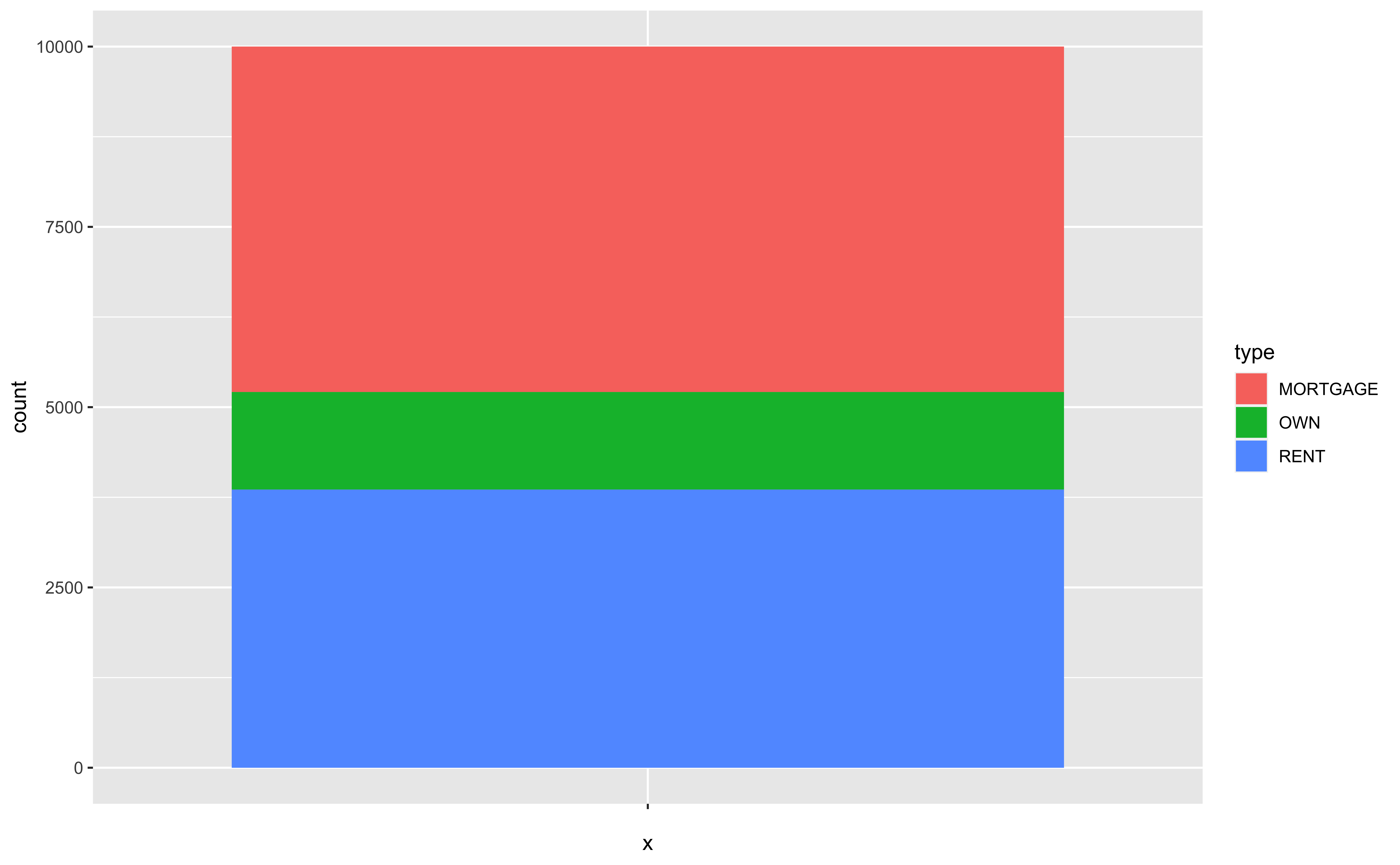
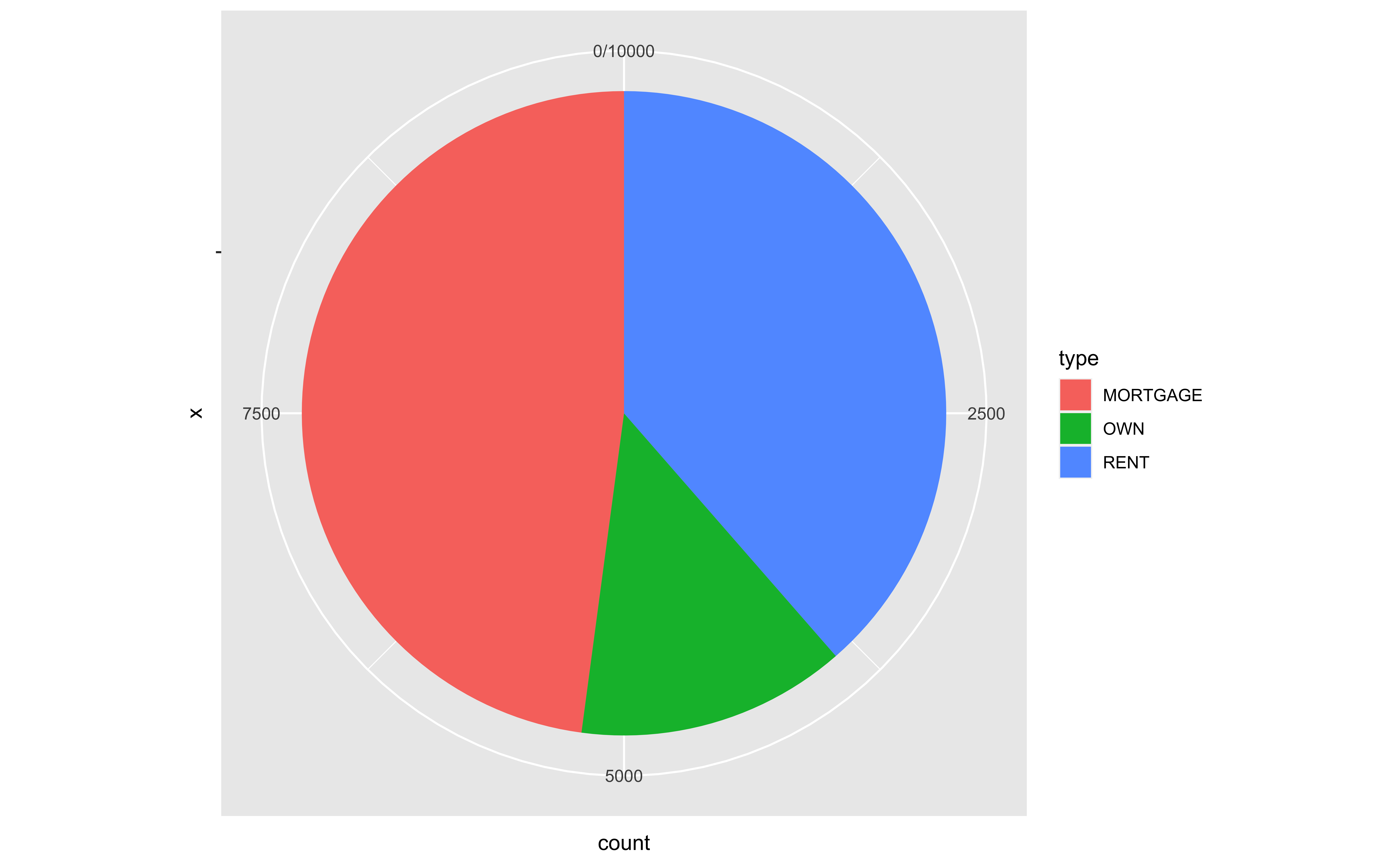
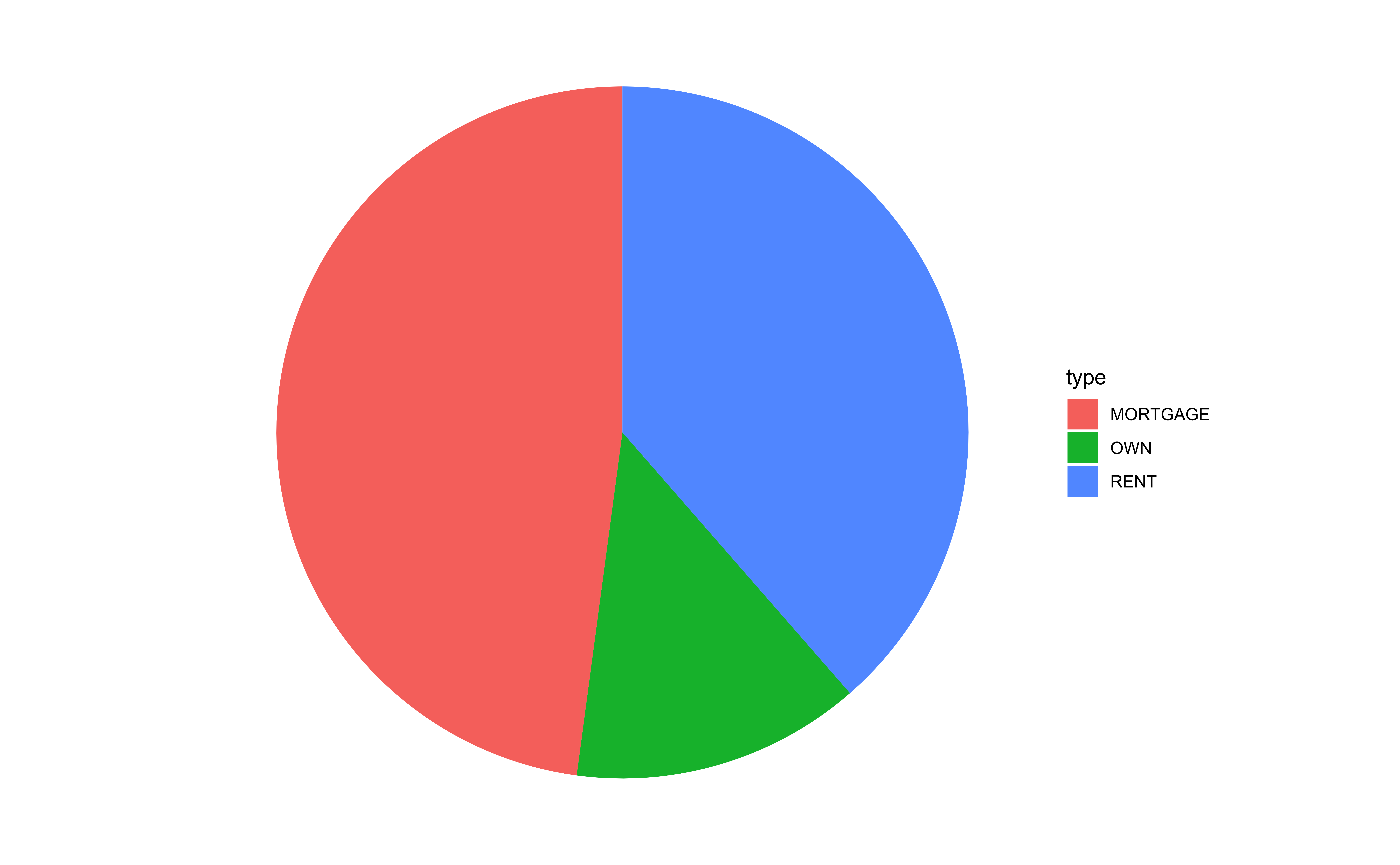
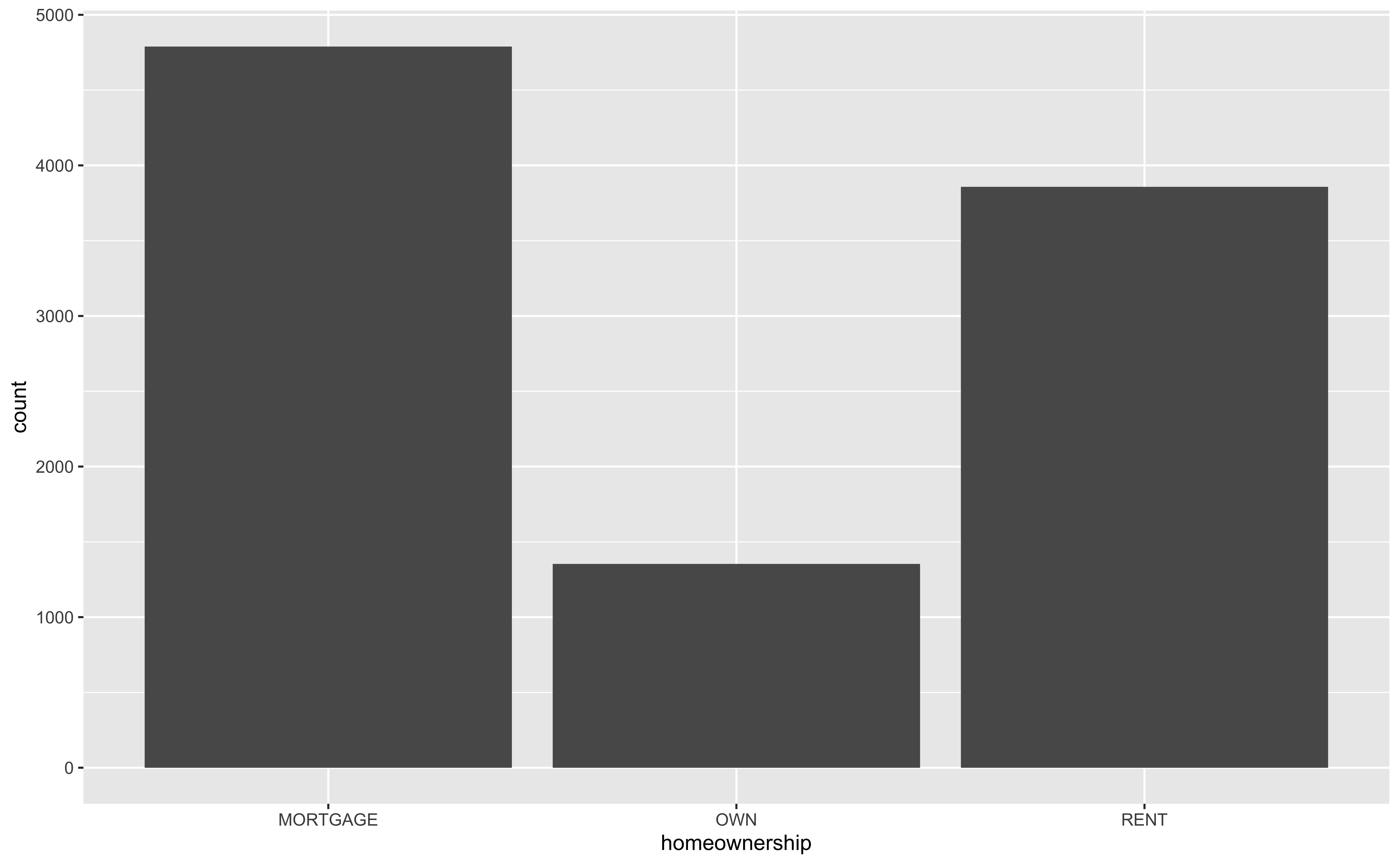
- A bar chart shows the frequency table of a categorical variable.
Stacked Bar Chart
Pie Chart
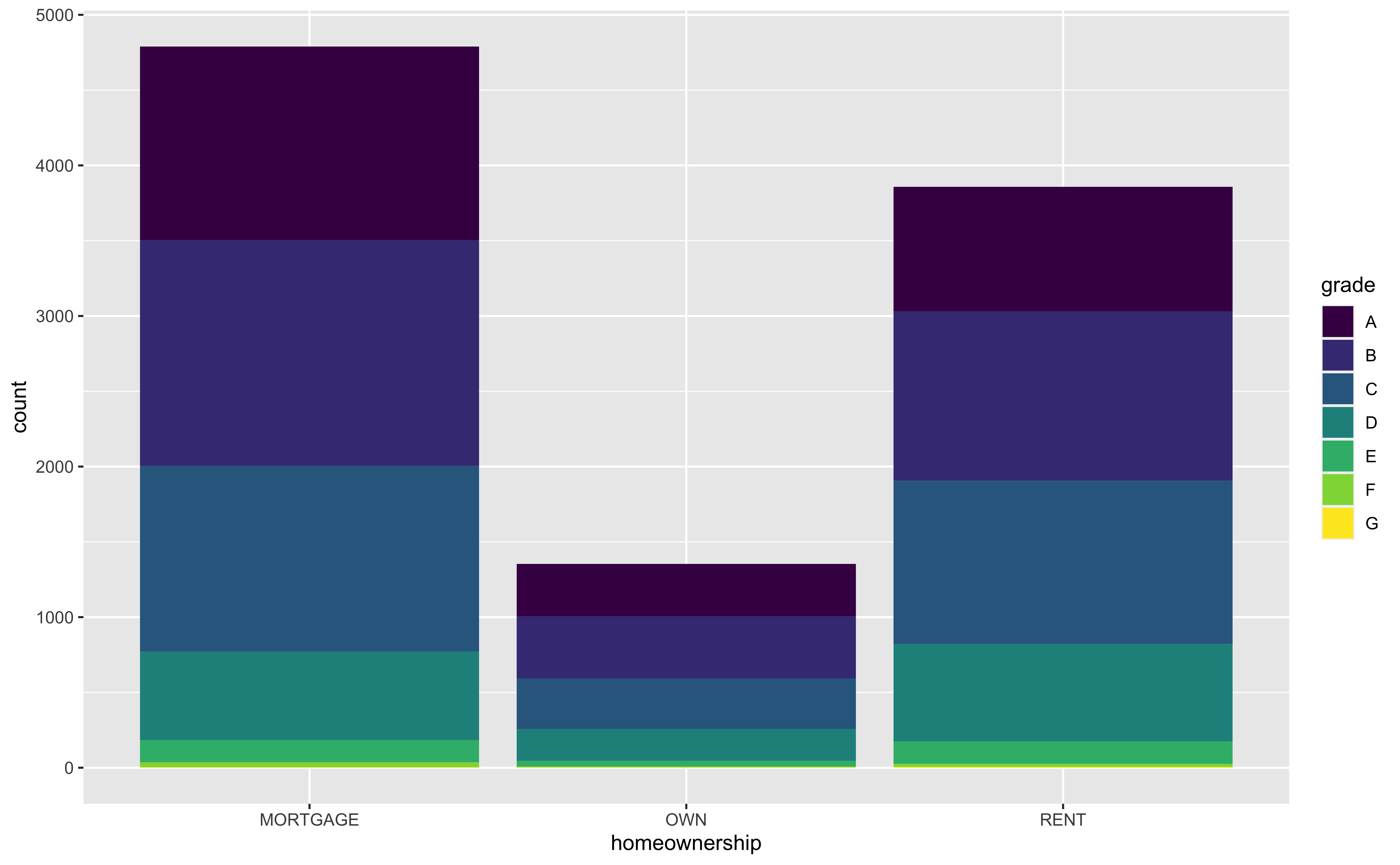
Segmented Bar Plot: Stacked
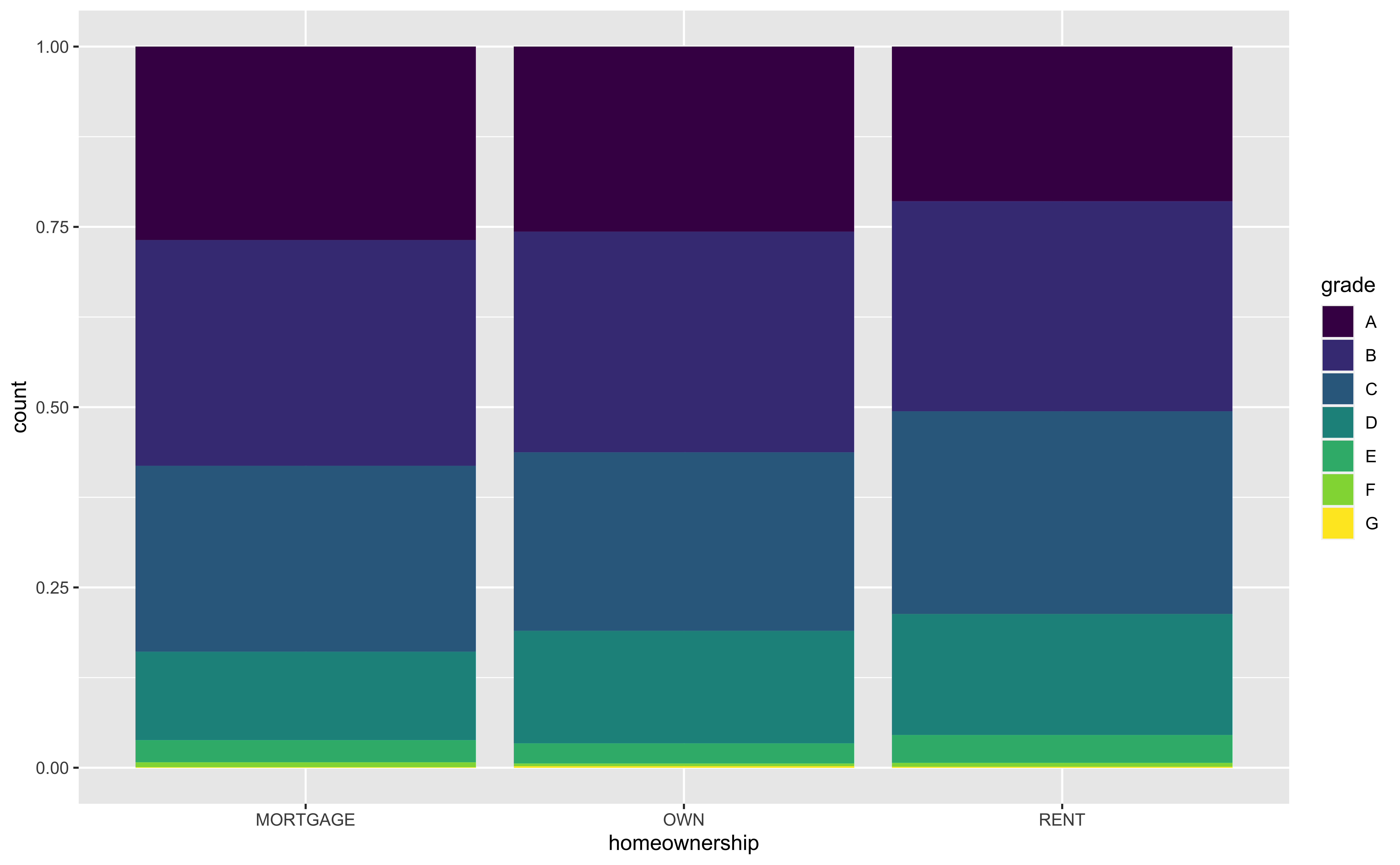
Segmented Bar Plot: Compare Proportions
-
position = "fill"makes each set of stacked bars the same height.
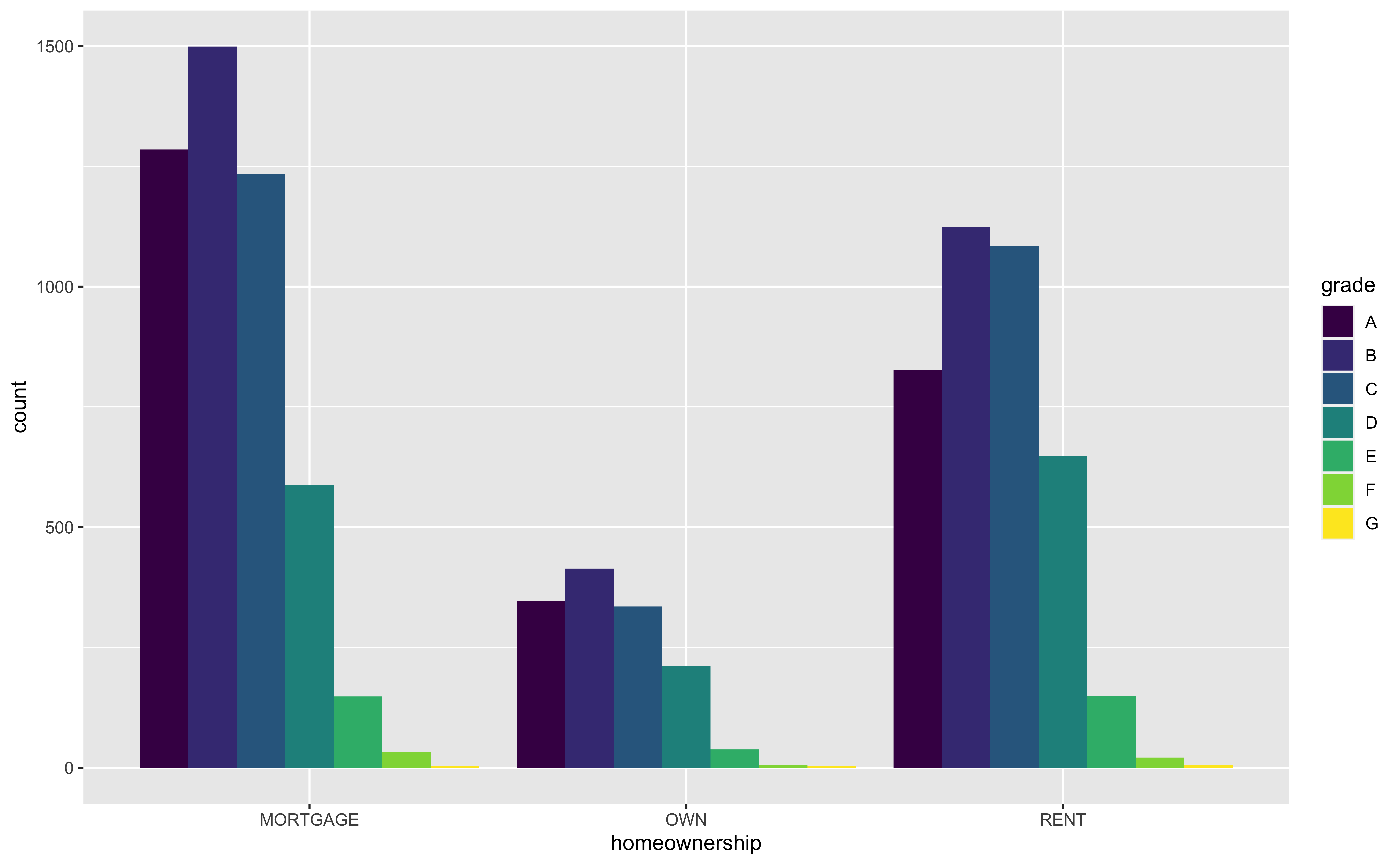
Segmented Bar Plot: Compare Individual Values
-
position = "dodge"places overlapping objects directly beside one another.
Customizing Bar Plots
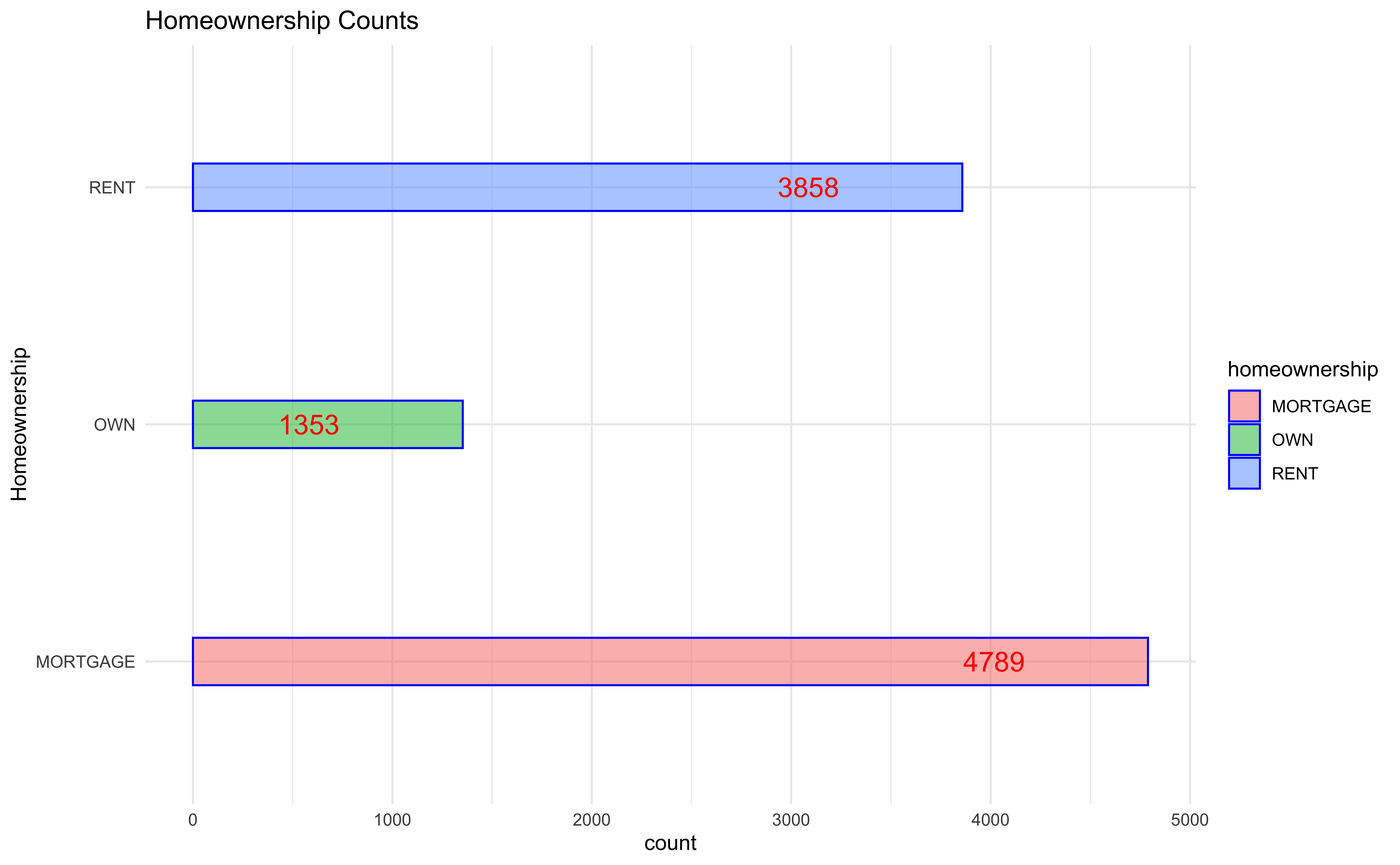
loans |>
  ggplot(
    aes(x = homeownership,
        fill = homeownership)
  ) +
  geom_bar(
    color = "blue",
    width = 0.2,
    alpha = 0.5
  ) +
  labs(
    x = "Homeownership",
    title = "Homeownership Counts"
  ) +
  geom_text(
    aes(label = after_stat(count)),
        stat = 'count',
        hjust = 3,
        color = "red",
        size = 5
  ) +
  theme_minimal() +
coord_flip() ## y = homeownershipVisualizing Numerical Data
Histogram
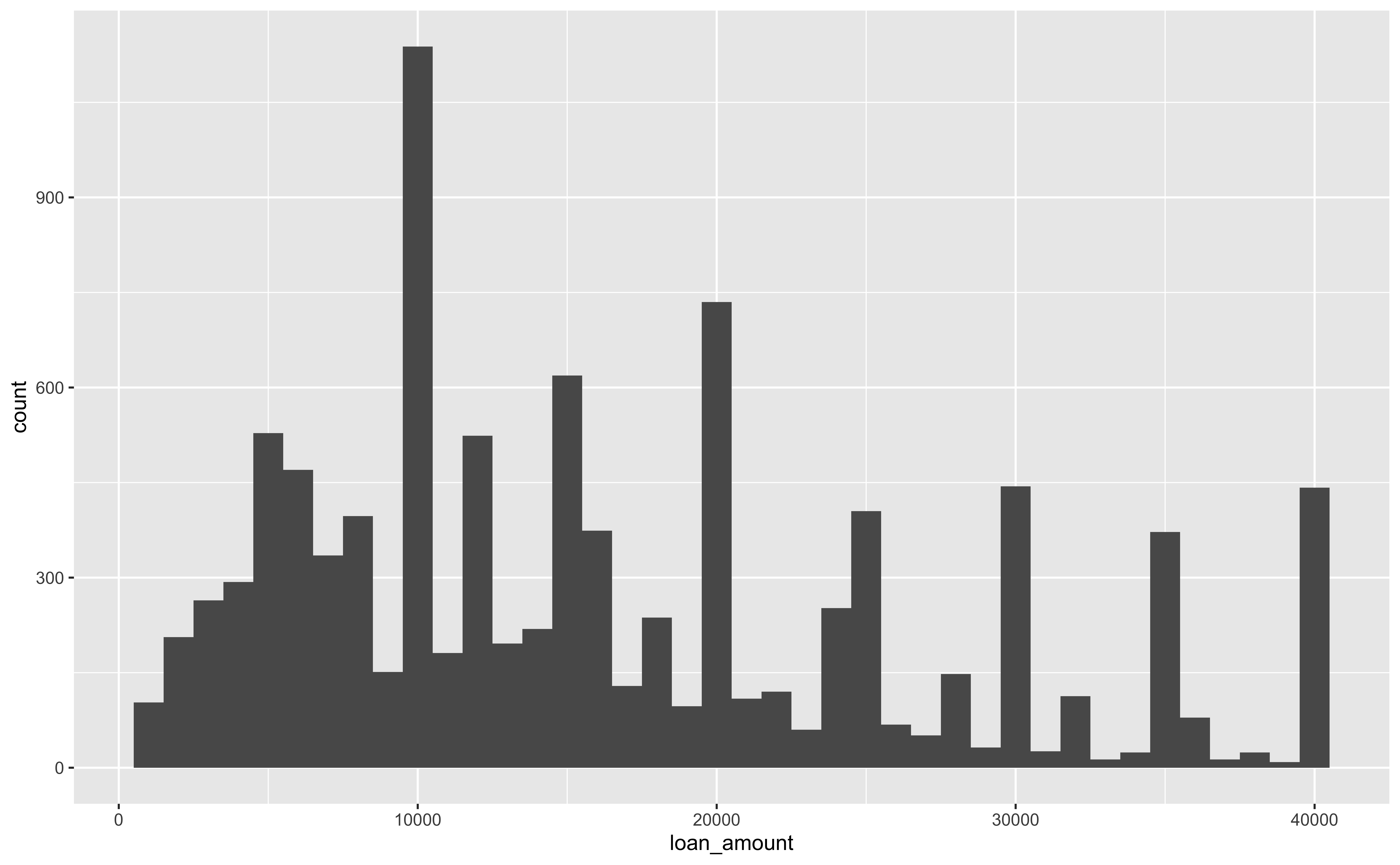
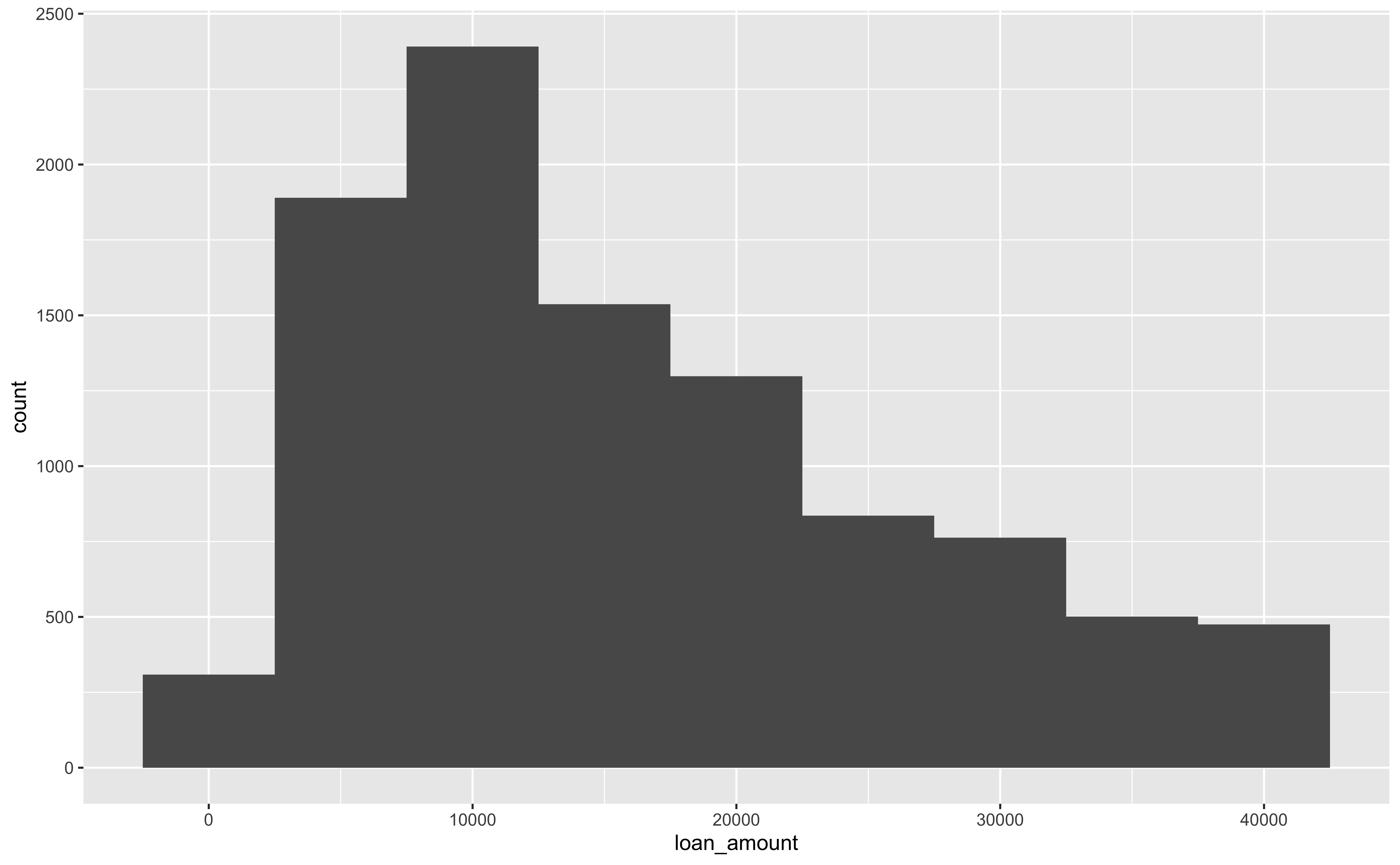
`stat_bin()` using `bins = 30`. Pick better value with `binwidth`.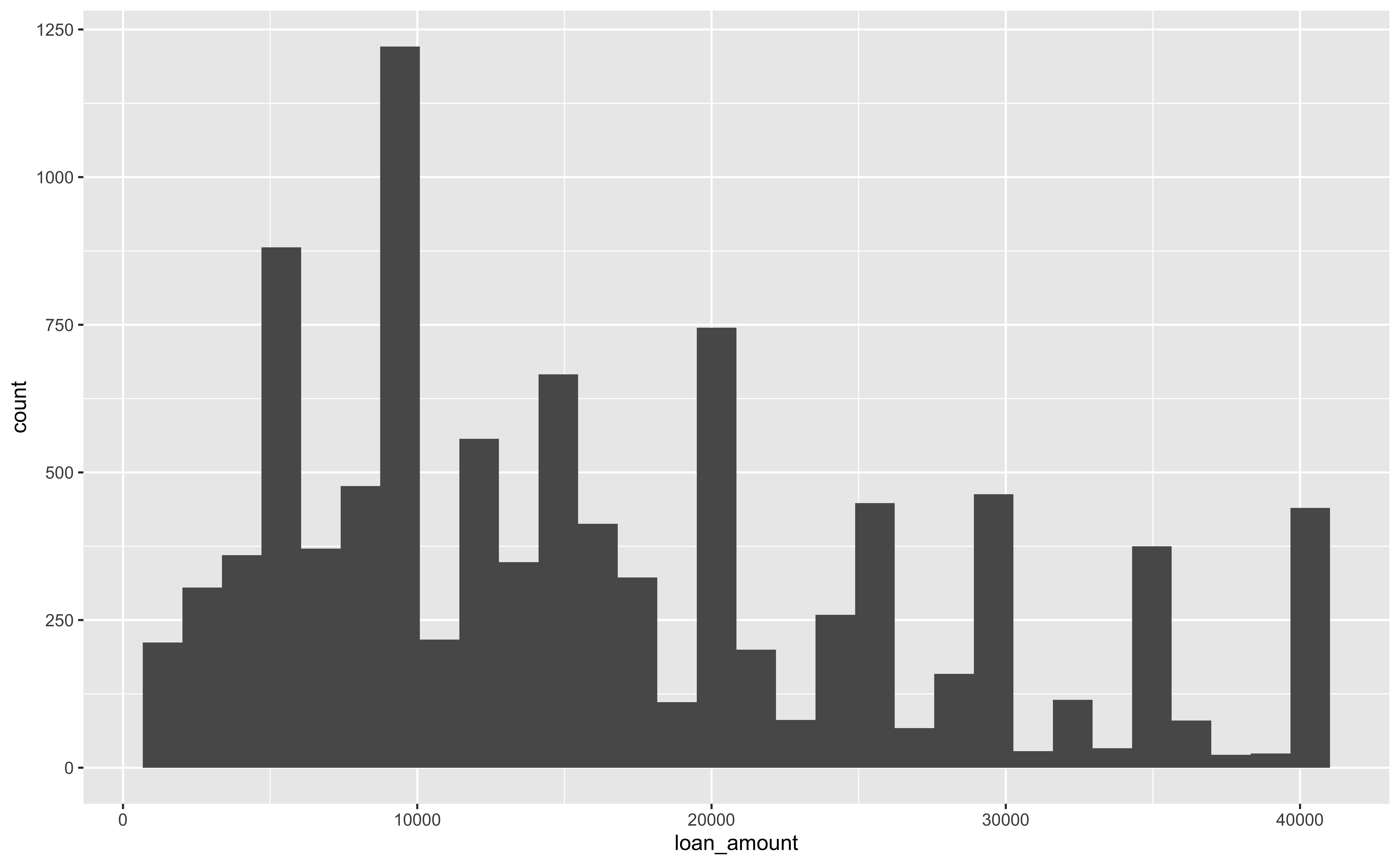
Customizing Histograms
Fill with a Categorical Variable: Stack
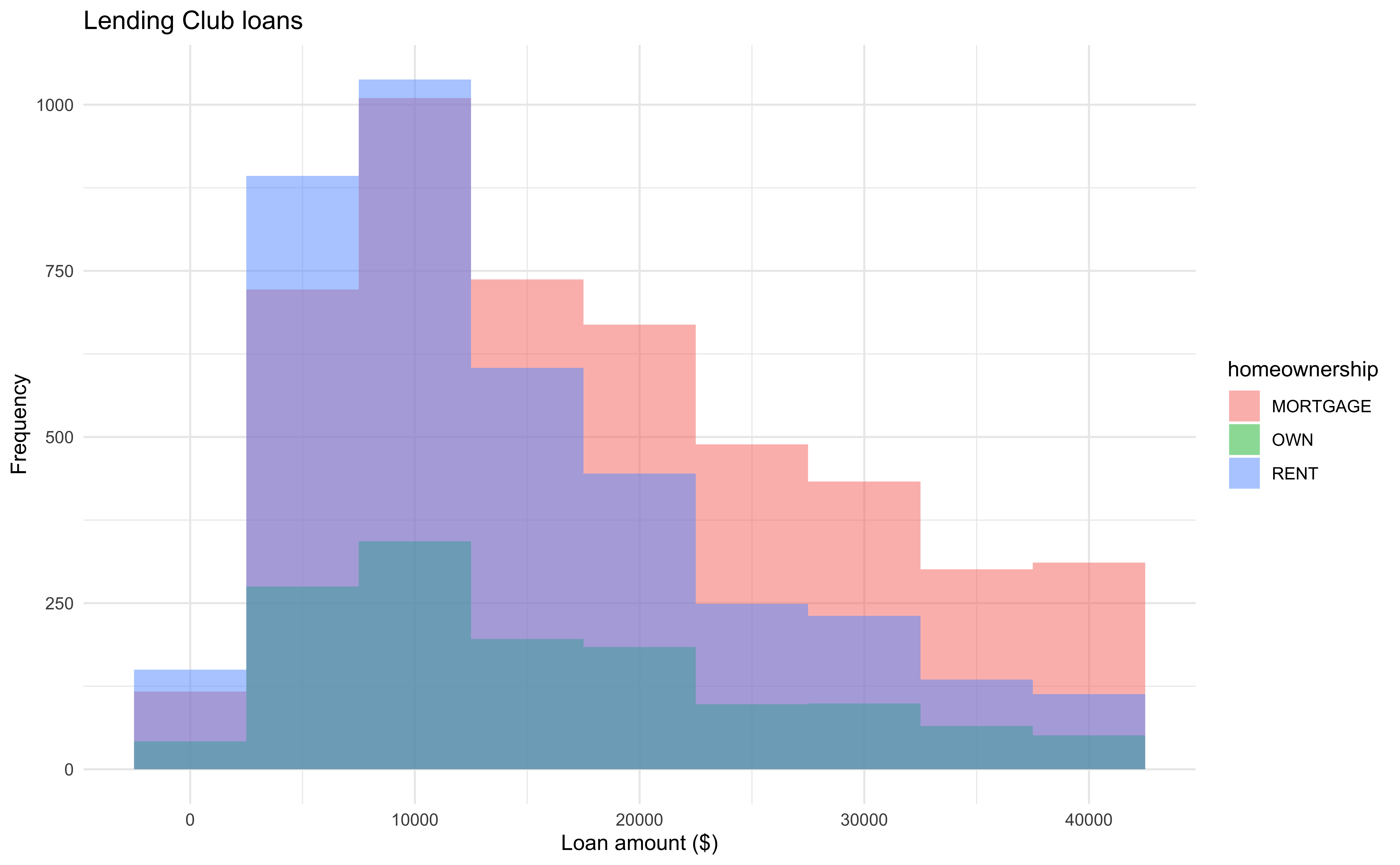
Fill with a Categorical Variable: Identity (bad)
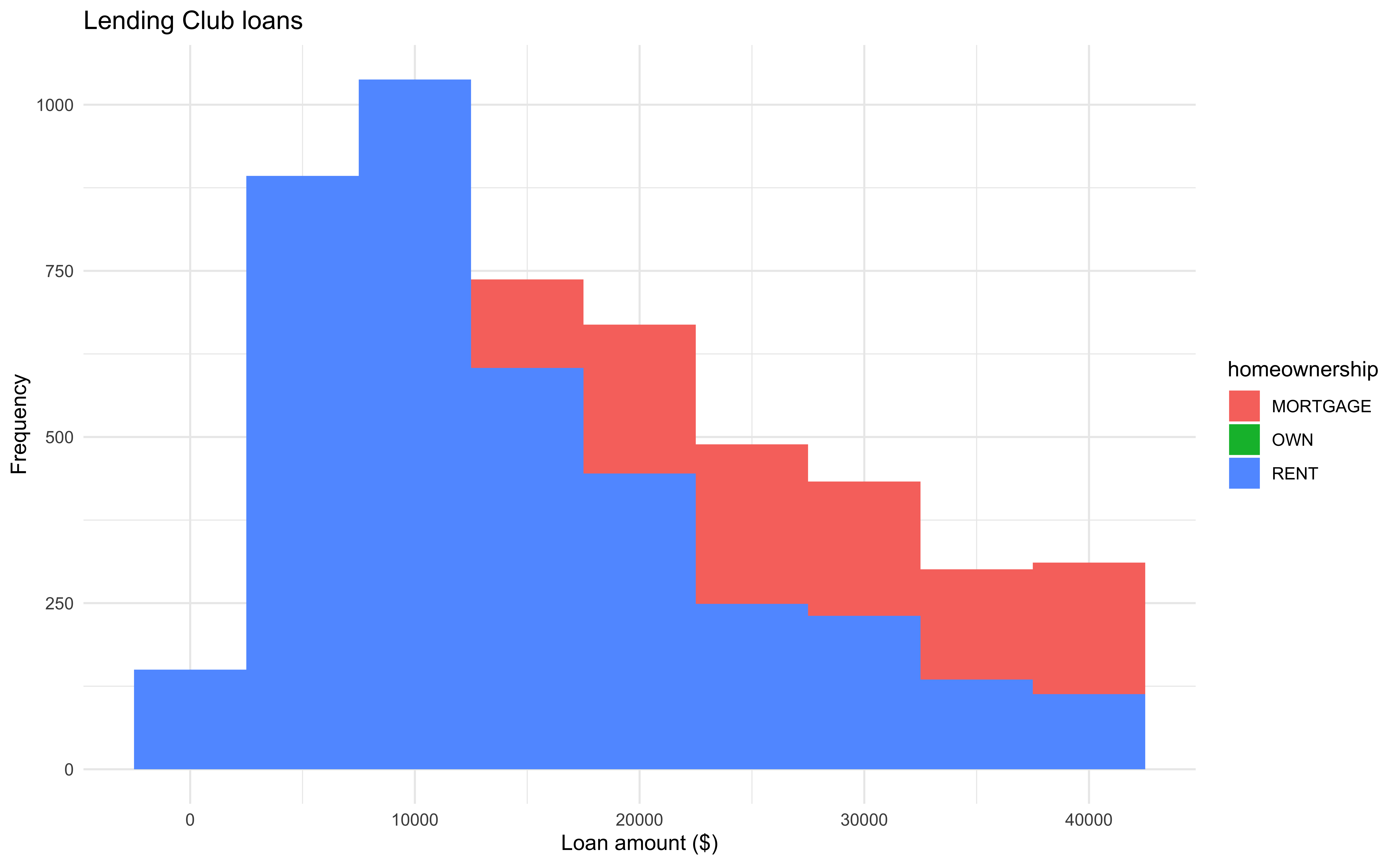
Why such plot is bad?
Fill with a Categorical Variable: Identity
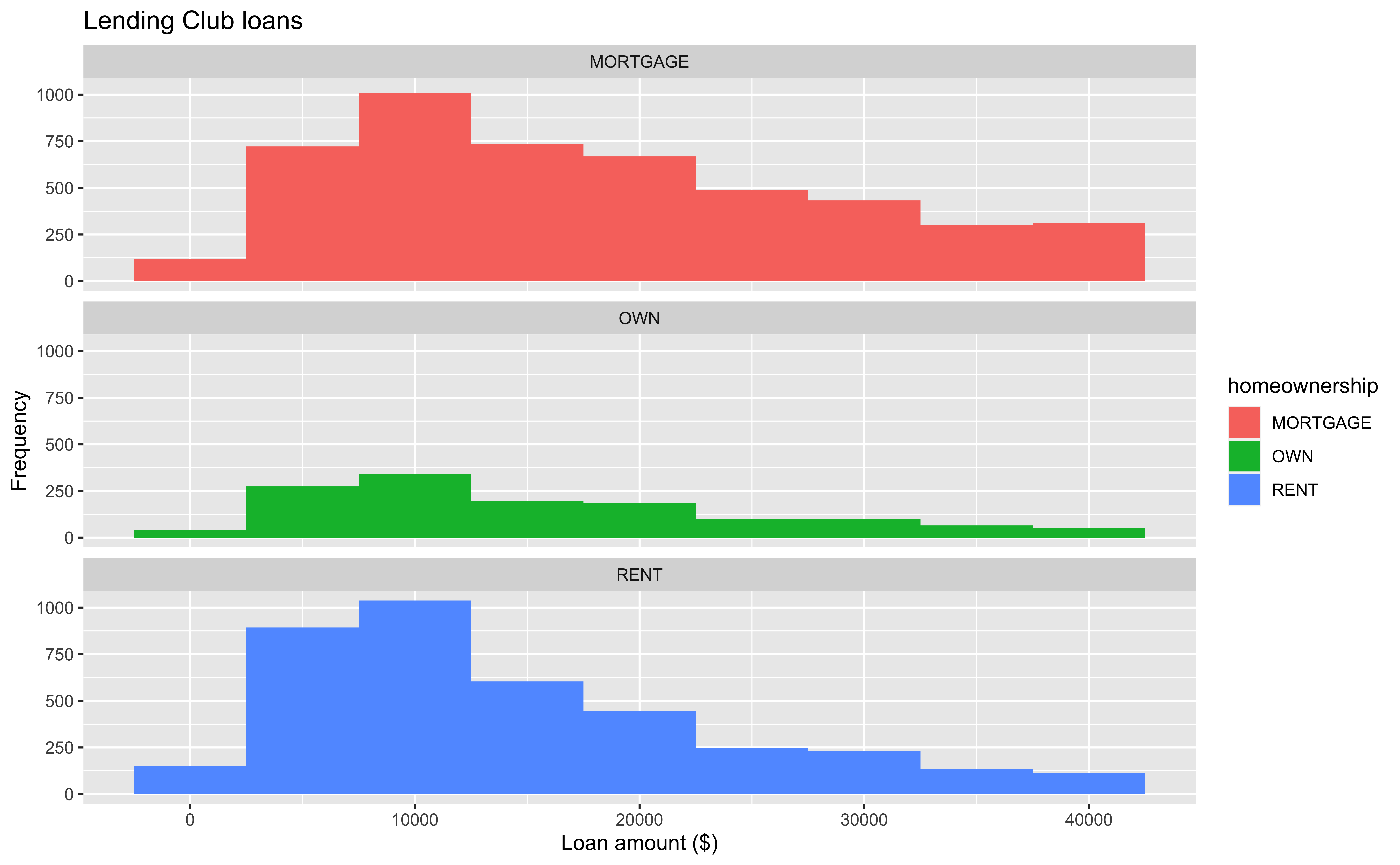
Facet with a Categorical Variable
13-Visualization
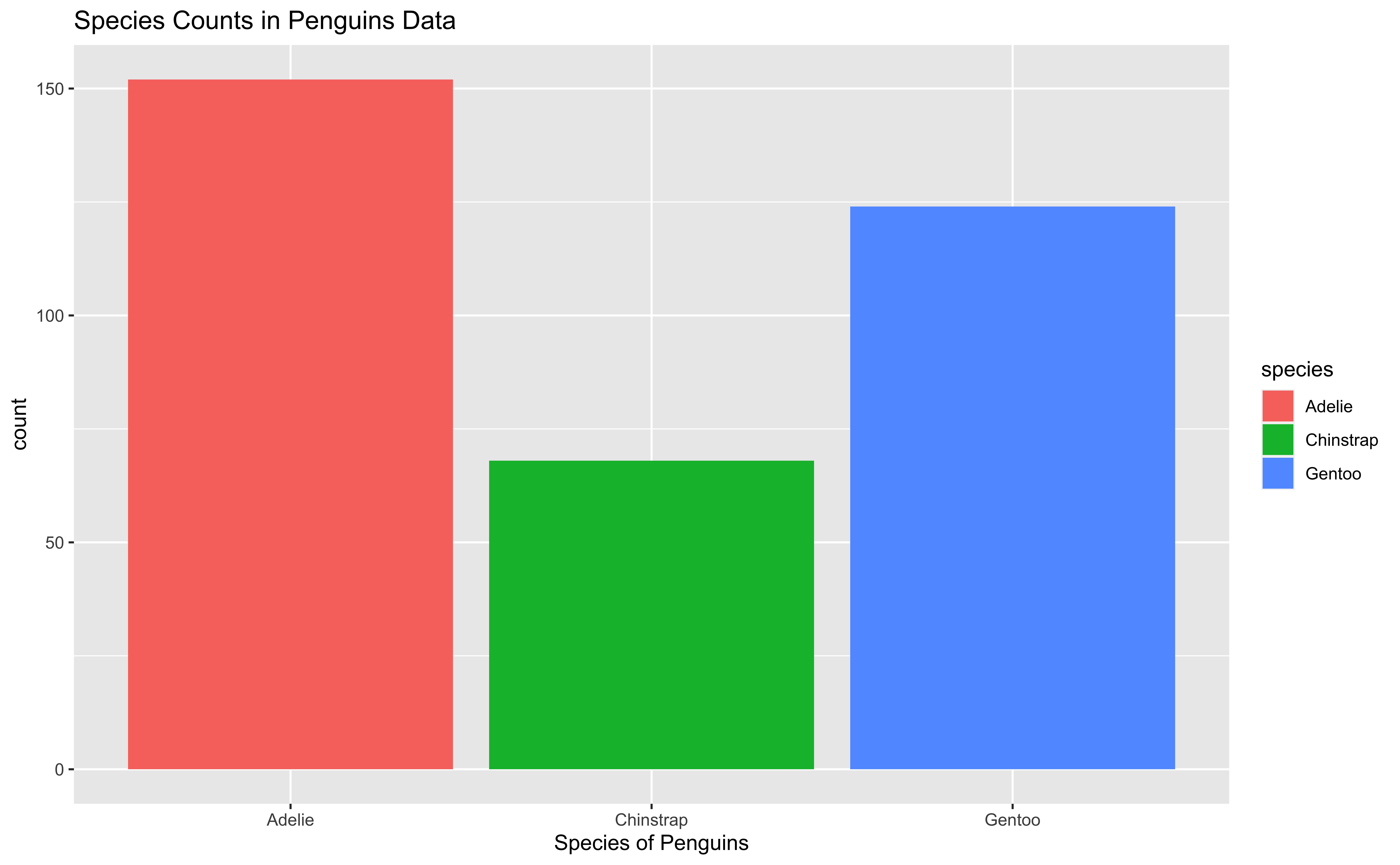
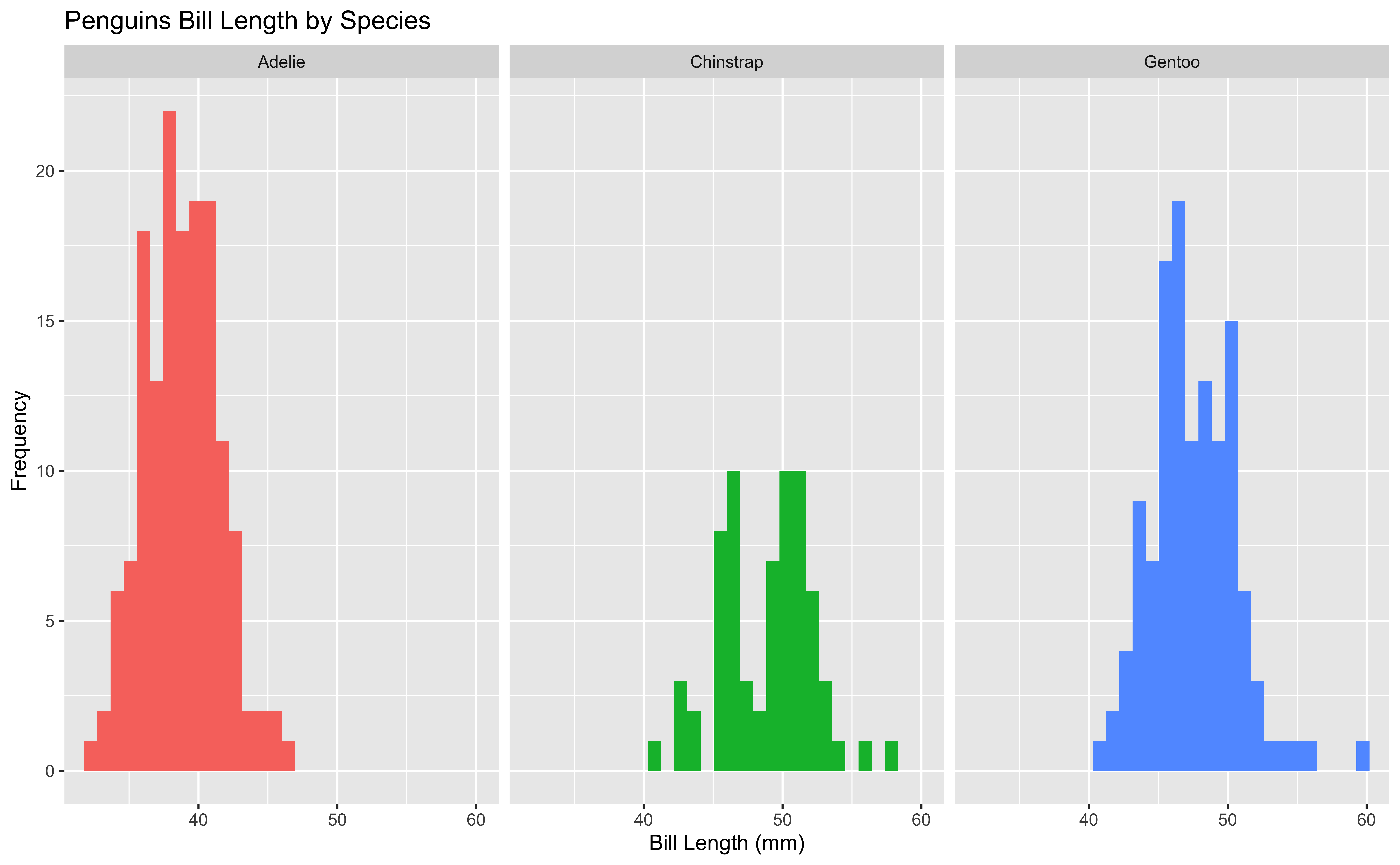
In lab.qmd ## Lab 13 section,
Import the data penguins.csv.
Generate the following
Density Plot
-
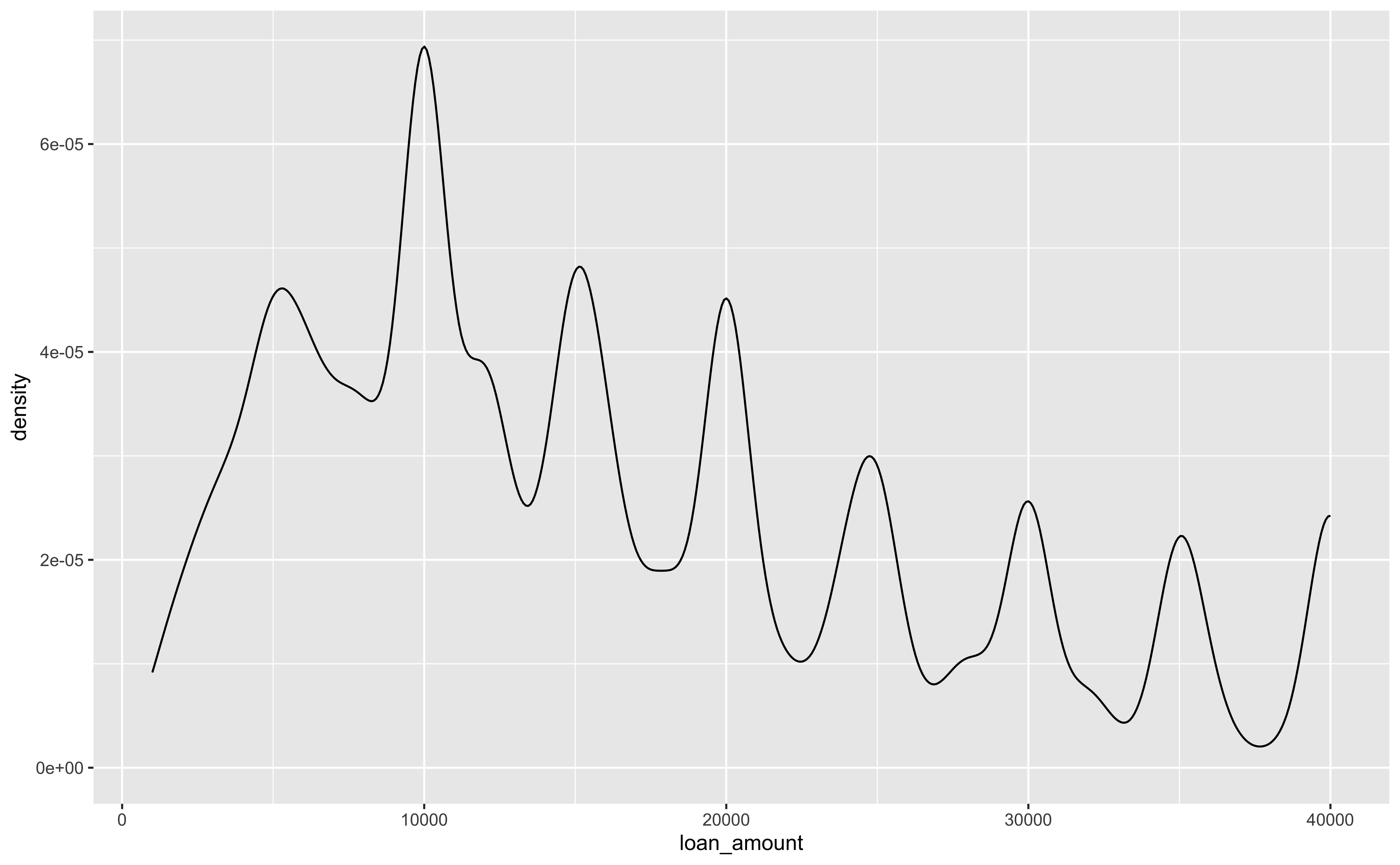
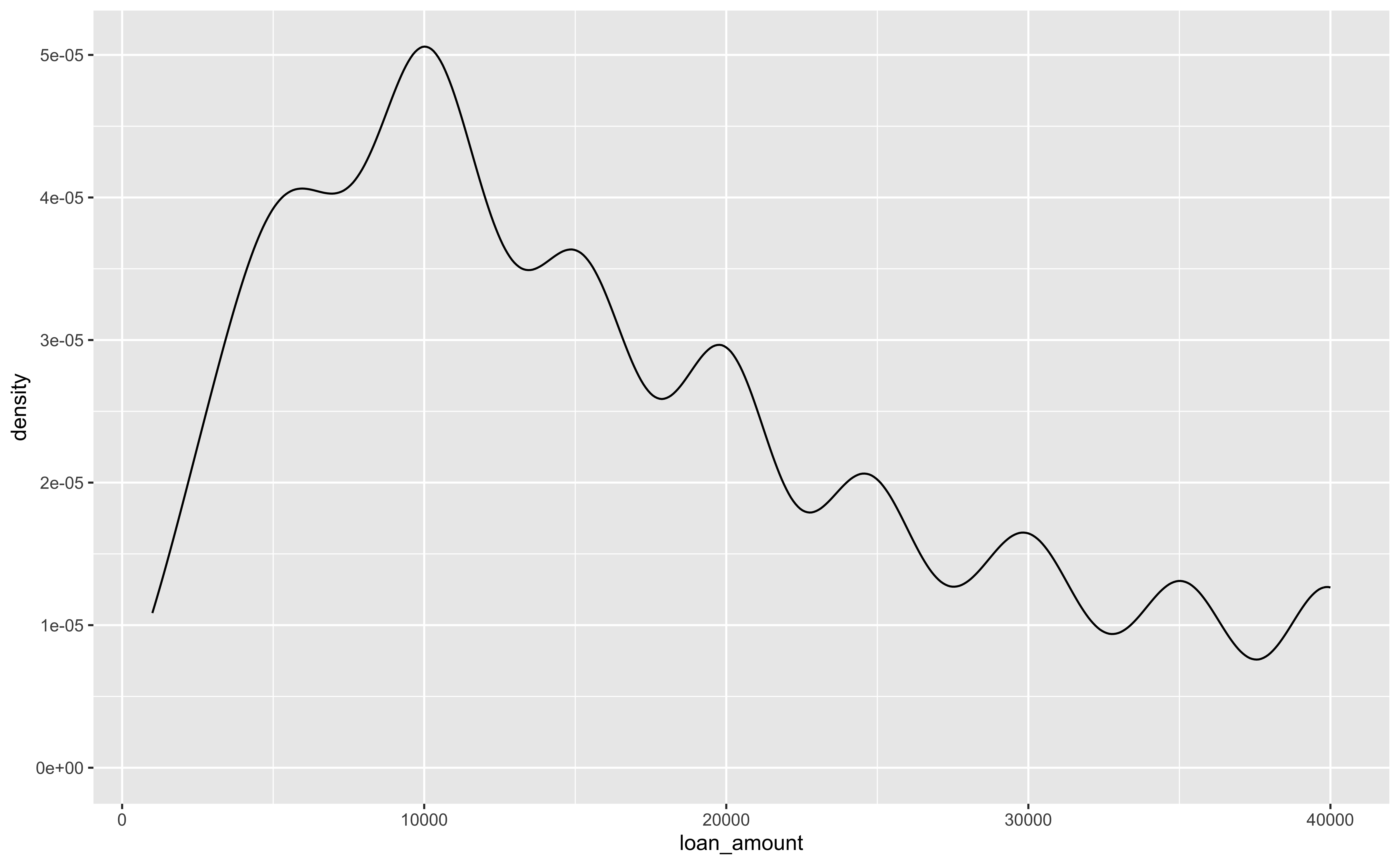
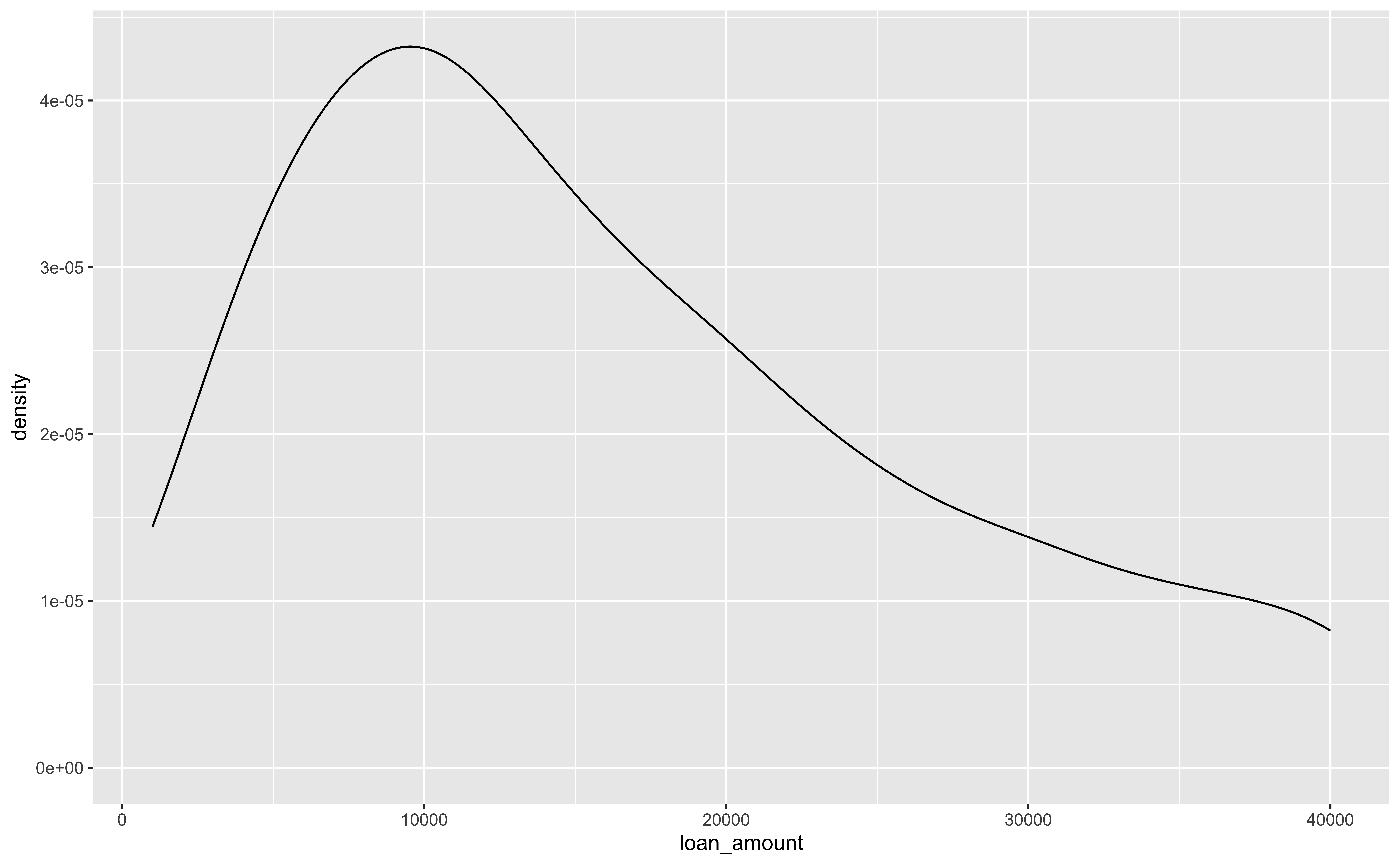
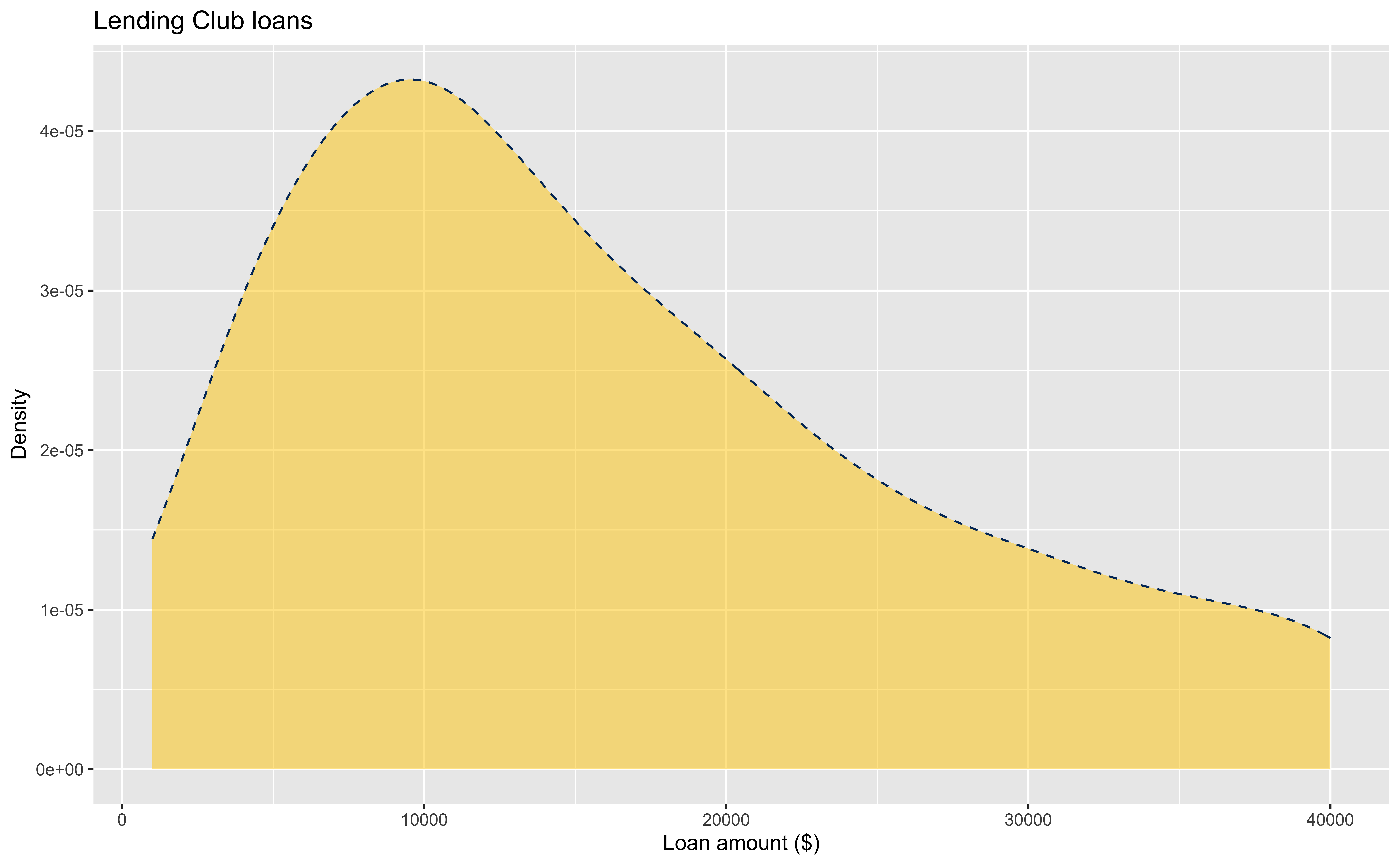
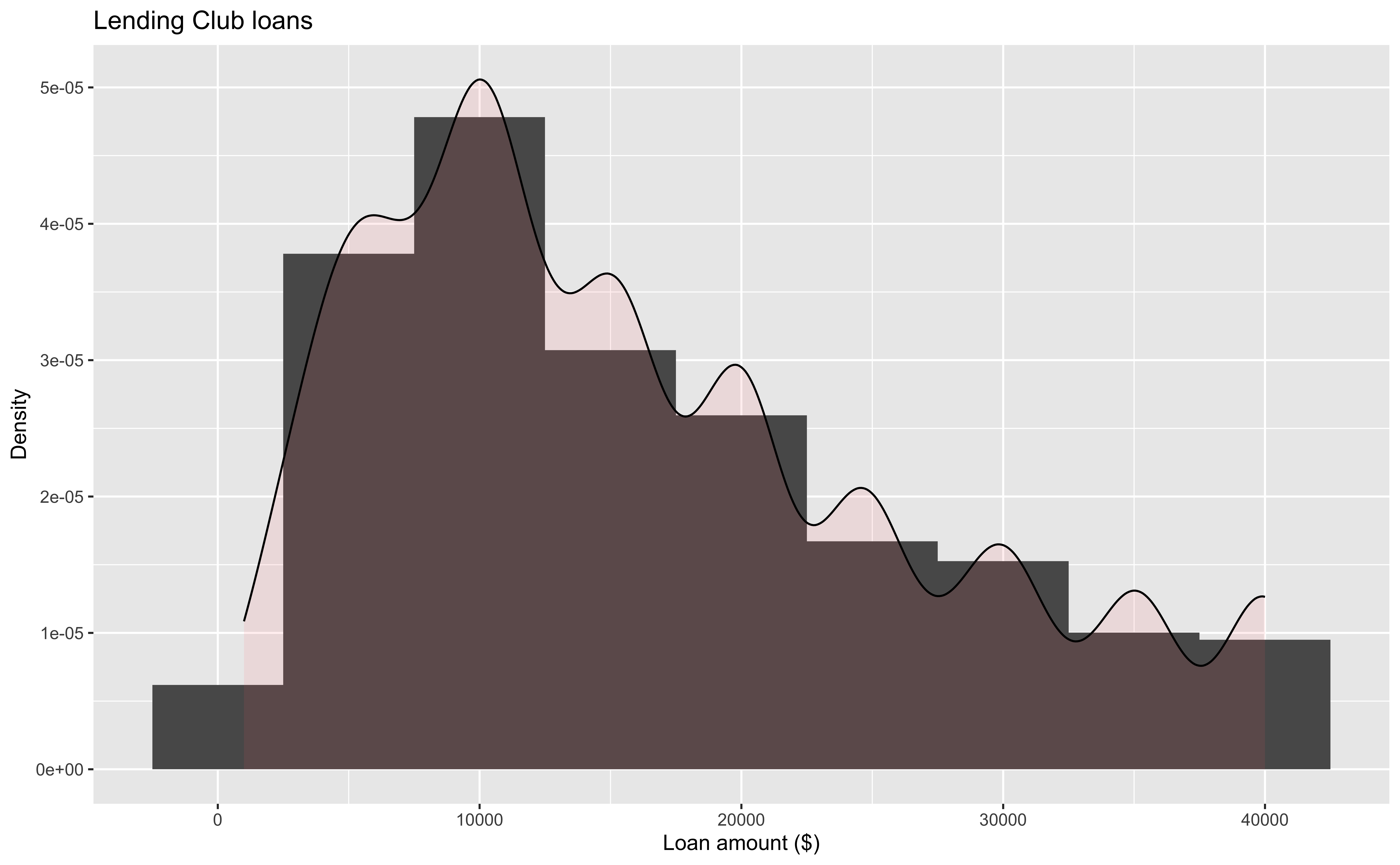
geom_density()uses kernel density estimation to smooth the histogram or our data. (MATH 4750 Statistical Computing)

Density Plots and Adjusting Bandwidth
Customizing Density Plots
Density Curve on a Histogram
Adding a Categorical Variable to Density Plots
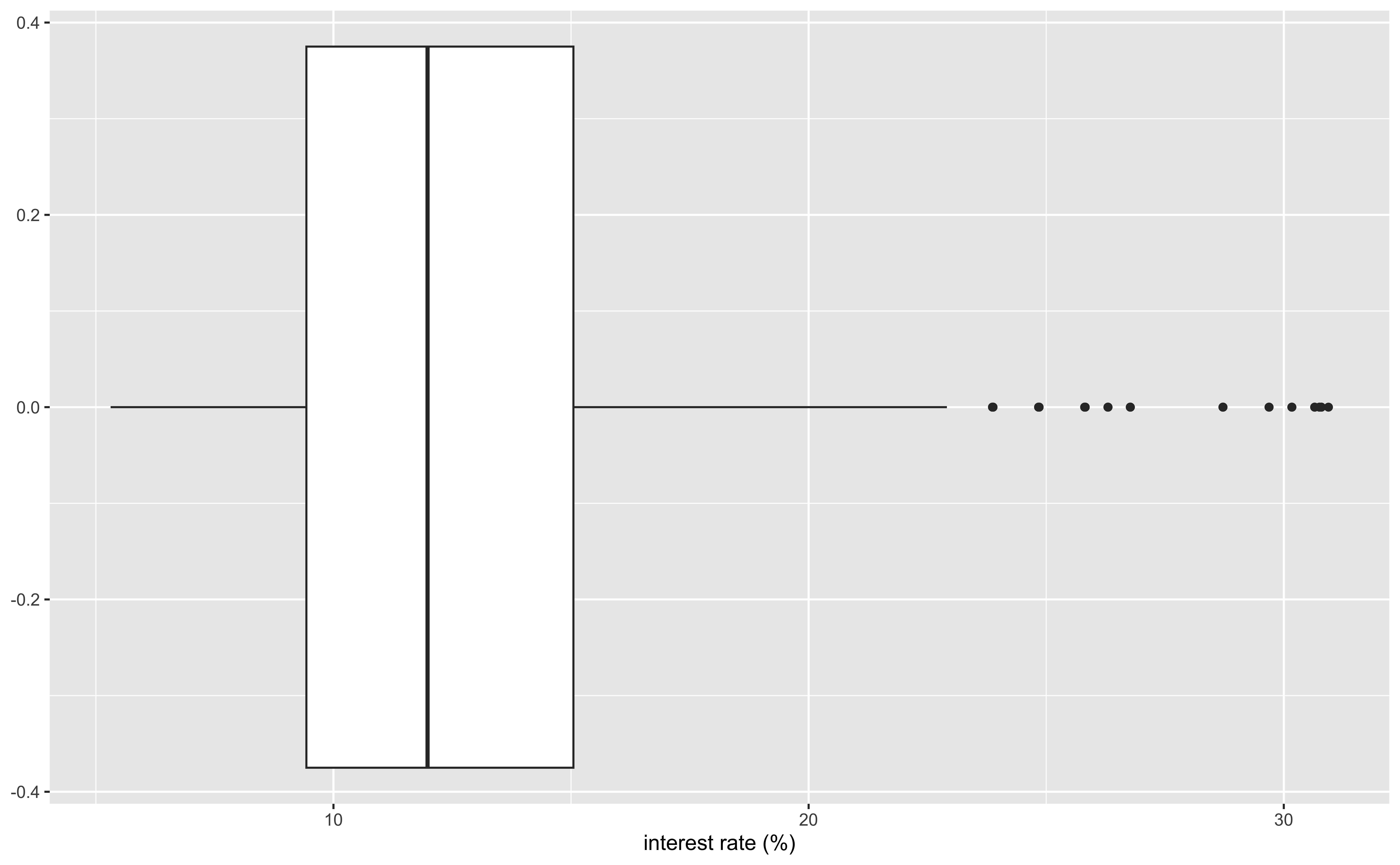
Box Plot
Customizing Box Plots
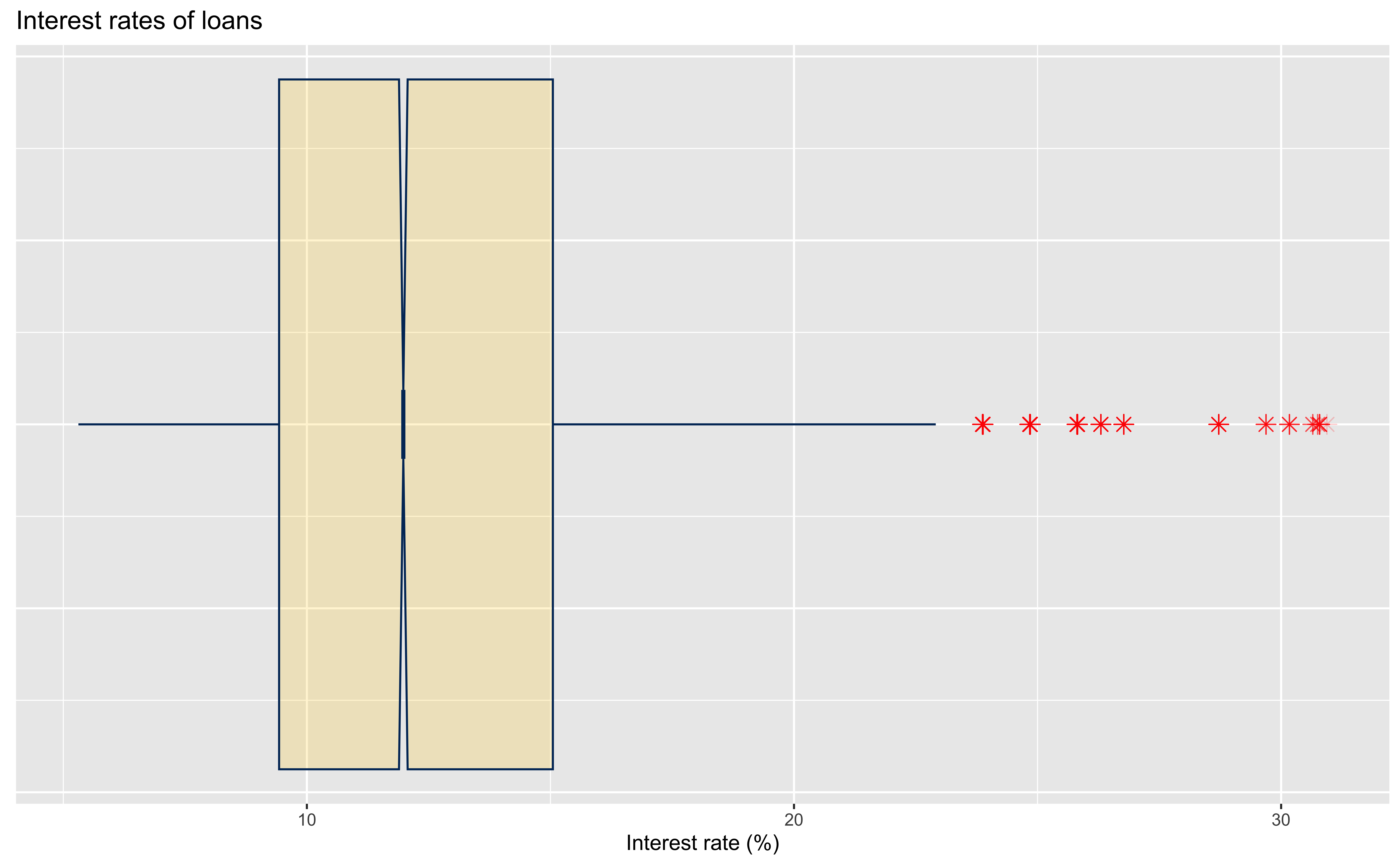
loans |>
  ggplot(aes(x = interest_rate)) +
  geom_boxplot(
    # custom outliers
    outlier.colour = "red",
    outlier.shape = 8,
    outlier.size = 3,
    # Notch?
    notch = TRUE,
    notchwidth = 0.1,
    # custom boxes
    fill = "#FFCC00",
    colour = "#003366",
    alpha = 0.2
  ) +
  labs(
    x = "Interest rate (%)",
    title = "Interest rates of loans"
  ) +
  theme(
    axis.ticks.y = element_blank(),
    axis.text.y = element_blank()
)Adding a Categorical Variable to Box Plots
Adding Two Categorical Variables to Box Plots
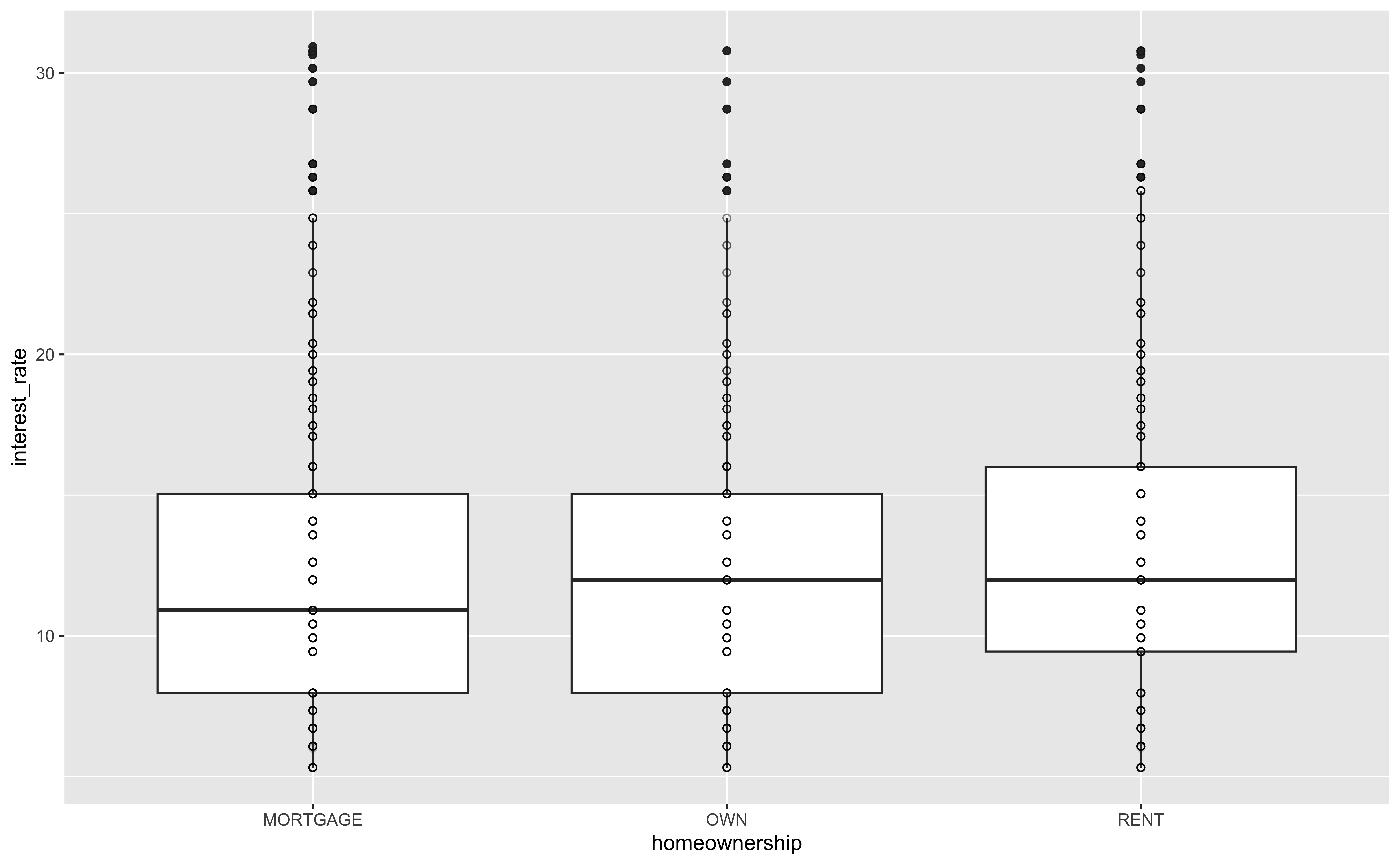
Adding Points on Box Plots
Relationships between numerical variables
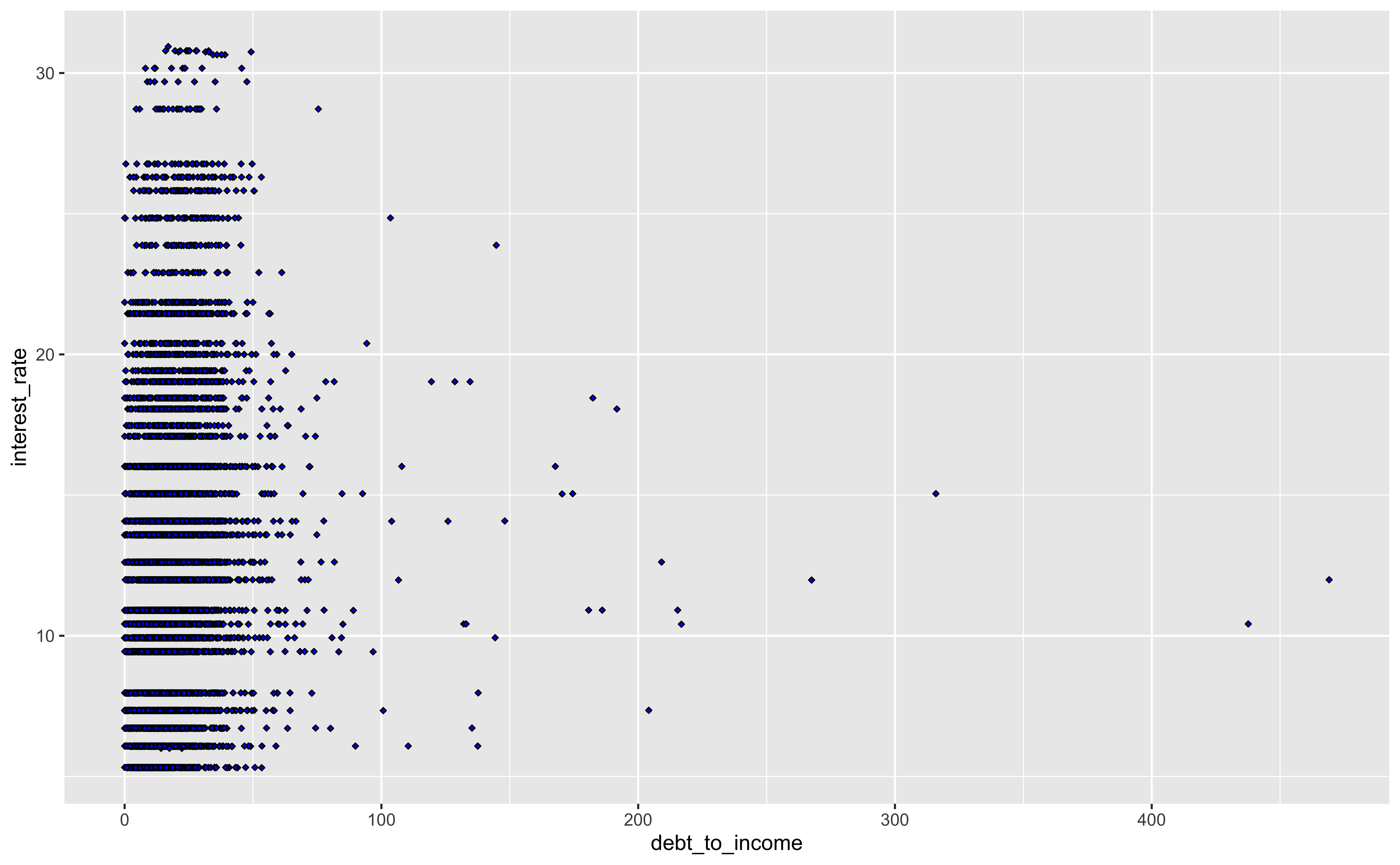
Scatterplot
Hex Plot

Hex Plot Zoom-in

Other Plots
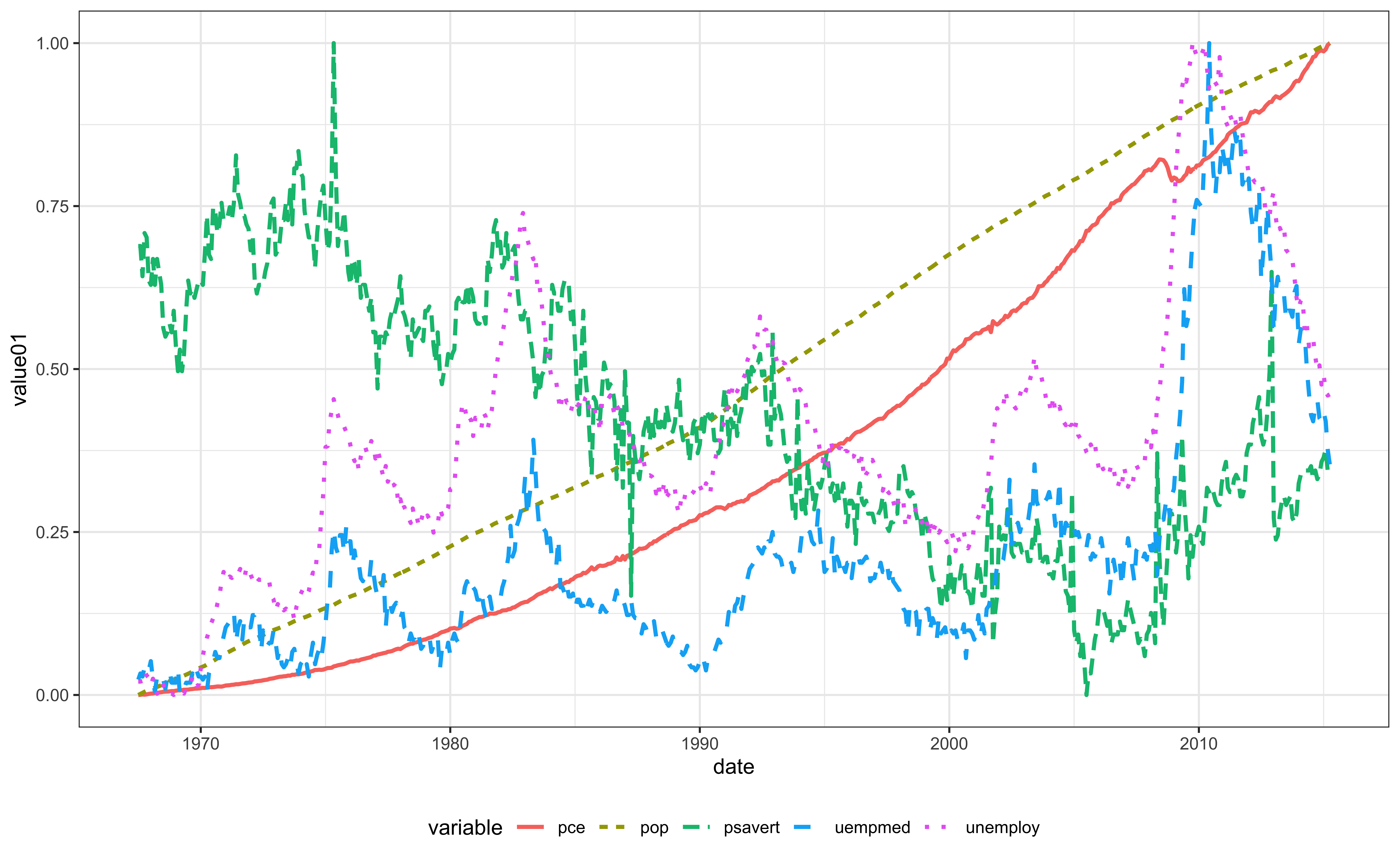
Line Chart for Time Series ggplot2::geom_line()
QQ-plots
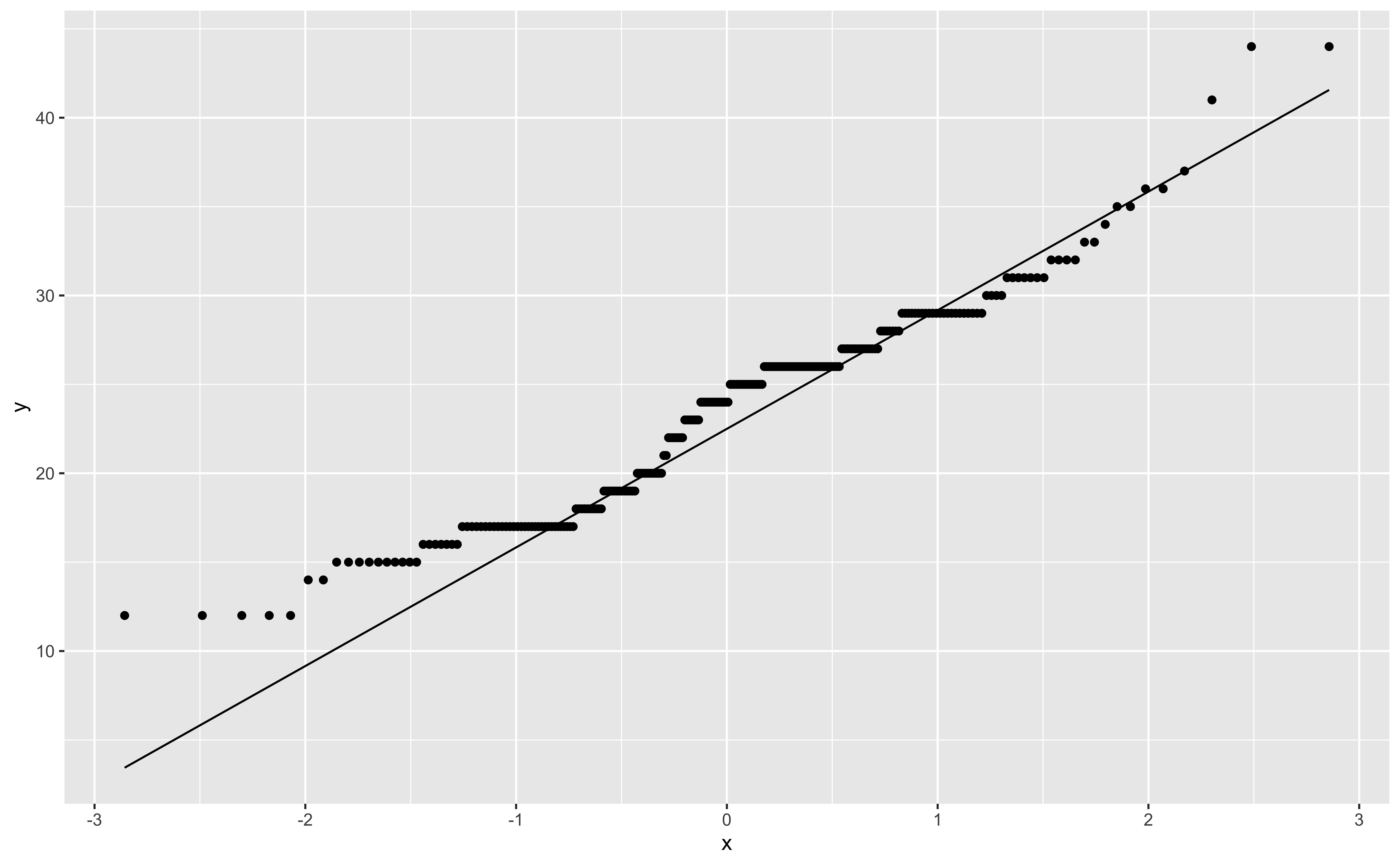
- Quantile-Quantile plots are used to check if data are normally distributed (or follow any distribution).
Violin Plots
- Violin plots are similar to box plots, but show the smooth density of the data.
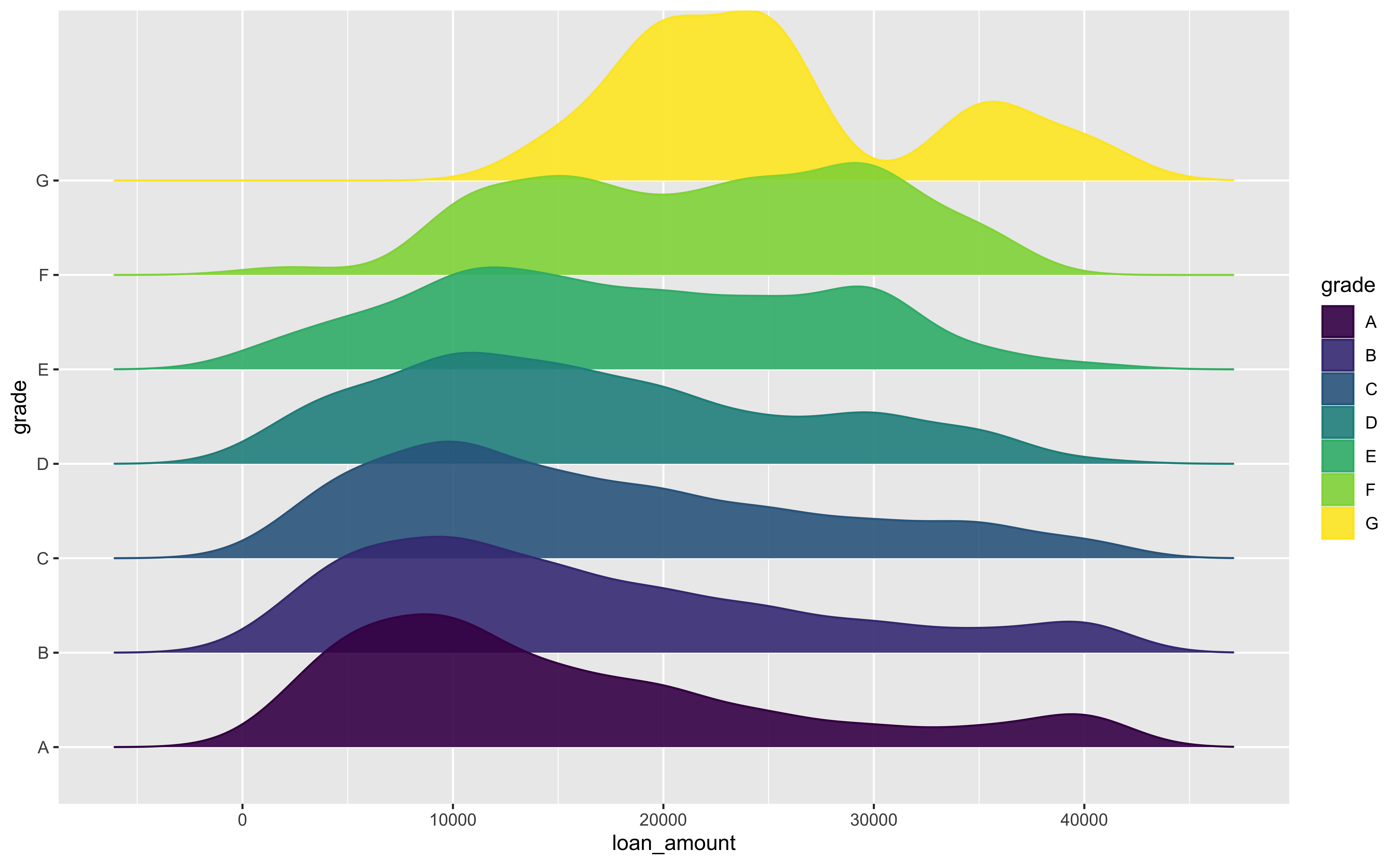
Add-on 📦: ggridges for Ridge Plots
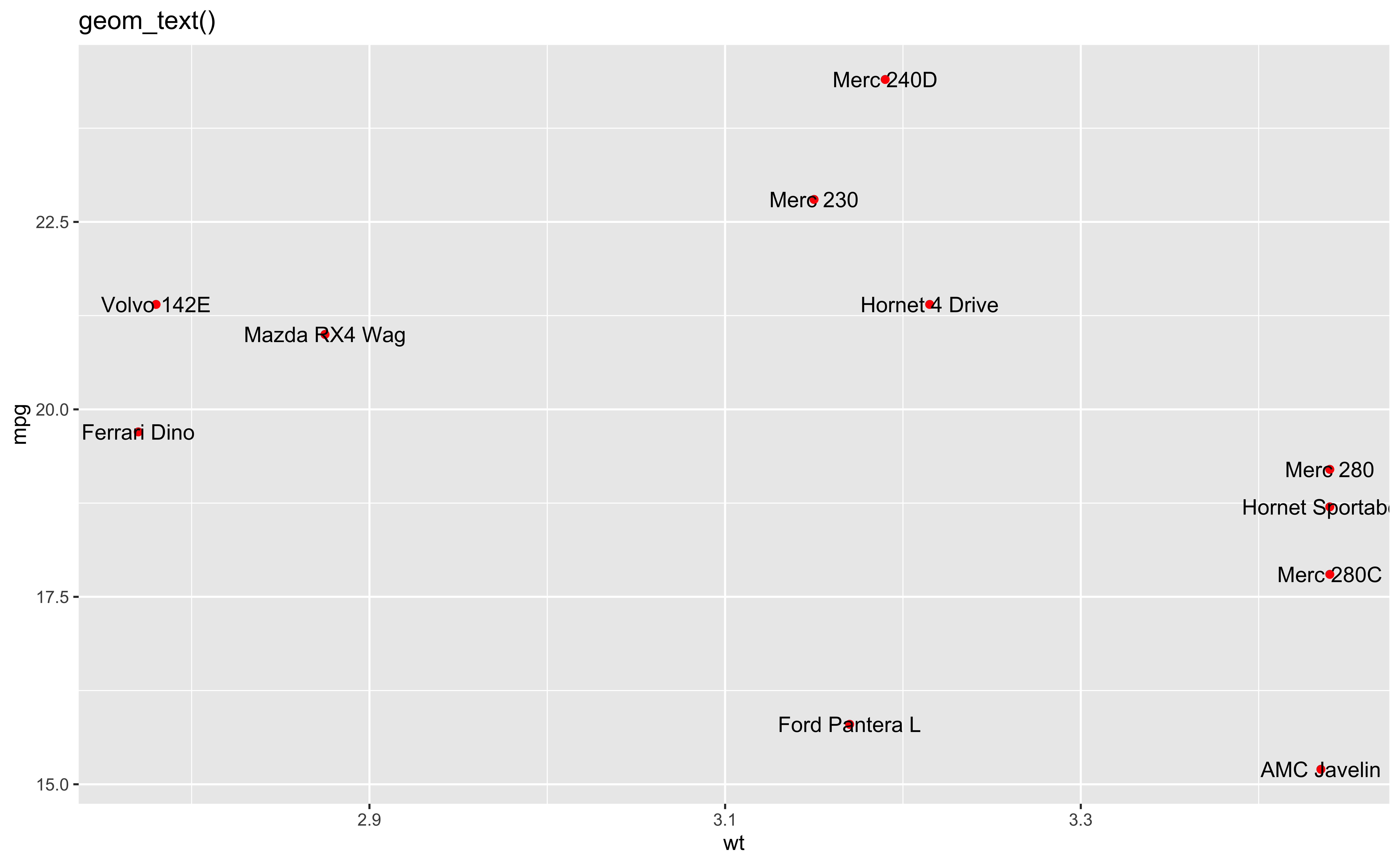
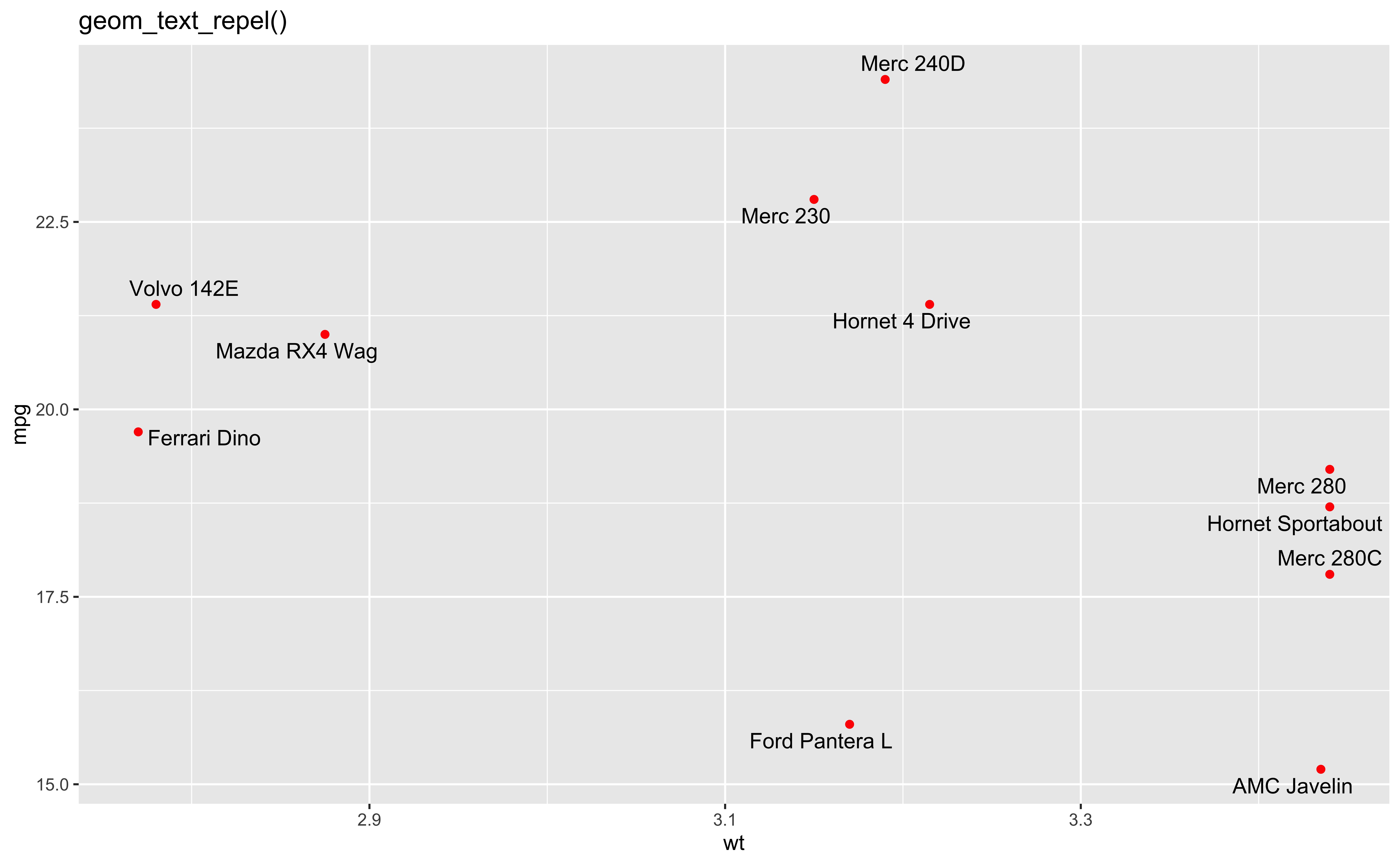
Add-on 📦: ggrepel ![]()
- ggrepel provides geoms for ggplot2 to repel overlapping text labels.
Wordcloud from ggwordcloud Package ![]()

library(ggwordcloud)
library(showtext)
where <- font_files()[which(str_detect(font_files()$family, "Arial Unicode MS")), ]
thankyou_words_small |> ggplot(aes(label = word, size = speakers, color = name)) +
    geom_text_wordcloud(area_corr = TRUE, rm_outside = TRUE,
                        family = where[1, ]$family) +
    scale_size_area(max_size = 24) +
    theme_minimal() +
    theme(plot.margin = margin(t = 0,  # Top margin
                               r = 0,  # Right margin
                               b = 0,  # Bottom margin
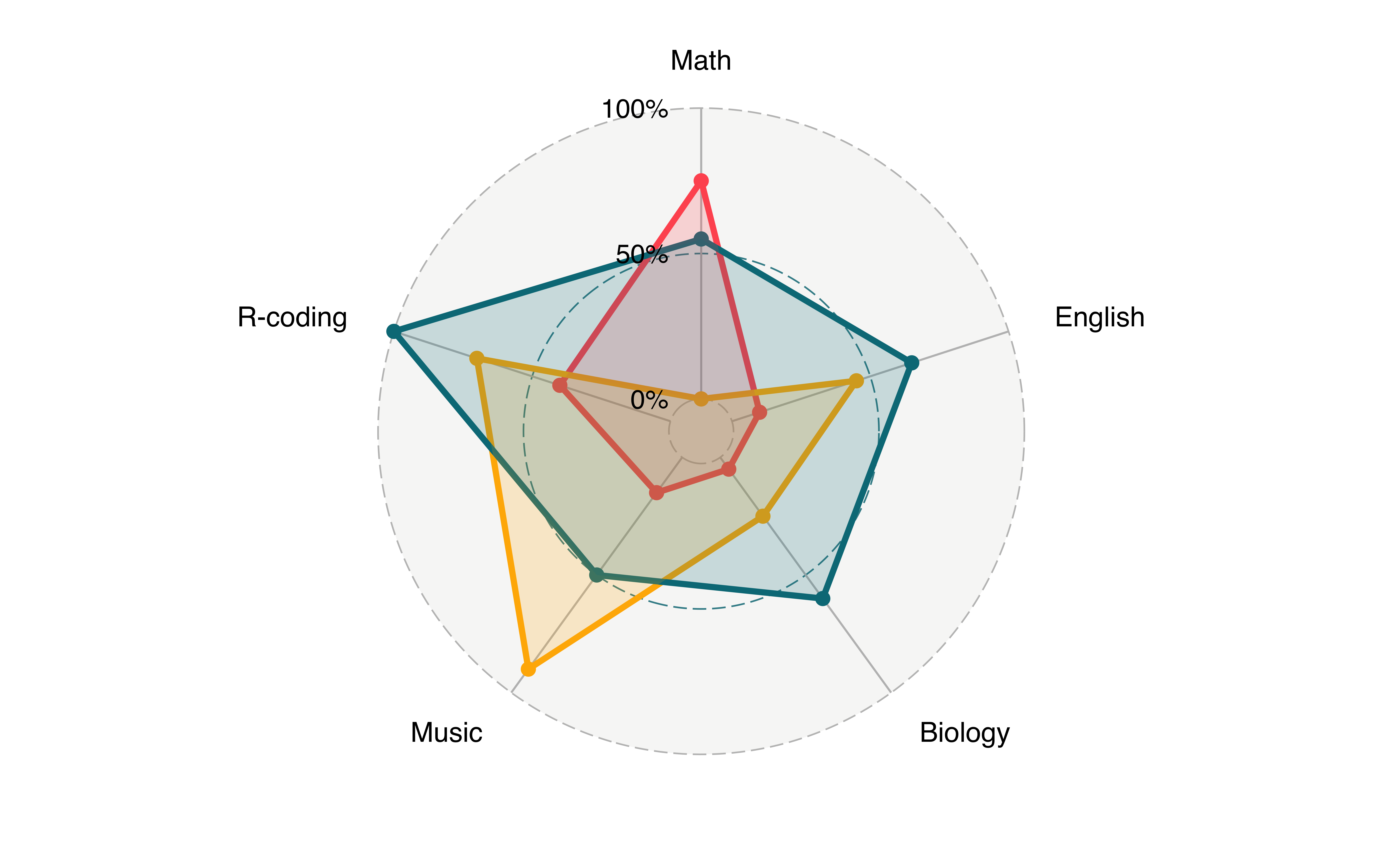
l = 0)) # Left marginRadar Chart from fmsb and ggradar Package
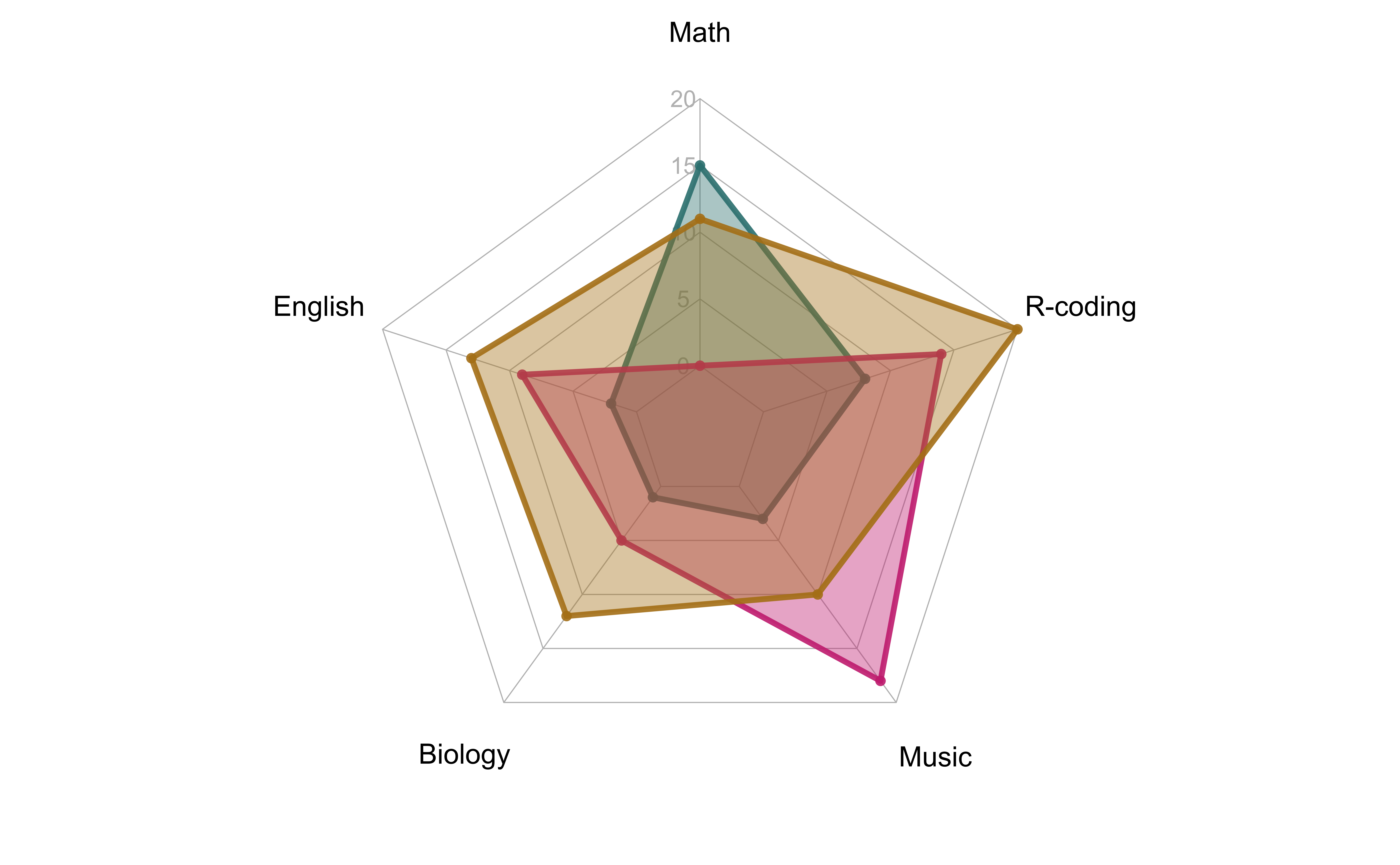
library(fmsb)
radar_data <- readr::read_csv(
    file = "./data/radar_data.csv")
# Color vector
colors_border <- c(rgb(0.2,0.5,0.5,0.9),
                   rgb(0.8,0.2,0.5,0.9),
                   rgb(0.7,0.5,0.1,0.9))
colors_in <- c(rgb(0.2,0.5,0.5,0.4),
               rgb(0.8,0.2,0.5,0.4),
               rgb(0.7,0.5,0.1,0.4))
radarchart(radar_data, axistype = 1,
           #custom polygon
           pcol = colors_border,
           pfcol = colors_in,
           plwd = 4, plty = 1,
           #custom the grid
           cglcol = "grey", cglty = 1,
           axislabcol = "grey",
           caxislabels = seq(0, 20, 5),
           cglwd = 0.8,
           #custom labels
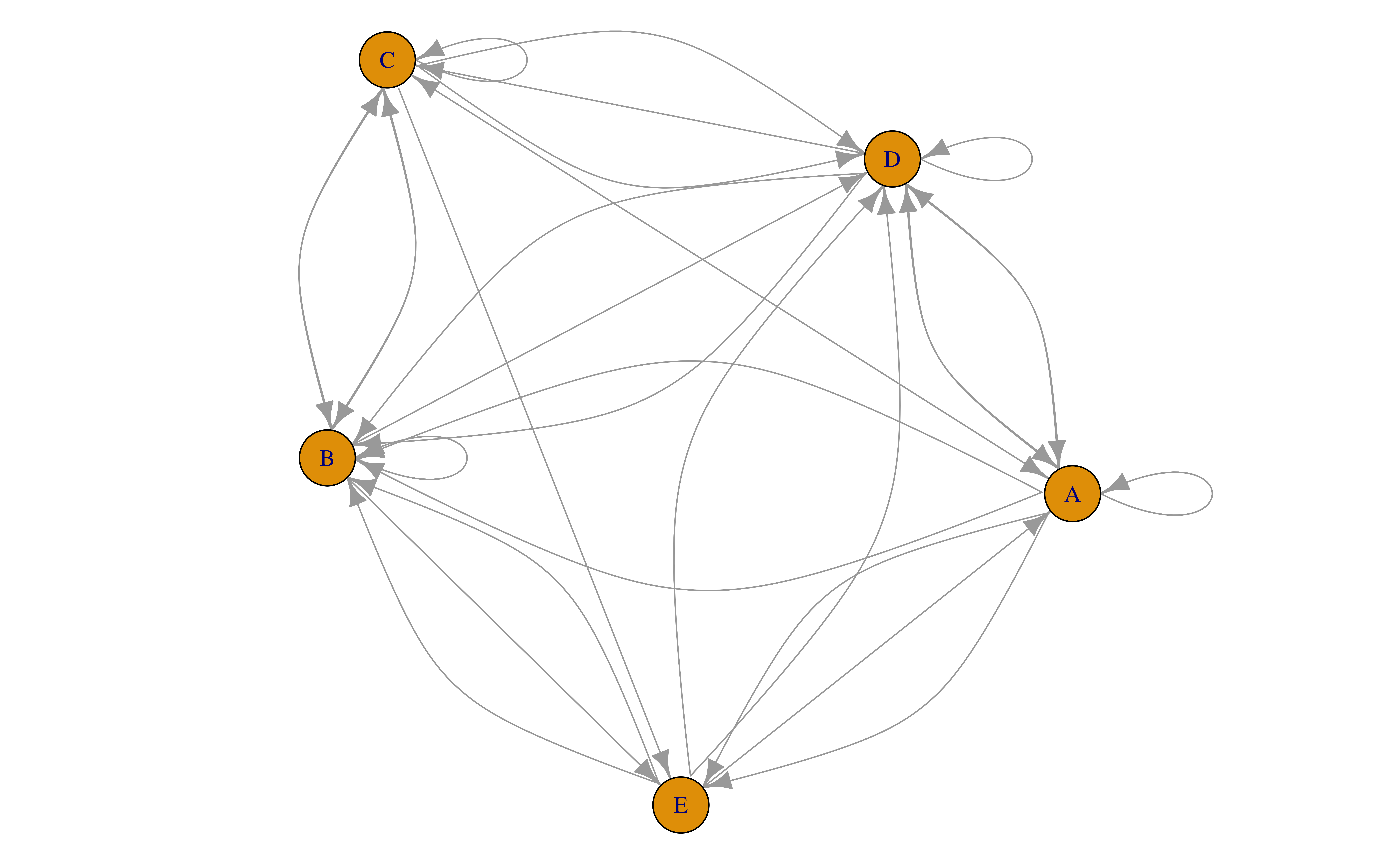
vlcex = 1.2)Network from igraph Package
More R Graphics Resources
- More add-on 📦: ggplot2 extensions
- The R Graph Gallery
- R Graphics Cookbook
- R CHARTS

