Principal Component Analysis
MATH/COSC 3570 Introduction to Data Science
Department of Mathematical and Statistical Sciences
Marquette University
Unsupervised Learning
Unsupervised Learning
Supervised Learning: response \(Y\) and features \(X_1, X_2, \dots, X_p\) measured on \(n\) observations.
-
Unsupervised Learning: only features \(X_1, X_2, \dots, X_p\) measured on \(n\) observations.
- Not interested in prediction (no response to be predicted)
- Discover any interesting pattern or relationships among these features.
-
Dimension reduction for effective data visualization or extracting most important information those features contain.
- plot a bunch of points of \(\boldsymbol{x} = (x_1, x_2, \dots, x_p)\) in a 2-D scatter plot (manifold). (reduce dimension from \(p\) to 2)
- use 2 variables to explain most variations or represents high data density in the \(p\) variables
-
Clustering discovers unknown subgroups/clusters in data
- find 3 sub-groups of people based on variables income, occupation, age, etc
Background: Dimensions
Going to be very SIMPLE!
But you’ll be happy I did this.
Because PCA is about reducing dimensions!
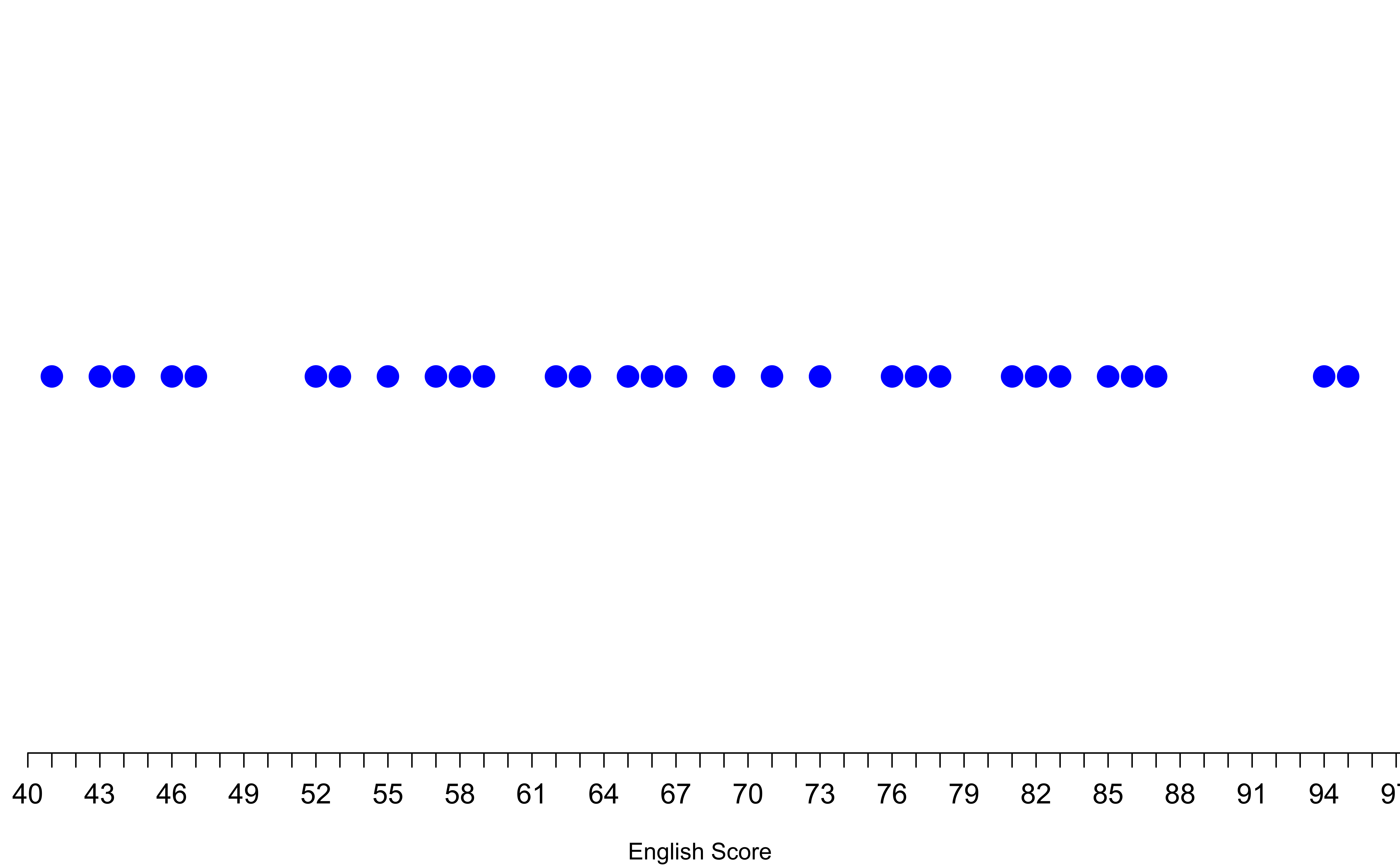
One-Dimension (1D) Number line
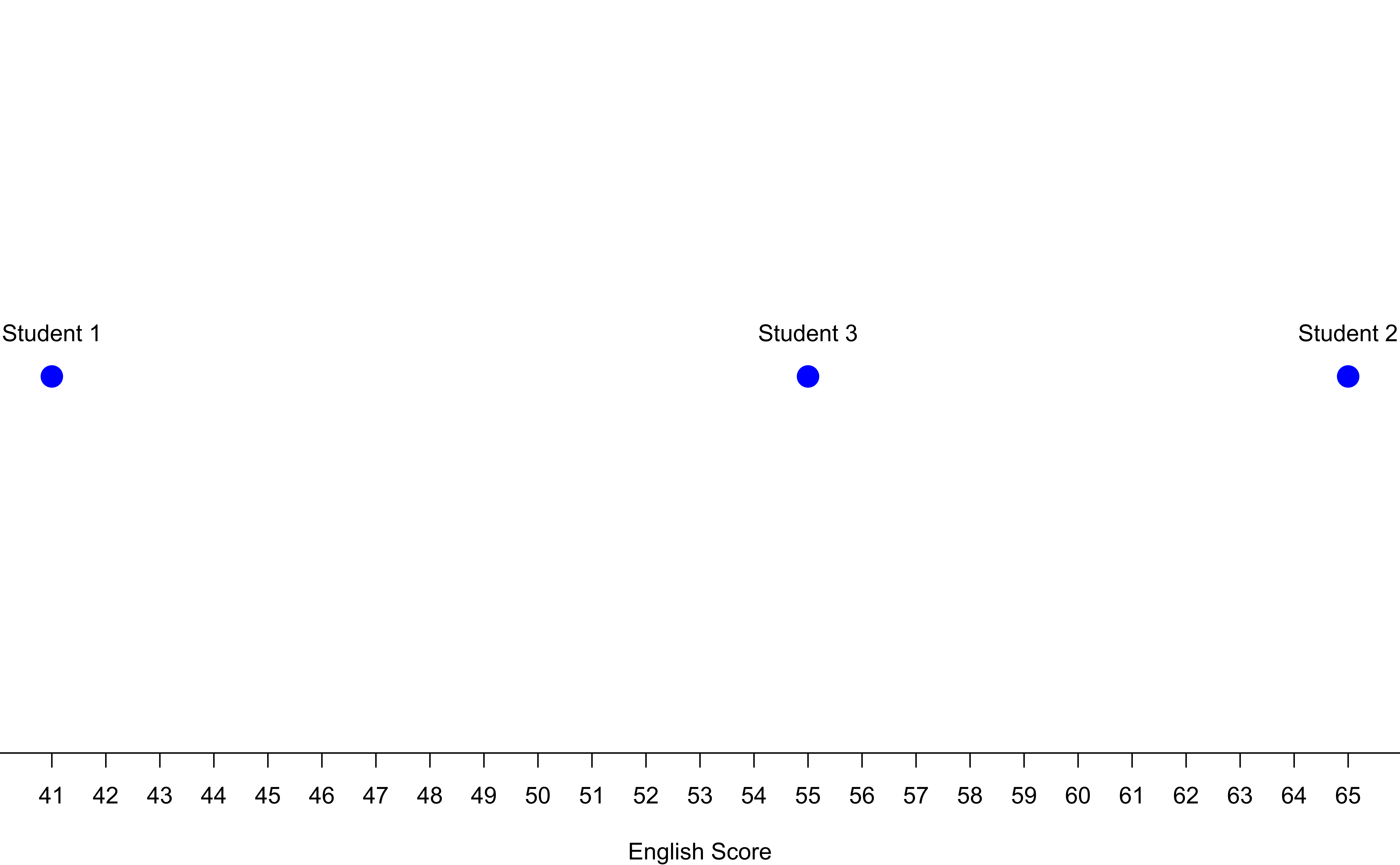
One-Dimension (1D) Number line: Uniform students
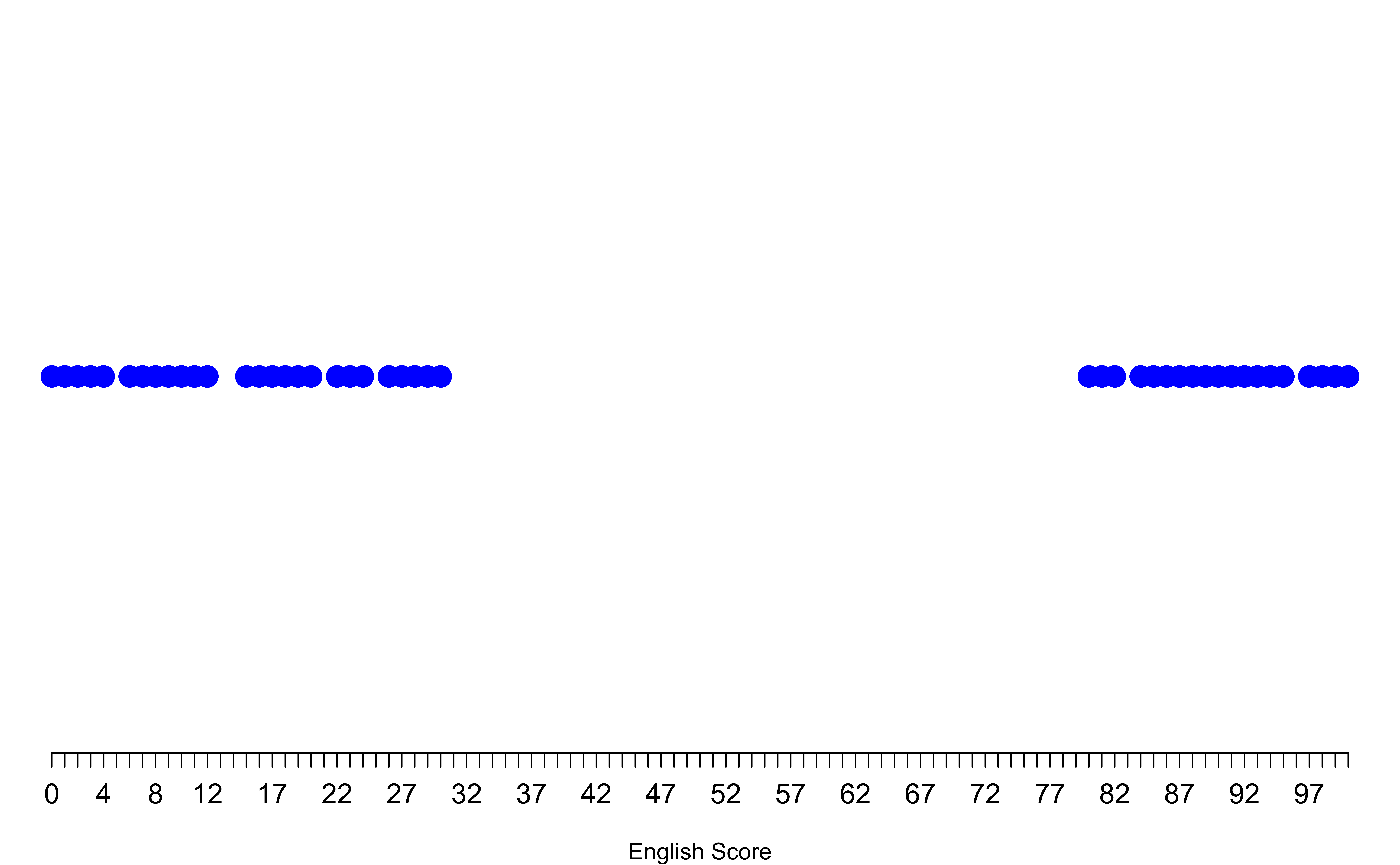
1D Number line: Non-uniform students
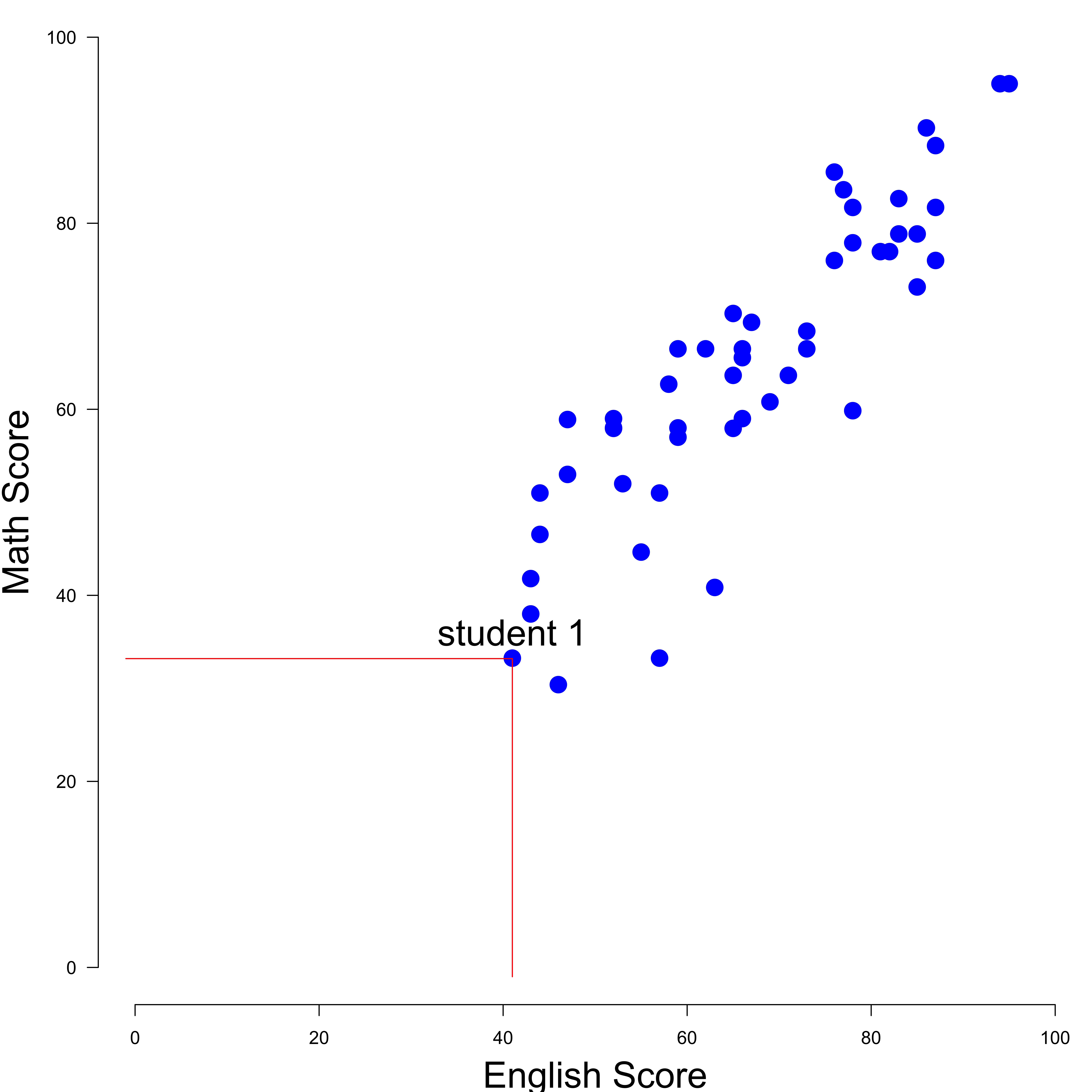
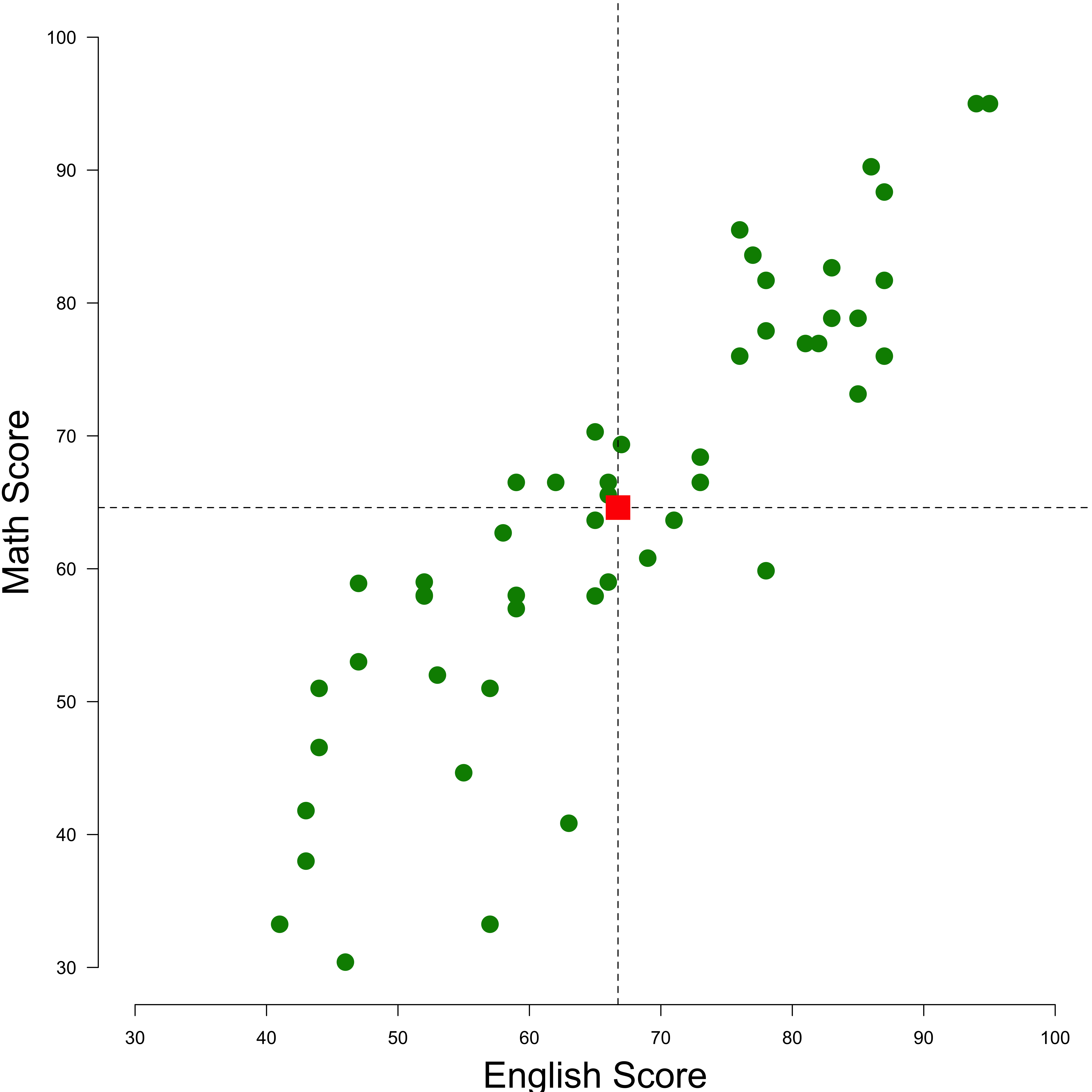
Two-Dimensions (2D) X-Y Scatter plot: High Correlated
English and Math measure an overall academic performance.
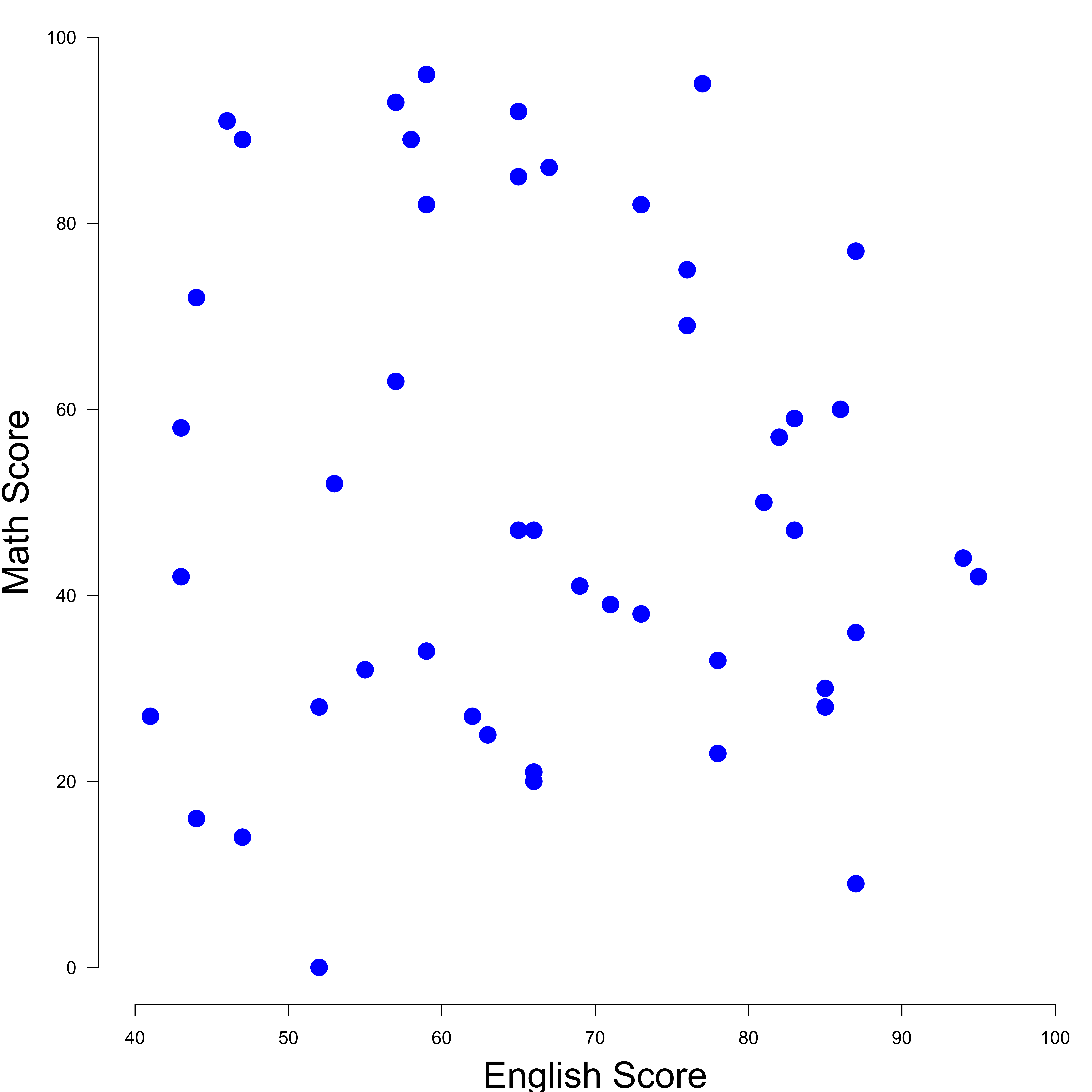
Two-Dimensions (2D) X-Y Scatter plot: No correlated
English and Math measure different abilities.
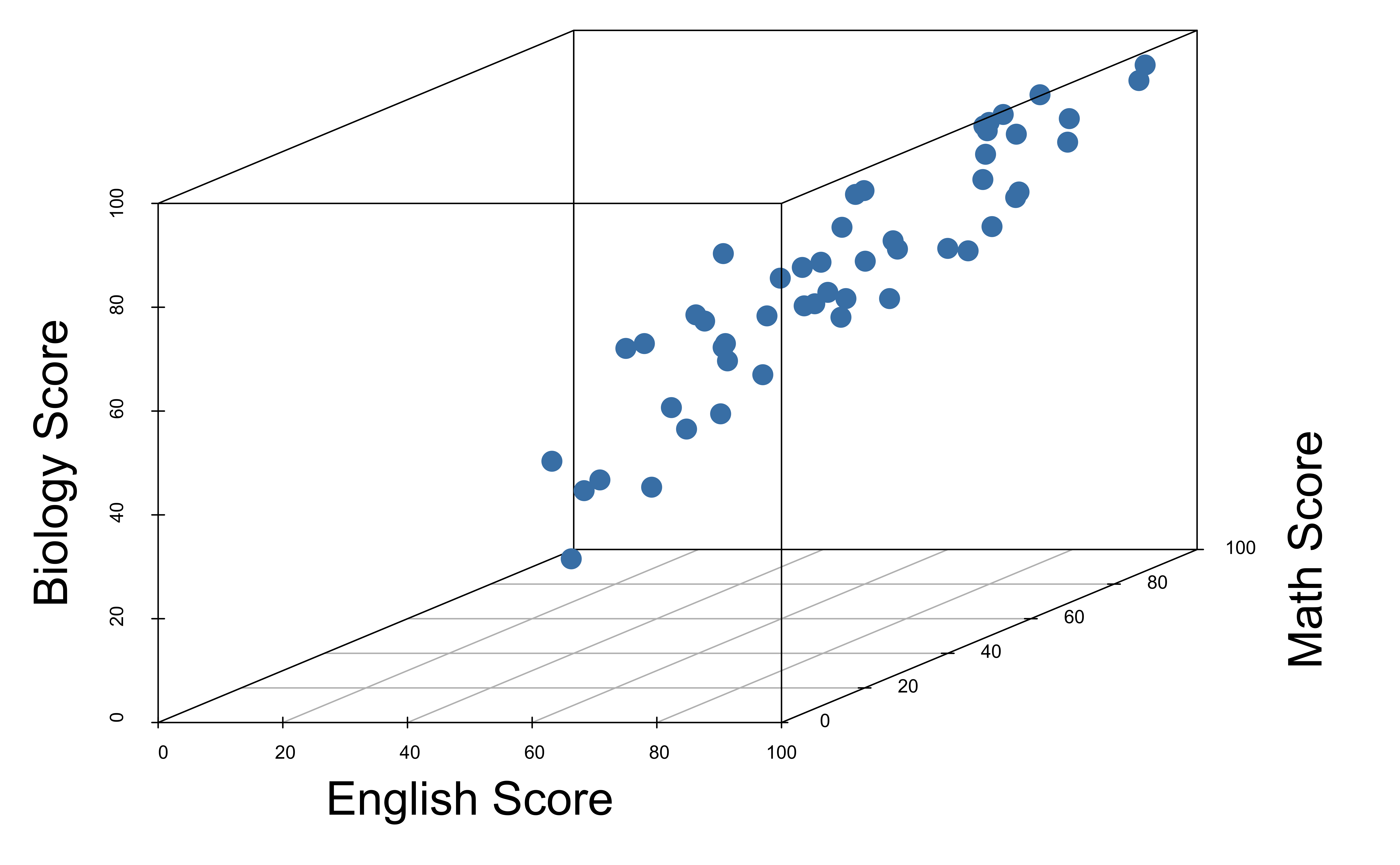
Three-Dimensions (3D) X-Y-Z Scatter plot
Four-Dimensions (4D) X-Y-Z-? Scatter plot
How about Pair Plots?
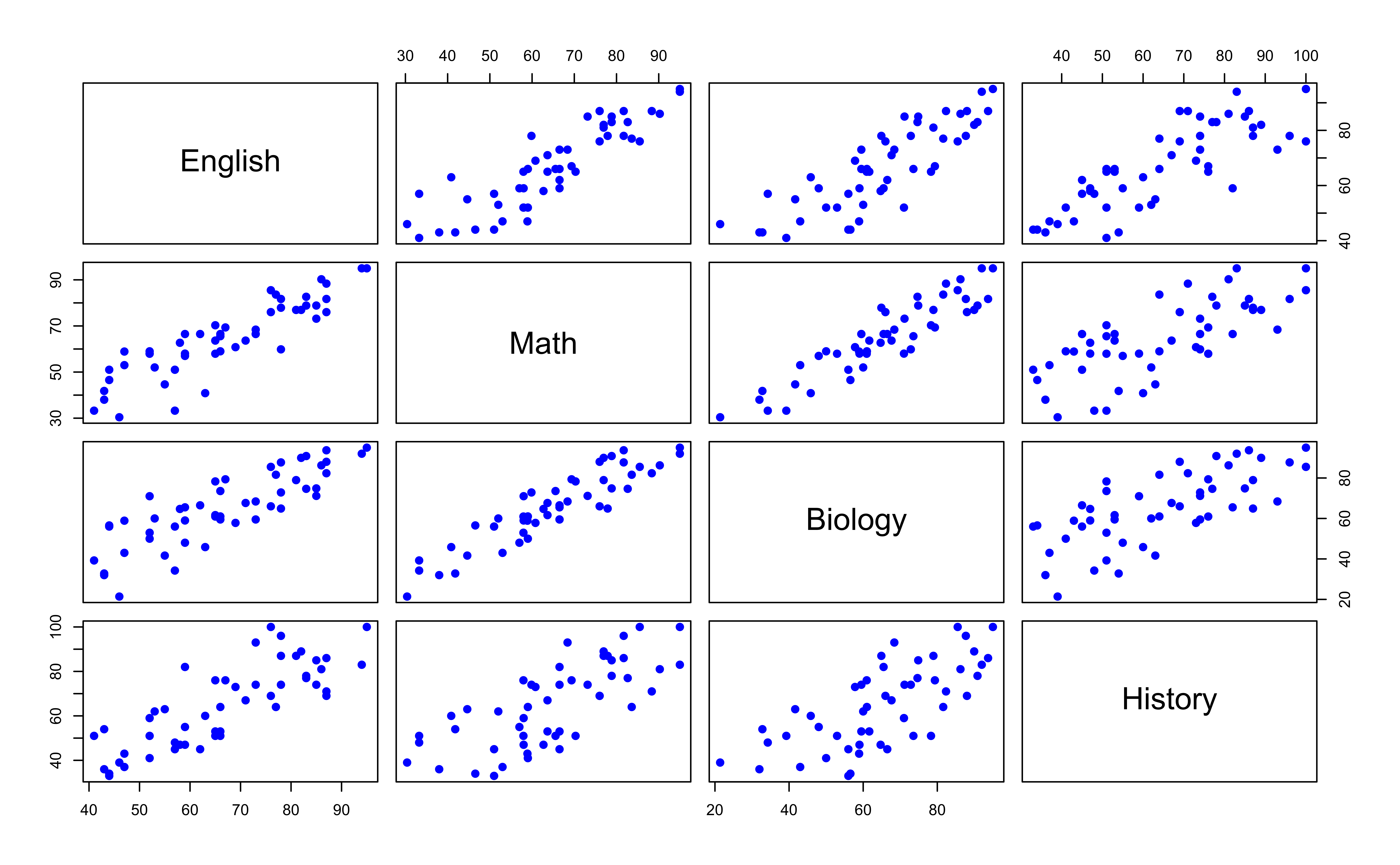
Tooooo Many Pair Plots!
- If we have \(p\) variables, there are \({p \choose 2} = p(p-1)/2\) pairs.
- If \(p = 10\), we have 45 such scatter plots to look at!
- In real data science work, we may encounter over 100 variables!!
Dimension Reduction
One variable represents one dimension.
With many variables in the data, we live in a high dimensional world.
GOAL:
Find a low-dimensional (usually 2D) representation of the data that captures as much of the information all of those variables provide as possible.
Use two created variables to represent all \(p\) variables, and make a scatter plot of the two created variables to learn what our observations look like as if they lived in the high dimensional space.
Why and when can we omit dimensions?
Variation mostly from One Variable
- Almost all of the variation in the data is from left to right.
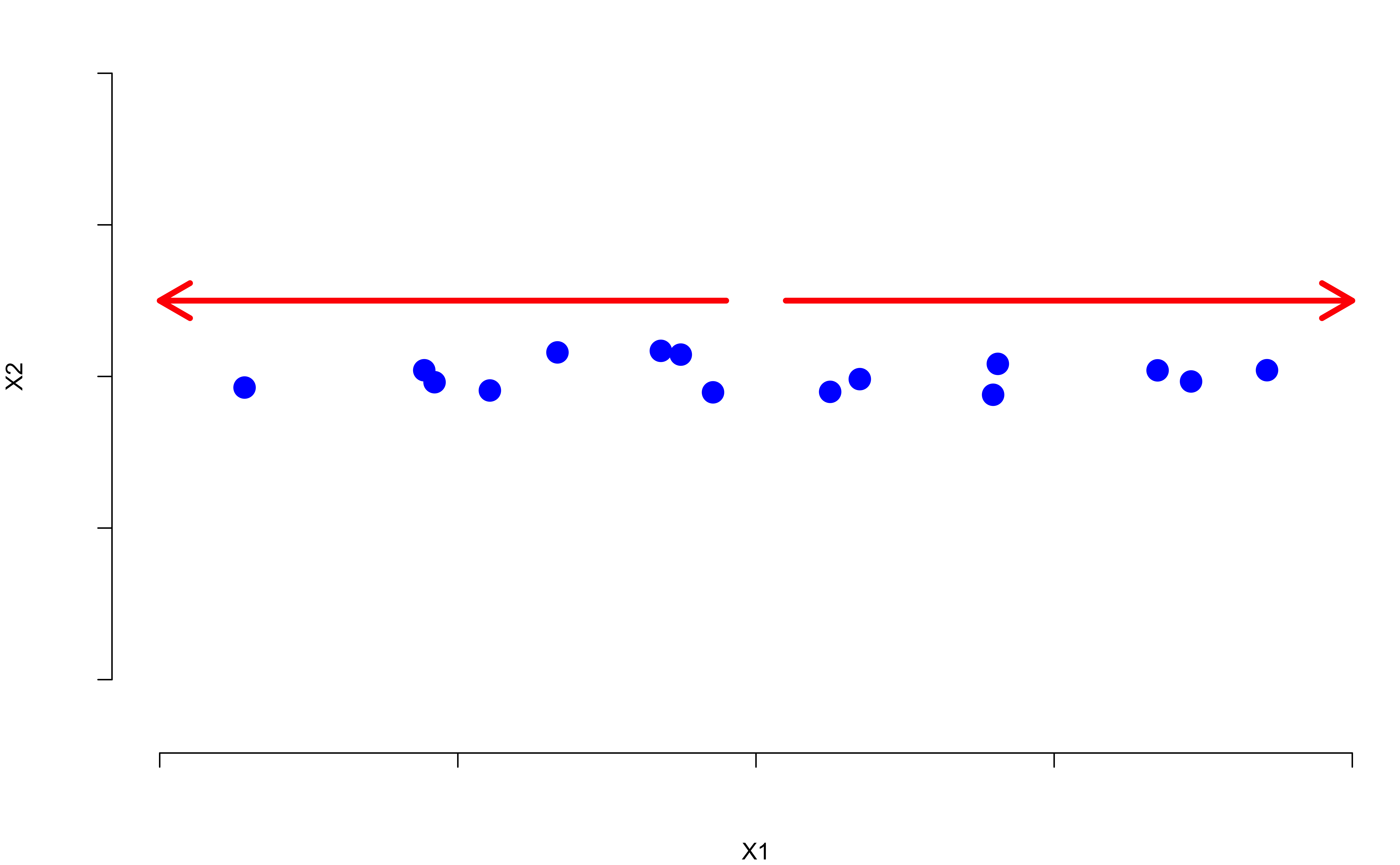
Variation mostly from One Variable
- If we flattened the data, the graph would not look much different.
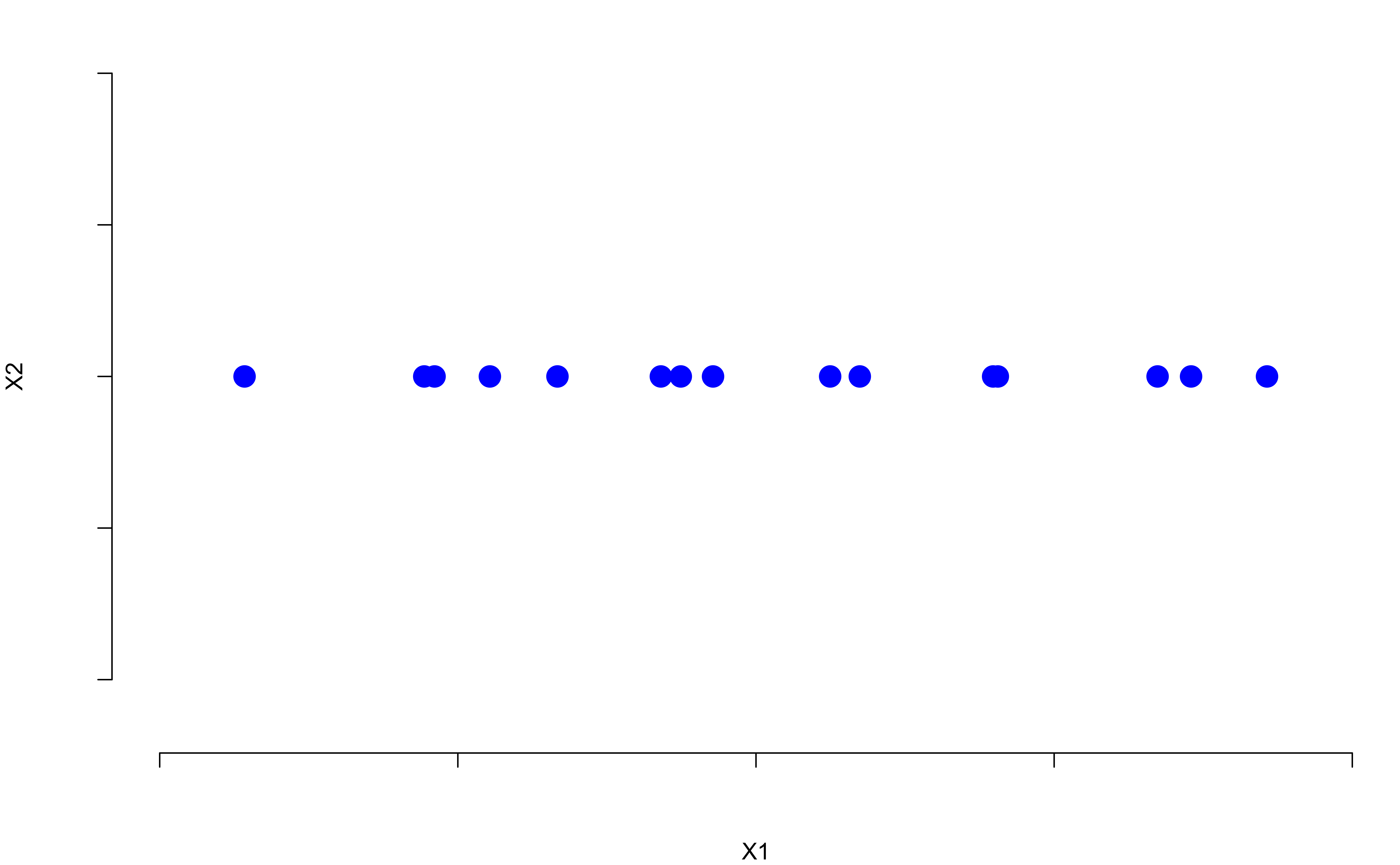
Variation mostly from One Variable
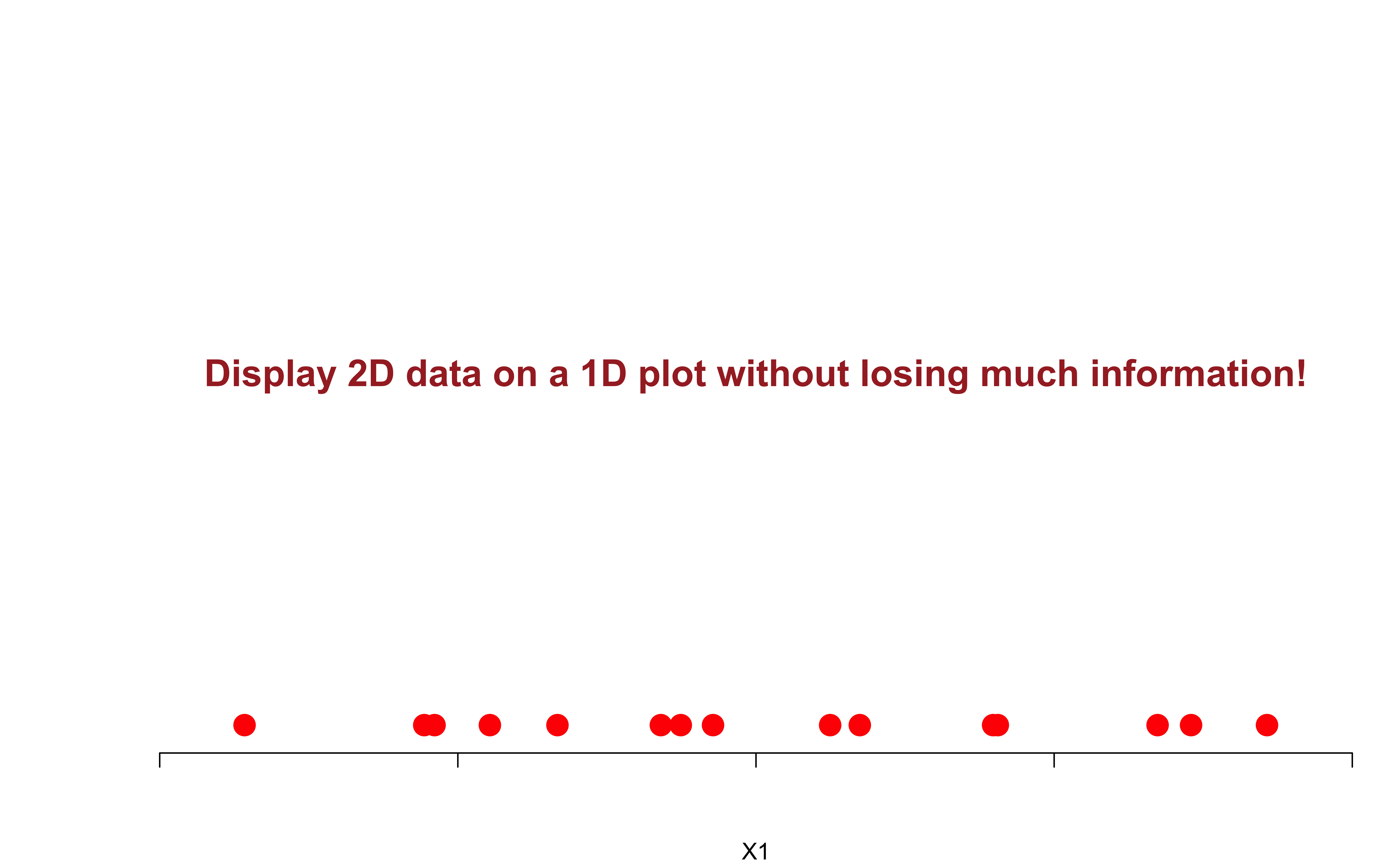
- If we flattened the data, we could graph it with a 1D number line!
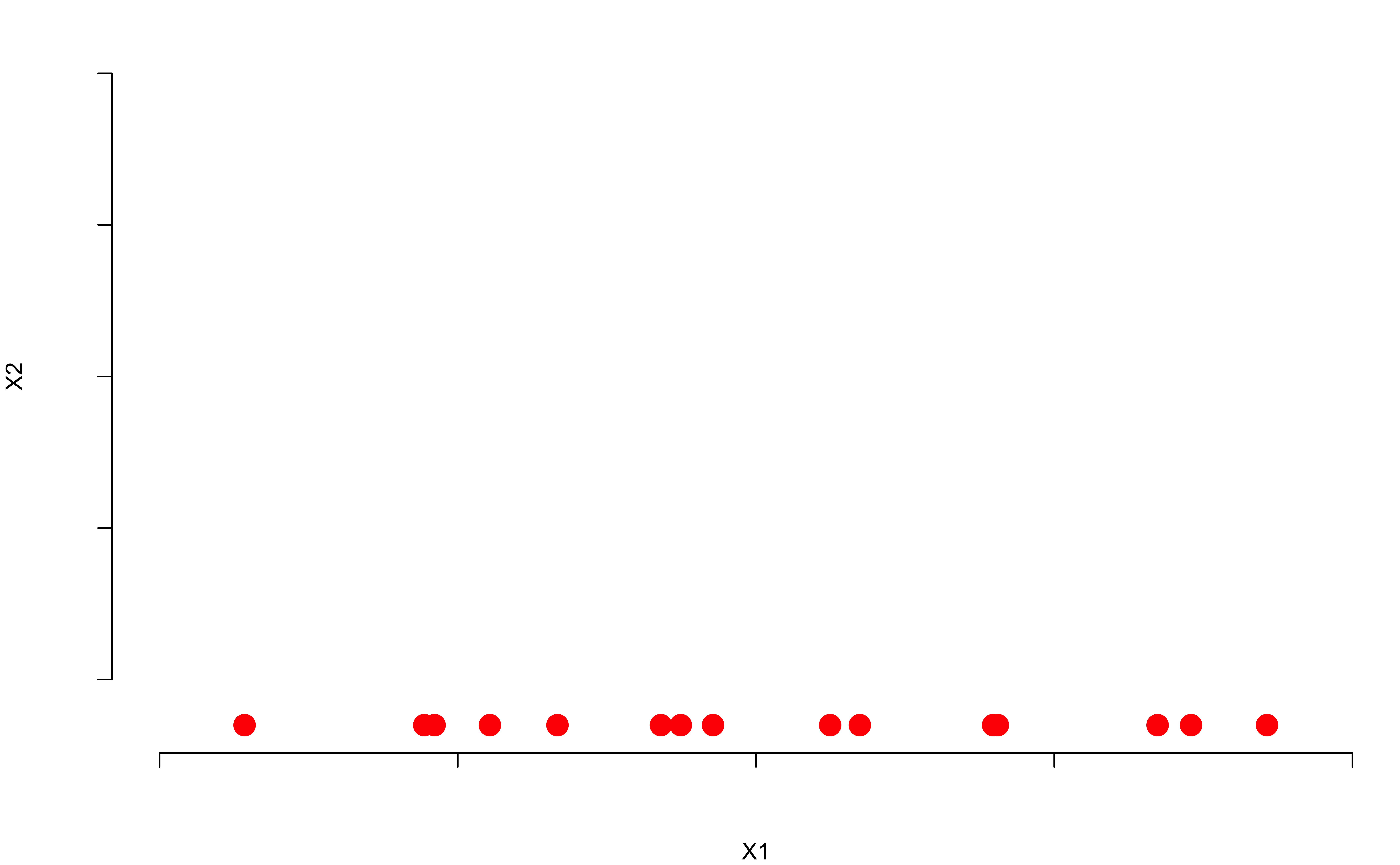
Variation mostly from One Variable
- Both graphs say “the important variation is left to right.”
Principal Component Analysis (PCA)
Idea of PCA
PCA is a dimension reduction tool that finds a low-dimensional representation of a data set that contains as much as possible of variation.
Each of the observations lives in a high-dimensional space (lots of variables), but not all of these dimensions (variables) are equally interesting/important.
The concept of interesting/important is measured by the amount that the data vary along each dimension.
PCA Illustration: 2 Variable Example
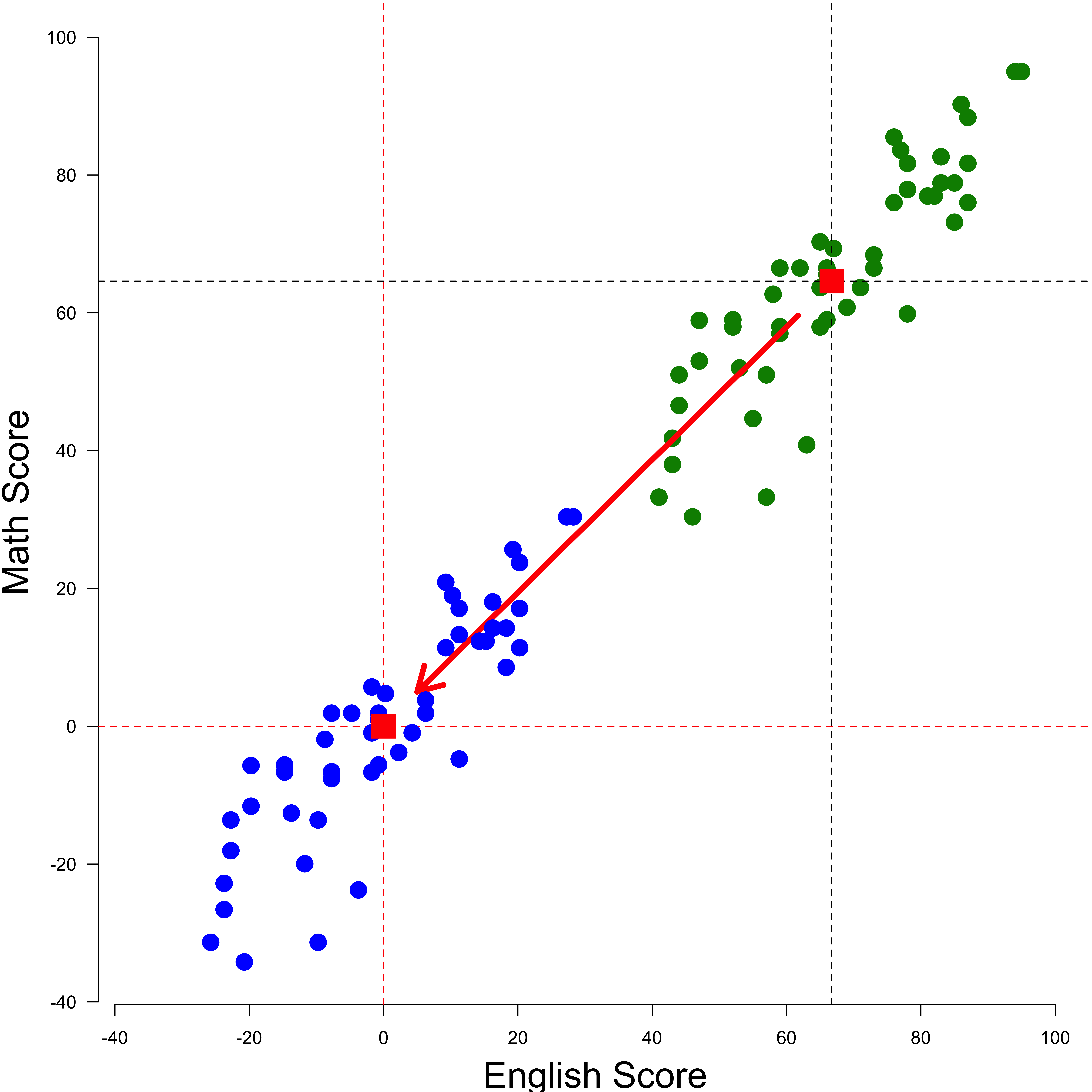
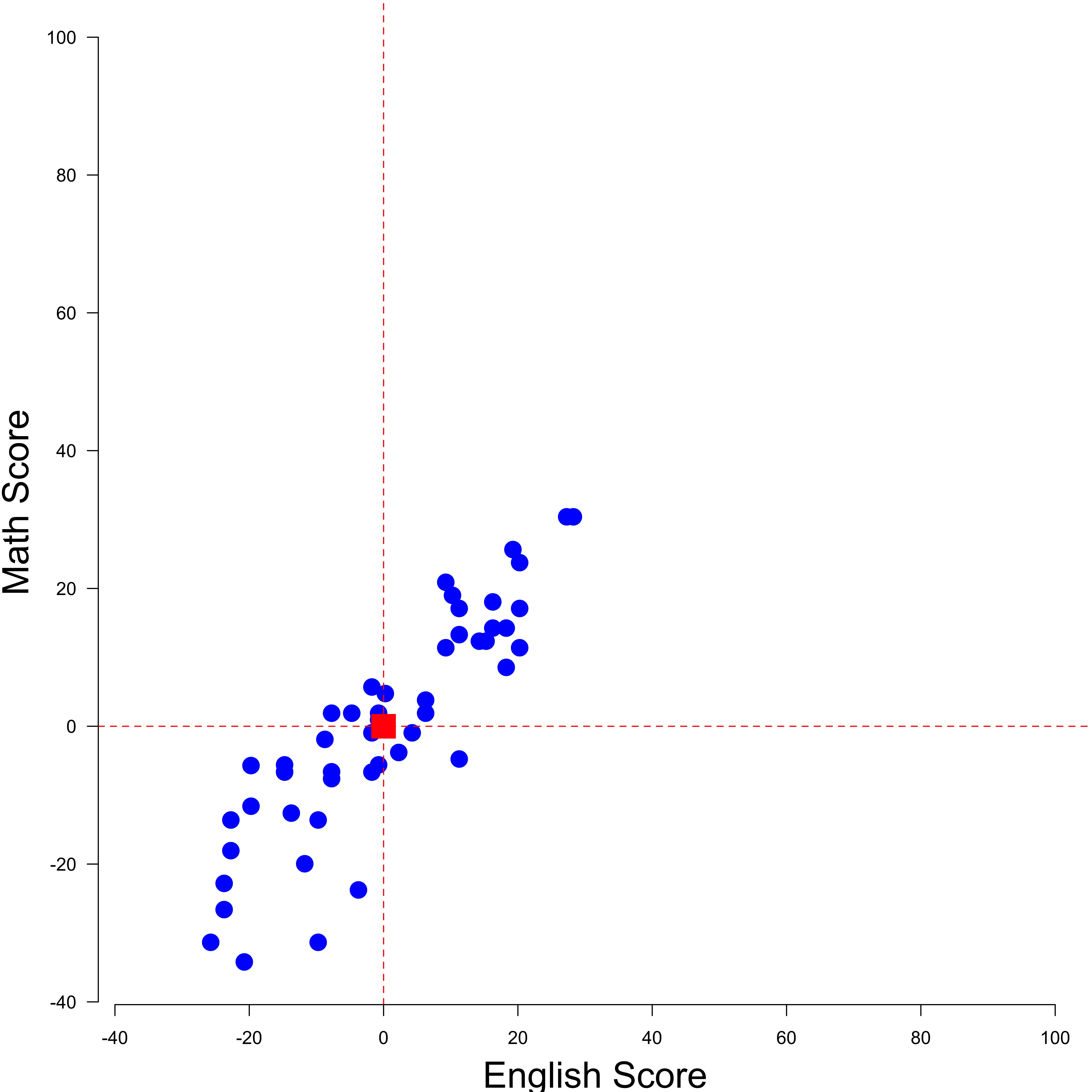
Step 1: Shift (or standardize) the Data
- So the two variables have both mean 0. If the variables are measured in a different unit, consider standardization, \(\frac{x_i - \bar{x}}{s_x}\).
- Shifting does not change how the data points are positioned relative to each other.
Step 2: Find a Line that Fits the Data the Best
- Start with a line going through the origin.
- Rotate the line until it fits the data as well as it can, given that it goes through the origin.

Step 2: Find a Line that Fits the Data the Best
- Start with a line going through the origin.
- Rotate the line until it fits the data as well as it can, given that it goes through the origin.
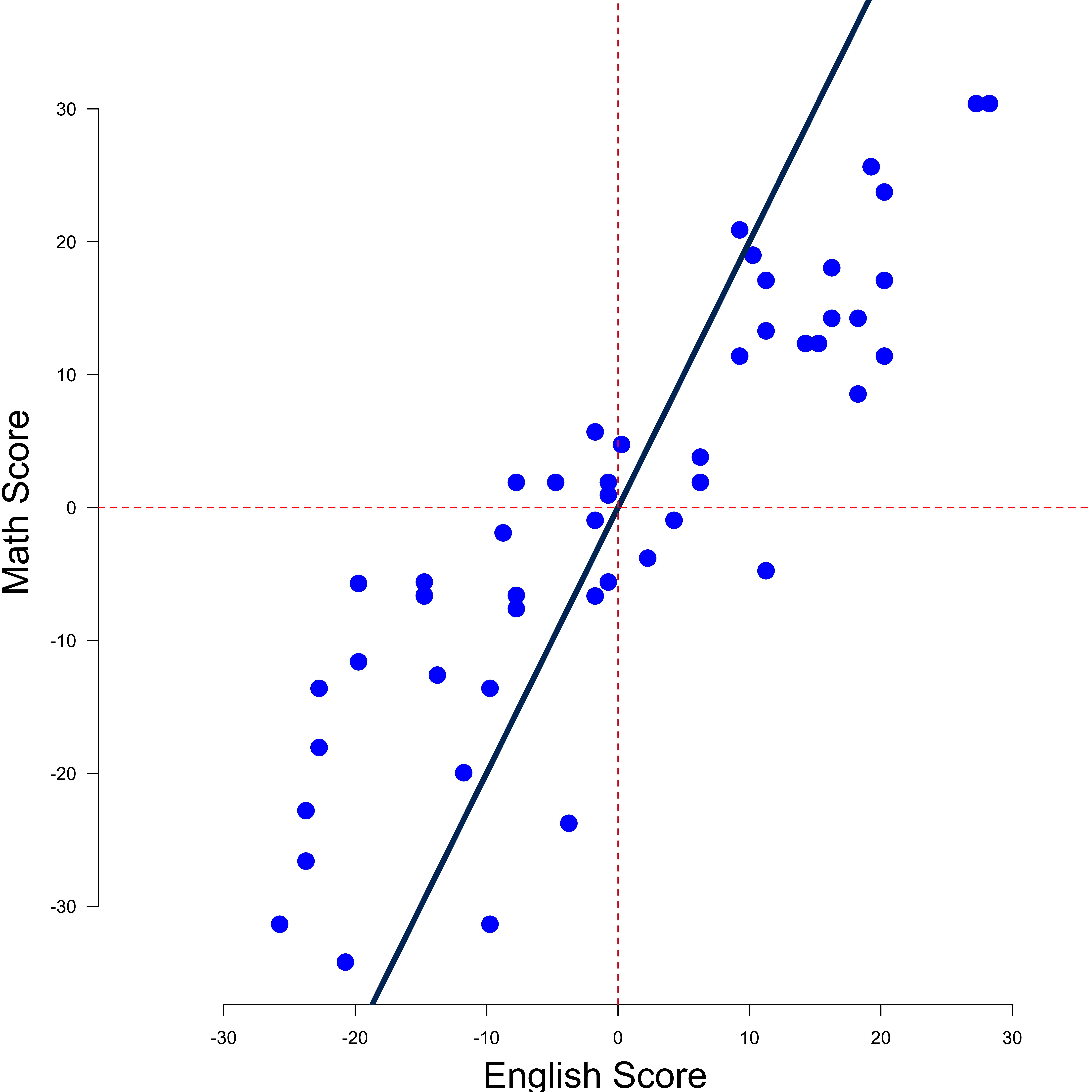
Step 2: Find a Line that Fits the Data the Best
- Start with a line going through the origin.
- Rotate the line until it fits the data as well as it can, given that it goes through the origin.
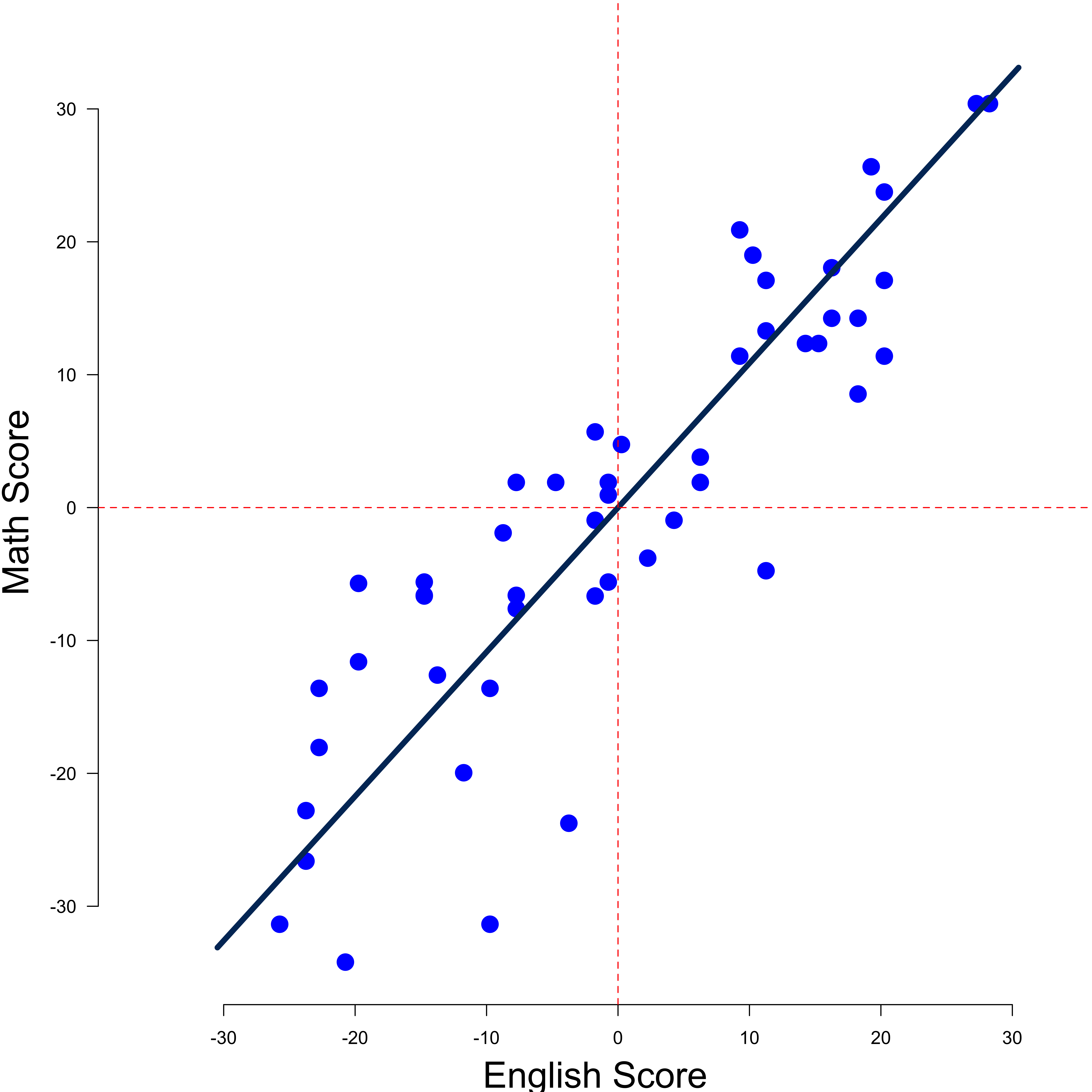
The Meaning of the Best line
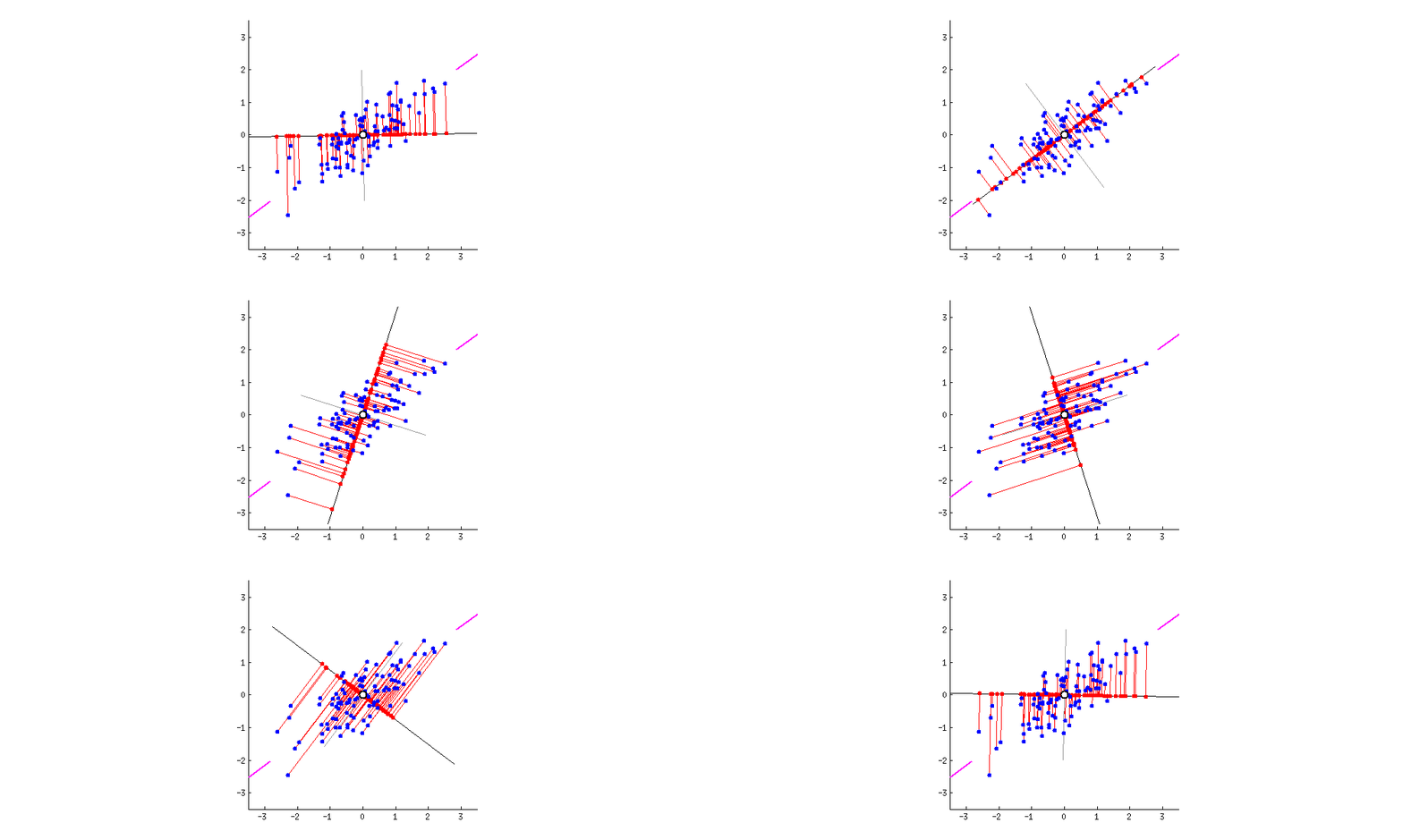
The best line maximizes the variance of the projected points from the data points onto the line! It is called the 1st Principal Component (PC1)
-
PC1 is the line in the Eng-Math space that is closest to the \(n\) observations
- PC1 minimizes the sum of squared distances between the data points and the PC1.
PC1 is the best 1D representation of the 2D data

The Meaning of the Best line
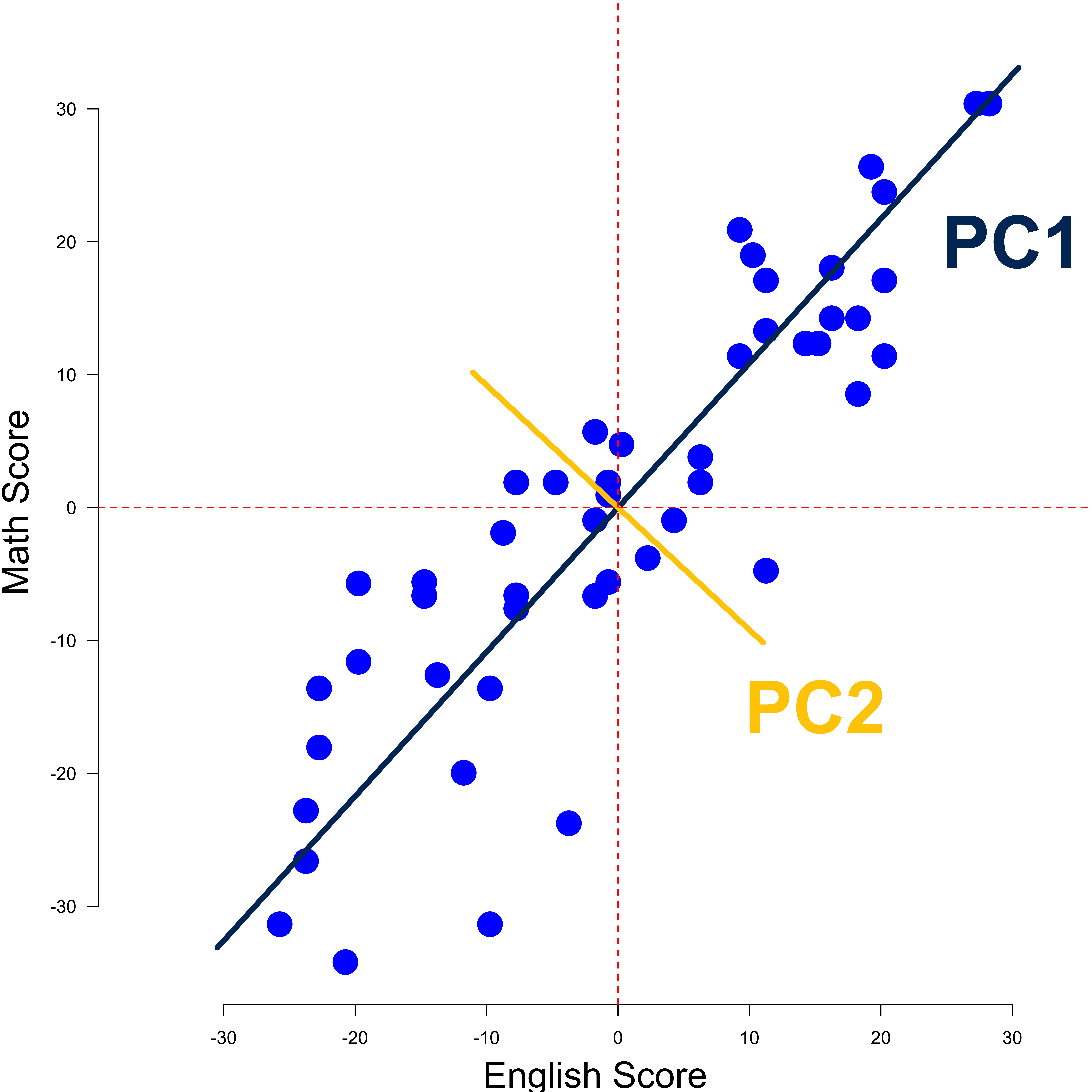
PC1 and PC2
- The data points are also spread out a little above and below the PC1.
- There are some variation that is not explained by the PC1.
- Find the second PC, PC2, that
- explains the remaining variation
- is the line through the origin and perpendicular to PC1.
Linear Combinations

- PC1 = 0.68 \(\times\) English \(+\) 0.74 \(\times\) Math
- PC2 = 0.74 \(\times\) English \(-\) 0.68 \(\times\) Math
- PC1 is like an overall intelligence index as it is a weighted average combining verbal and quantitative abilities.
- PC2 accounts for individual difference in English and Math scores.
- The combination weights 0.68, 0.74, etc are called PC loadings.
Variation
If the variance for PC1 is \(17\) and the variance for PC2 is \(2\), the total variation presented in the data is \(17+2=19\).
PC1 accounts for \(17/19 = 89\%\) of the total variation, and PC2 accounts for \(2/19 = 11\%\) of the total variation.
How about 3 or More Variables?
- PC1 spans the direction of the most variation
- PC2 spans the direction of the 2nd most variation
- PC3 spans the direction of the 3rd most variation
- PC4 spans the direction of the 4th most variation
- If we have \(n\) observations and \(p\) variables (dimensions), there are at most \(\min(n - 1, p)\) PCs.
US Arrest Data in 1973
            Murder Assault UrbanPop Rape
Alabama       13.2     236       58   21
Alaska        10.0     263       48   44
Arizona        8.1     294       80   31
Arkansas       8.8     190       50   20
California     9.0     276       91   41
Colorado       7.9     204       78   39
Connecticut    3.3     110       77   11
Delaware       5.9     238       72   16
Florida       15.4     335       80   32
Georgia       17.4     211       60   26
Hawaii         5.3      46       83   20
Idaho          2.6     120       54   14
Illinois      10.4     249       83   24
Indiana        7.2     113       65   21
Iowa           2.2      56       57   11
Kansas 6.0 115 66 18PC Loading Vectors on USArrests
pca_output <- prcomp(USArrests, scale = TRUE)

## rotation matrix provides PC loadings
(pca_output$rotation <- -pca_output$rotation)
PC1 PC2 PC3 PC4
Murder 0.54 0.42 -0.34 -0.649
Assault 0.58 0.19 -0.27 0.743
UrbanPop 0.28 -0.87 -0.38 -0.134
Rape 0.54 -0.17 0.82 -0.089- PCs are unique up to a sign change, so
-pca_output$rotationgives us the same PCs aspca_output$rotationdoes.
\(\text{PC1} = 0.54 \times \text{Murder} + 0.58 \times \text{Assault} + 0.28 \times \text{UrbanPop} + 0.54 \times \text{Rape}\)
\(\text{PC2} = 0.42 \times \text{Murder} + 0.19 \times \text{Assault} - 0.87 \times \text{UrbanPop} - 0.17 \times \text{Rape}\)
- We have 4 PCs because \(\min(n-1, p) = \min(50-1, 4) = 4\).
PC Scores
- The value of the rotated data, the data values of each PC are stored in
pca_output$x
PC1 PC2 PC3 PC4
Alabama 0.98 1.12 -0.44 -0.15
Alaska 1.93 1.06 2.02 0.43
Arizona 1.75 -0.74 0.05 0.83
Arkansas -0.14 1.11 0.11 0.18
California 2.50 -1.53 0.59 0.34
Colorado 1.50 -0.98 1.08 0.00
Connecticut -1.34 -1.08 -0.64 0.12
Delaware 0.05 -0.32 -0.71 0.87
Florida 2.98 0.04 -0.57 0.10
Georgia 1.62 1.27 -0.34 -1.07
Hawaii -0.90 -1.55 0.05 -0.89
Idaho -1.62 0.21 0.26 0.49
Illinois 1.37 -0.67 -0.67 0.12
Indiana -0.50 -0.15 0.23 -0.42
Iowa -2.23 -0.10 0.16 -0.02
Kansas -0.79 -0.27 0.03 -0.20Interpretation of PCs
          PC1   PC2   PC3    PC4
Murder   0.54  0.42 -0.34 -0.649
Assault  0.58  0.19 -0.27  0.743
UrbanPop 0.28 -0.87 -0.38 -0.134
Rape     0.54 -0.17  0.82 -0.089
PCs are less interpretable than original features.
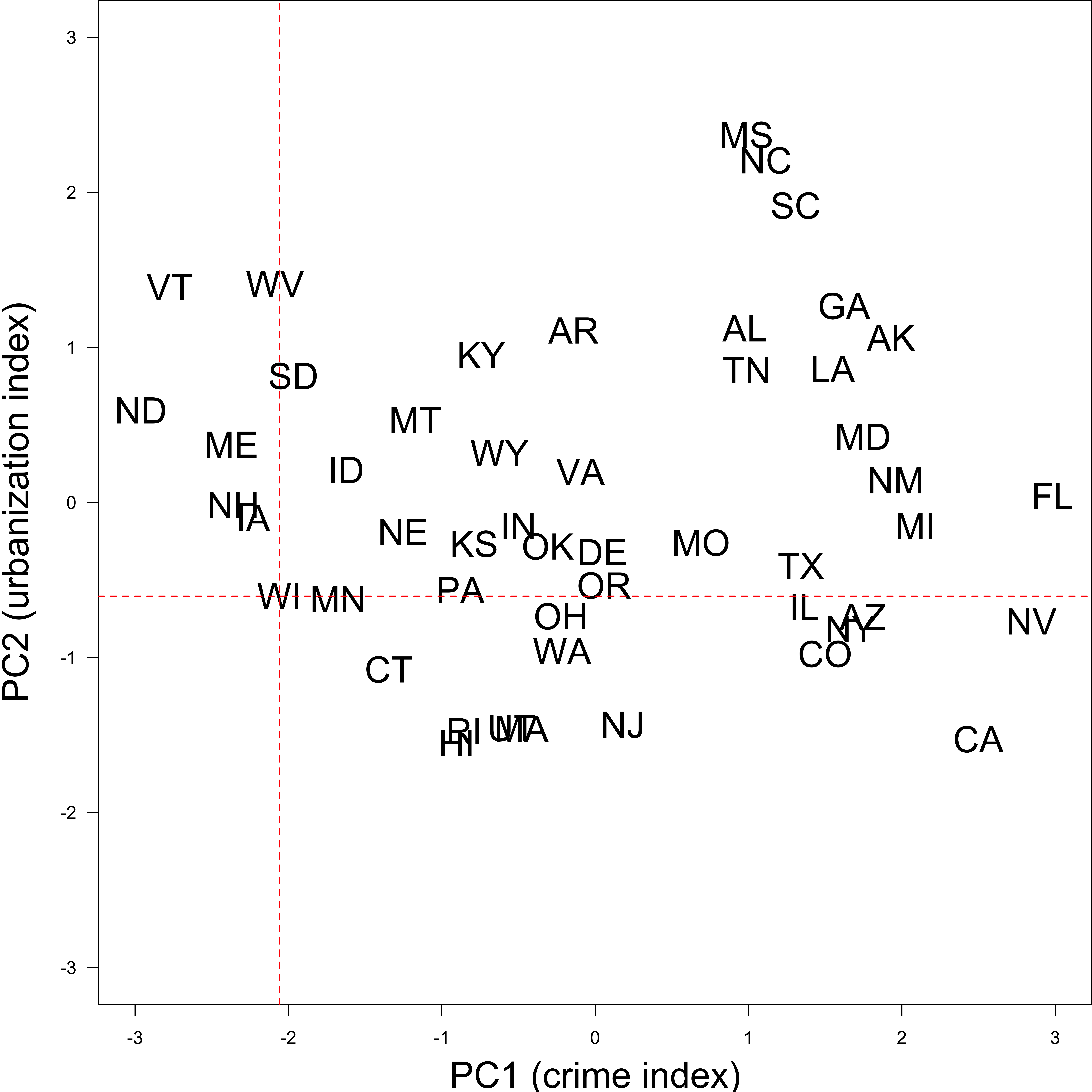
The first loading vector places approximately equal weight on
Assualt,MurderandRape, with much less weights onUrbanPop.PC1 roughly corresponds to a overall serious crime rate.
The second loading vector places most of its weight on
UrbanPop, and much less weight on the other 3 features.PC2 roughly corresponds to the level of urbanization.
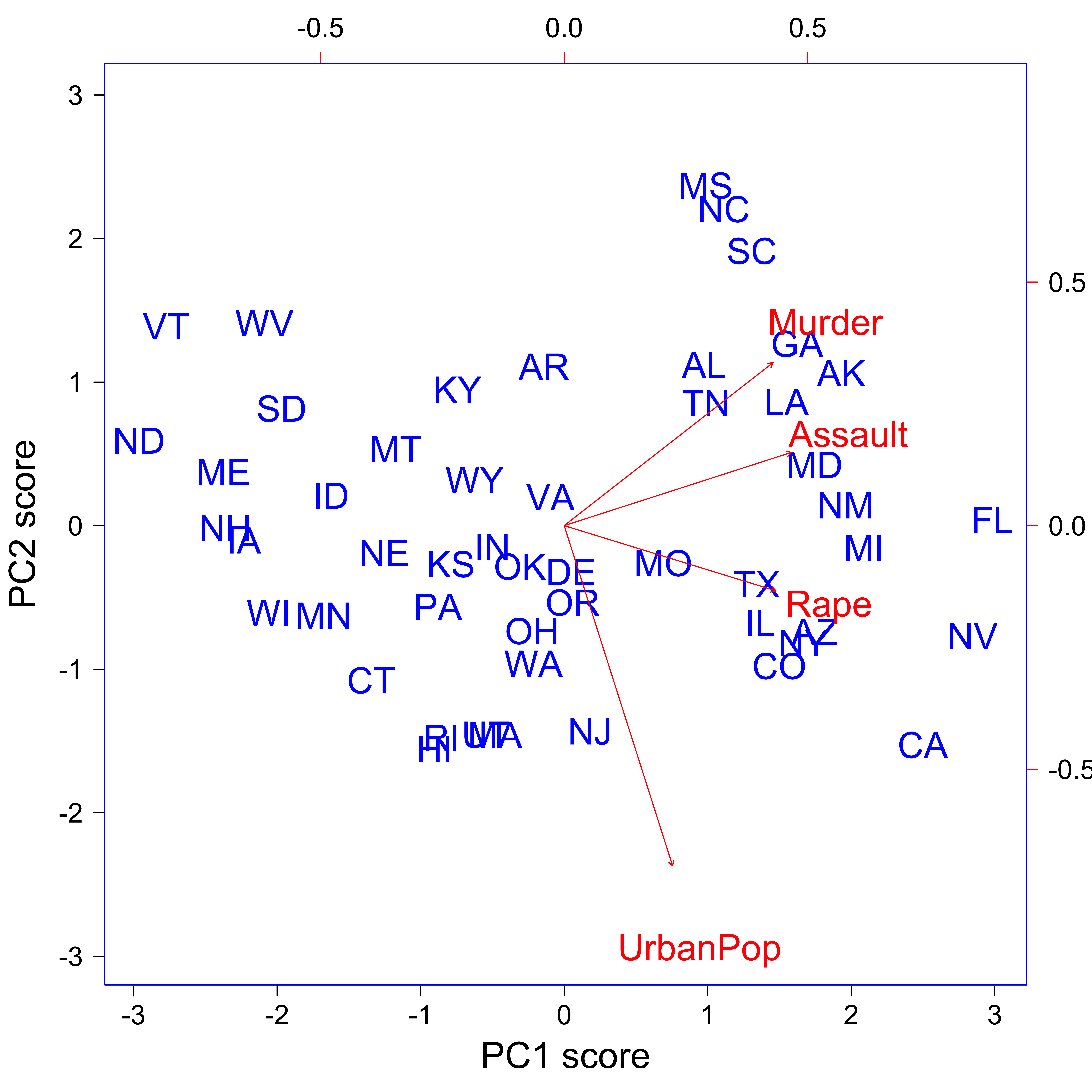
2D Representation of the 4D data
2D Representation of the 4D data: biplot
- Top axis: PC1 loadings
- Right axis: PC2 loadings
- Red arrows: PC1 and PC2 loading vector, e.g., (0.28, -0.87) for
UrbanPop. - Crime-related variables (
Assualt,MurderandRape) are located close to each other. -
UrbanPopis far from the other three. -
Assualt,MurderandRapeare more correlated, andUrbanPopis less correlated with the other three.
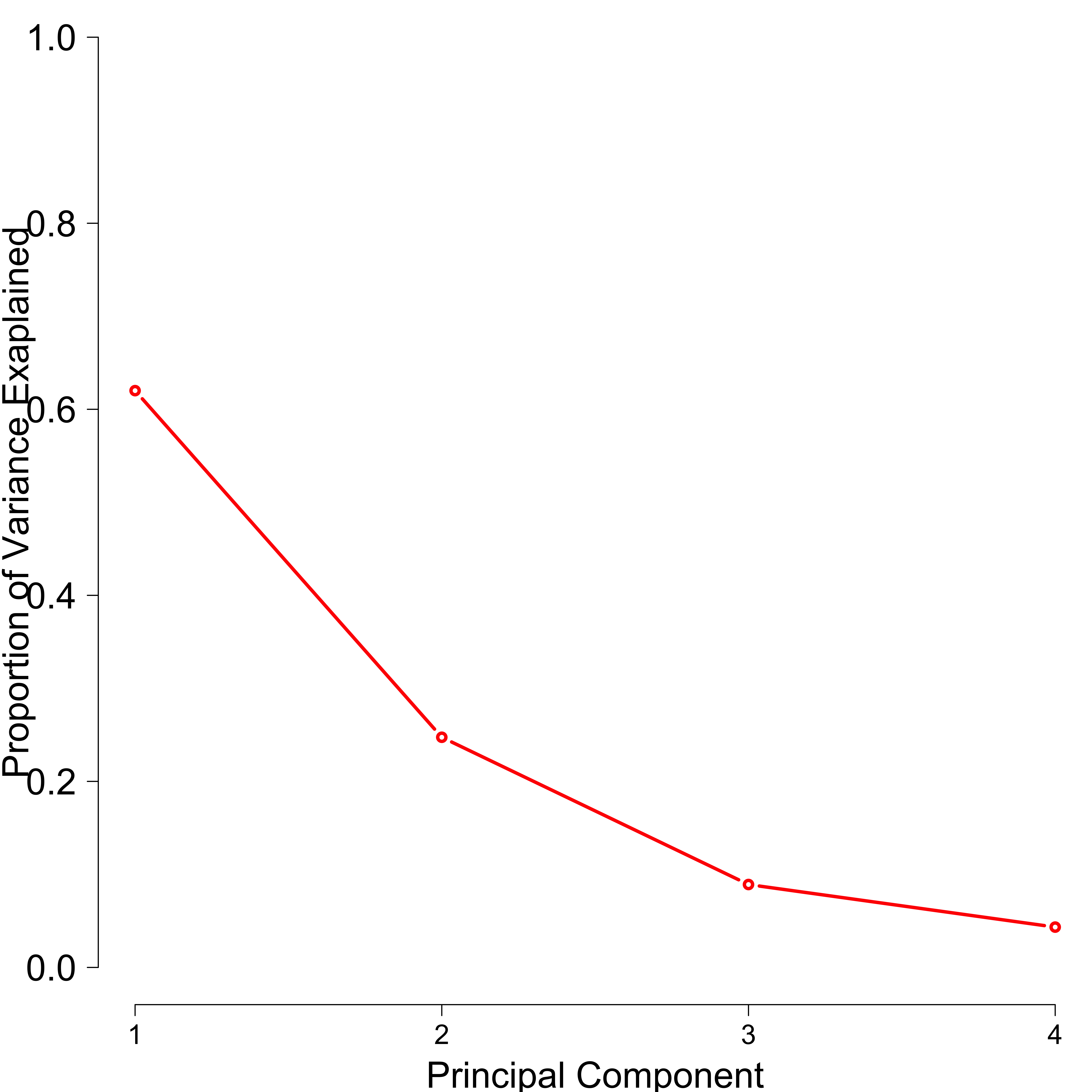
Proportion of Variance Explained
Importance of components:
                        PC1   PC2    PC3    PC4
Standard deviation     1.57 0.995 0.5971 0.4164
Proportion of Variance 0.62 0.247 0.0891 0.0434
Cumulative Proportion 0.62 0.868 0.9566 1.0000- PC1 explains \(62\%\) of the variations in the data, and PC2 explains \(24.7\%\) of the variance.
- PC1 and PC2 explain about \(87\%\) of the variance, and the last two PCs explain only \(13\%\).
- 2D plot provides pretty accurate summary of the data.
Scree Plot
Look for a point at which the proportion of variance explained by each subsequent PC drops off.
23-Principal Component Analysis
In lab.qmd ## Lab 23 section,
Use
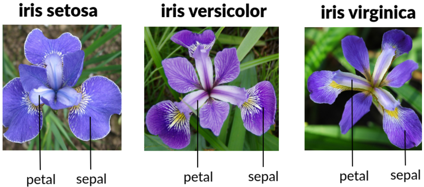
slice()to print the first six rows ofirisdata.Perform PCA on
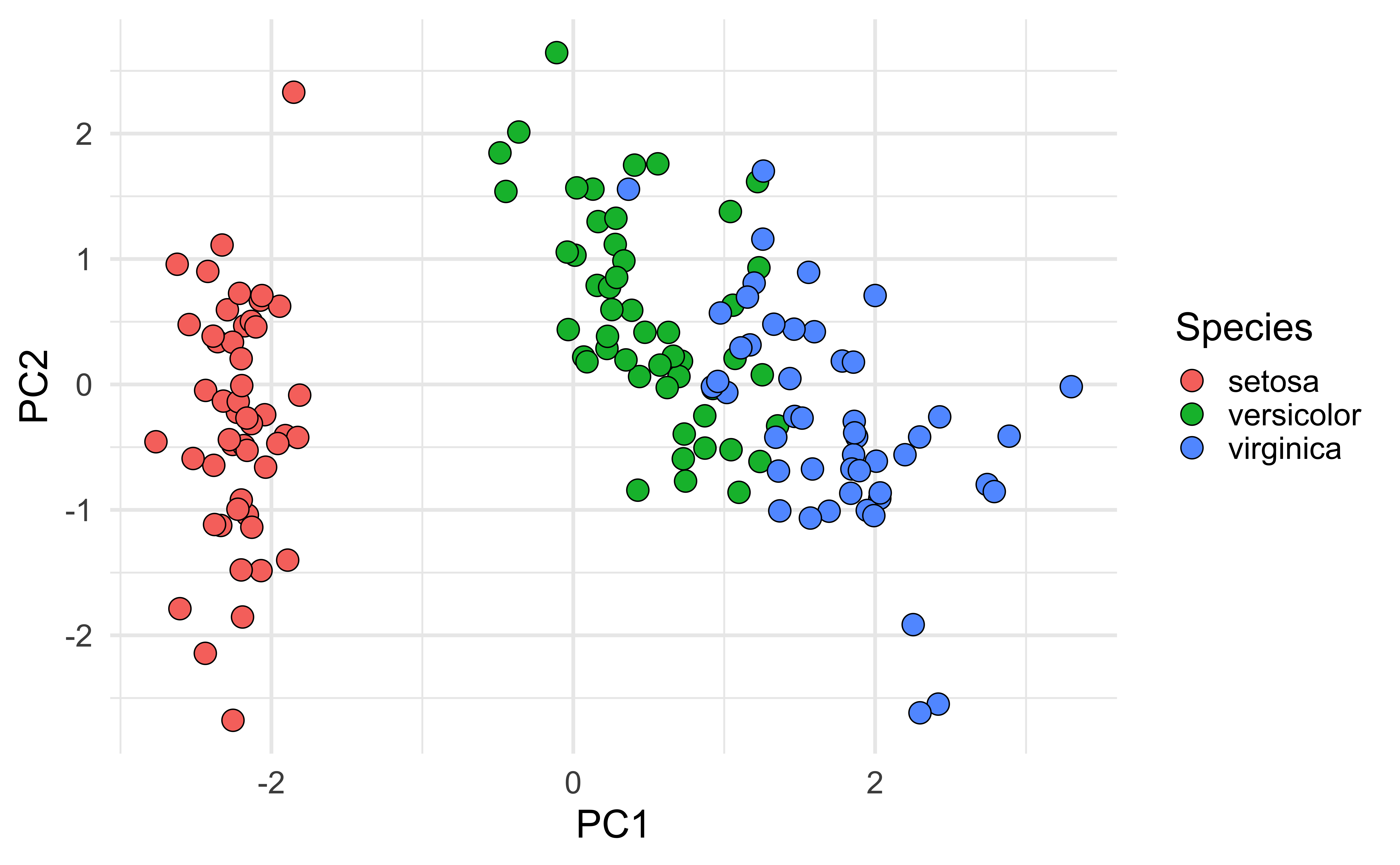
Sepal.Length,Sepal.Width,Petal.Length, andPetal.Width.Generate biplot, and explain it.
  Sepal.Length Sepal.Width Petal.Length Petal.Width Species
1          5.1         3.5          1.4         0.2  setosa
2          4.9         3.0          1.4         0.2  setosa
3          4.7         3.2          1.3         0.2  setosa
4          4.6         3.1          1.5         0.2  setosa
5          5.0         3.6          1.4         0.2  setosa
6          5.4         3.9          1.7         0.4  setosa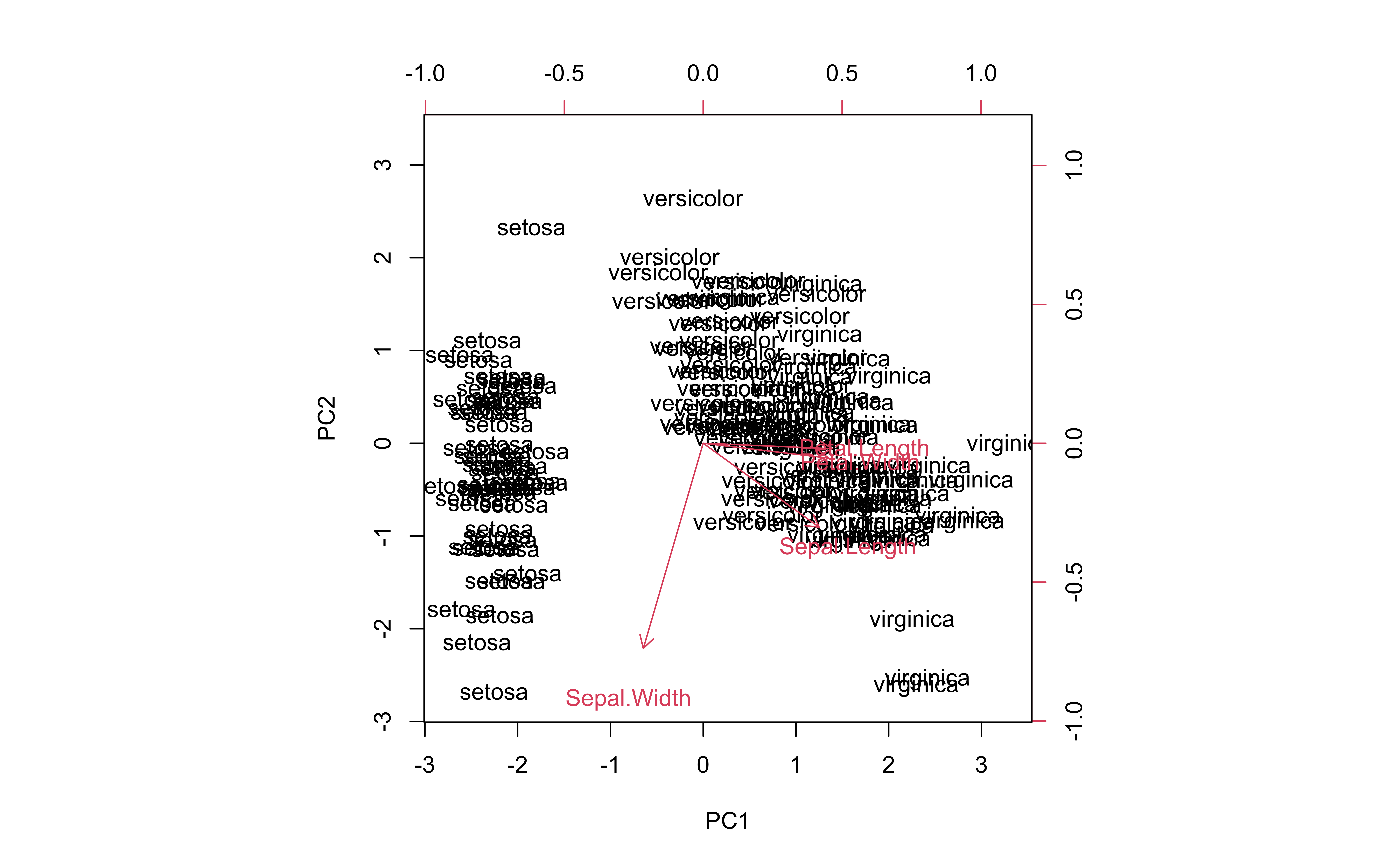
sklearn.decomposition
sklearn.preprocessing
# https://raw.githubusercontent.com/vincentarelbundock/Rdatasets/master/csv/datasets/USArrests.csv
USArrests = pd.read_csv('./data/USArrests.csv')
USArrests.head(4)
rownames Murder Assault UrbanPop Rape
0 Alabama 13.2 236 58 21.2
1 Alaska 10.0 263 48 44.5
2 Arizona 8.1 294 80 31.0
3 Arkansas 8.8 190 50 19.5- Standardization
-
Perform PCA (
prcomp(USArrests, scale = TRUE))
-
Data on PCs (
pca_output$x)
X_pc = np.round(pca.transform(X), 2)
pd.DataFrame(X_pc, columns=['PC1', 'PC2', 'PC3', 'PC4'], index=USArr.index)
PC1 PC2 PC3 PC4
rownames
Alabama 0.99 1.13 -0.44 0.16
Alaska 1.95 1.07 2.04 -0.44
Arizona 1.76 -0.75 0.05 -0.83
Arkansas -0.14 1.12 0.11 -0.18
California 2.52 -1.54 0.60 -0.34
Colorado 1.51 -0.99 1.10 0.00
Connecticut -1.36 -1.09 -0.64 -0.12
Delaware 0.05 -0.33 -0.72 -0.88
Florida 3.01 0.04 -0.58 -0.10
Georgia 1.64 1.28 -0.34 1.08
Hawaii -0.91 -1.57 0.05 0.90
Idaho -1.64 0.21 0.26 -0.50
Illinois 1.38 -0.68 -0.68 -0.12
Indiana -0.51 -0.15 0.23 0.42
Iowa -2.25 -0.10 0.16 0.02
Kansas -0.80 -0.27 0.03 0.21
Kentucky -0.75 0.96 -0.03 0.67
Louisiana 1.56 0.87 -0.78 0.45
Maine -2.40 0.38 -0.07 -0.33
Maryland 1.76 0.43 -0.16 -0.56
Massachusetts -0.49 -1.47 -0.61 -0.18
Michigan 2.11 -0.16 0.38 0.10
Minnesota -1.69 -0.63 0.15 0.07
Mississippi 1.00 2.39 -0.74 0.22
Missouri 0.70 -0.26 0.38 0.23
Montana -1.19 0.54 0.25 0.12
Nebraska -1.27 -0.19 0.18 0.02
Nevada 2.87 -0.78 1.16 0.31
New Hampshire -2.38 -0.02 0.04 -0.03
New Jersey 0.18 -1.45 -0.76 0.24
New Mexico 1.98 0.14 0.18 -0.34
New York 1.68 -0.82 -0.64 -0.01
North Carolina 1.12 2.23 -0.86 -0.95
North Dakota -2.99 0.60 0.30 -0.25
Ohio -0.23 -0.74 -0.03 0.47
Oklahoma -0.31 -0.29 -0.02 0.01
Oregon 0.06 -0.54 0.94 -0.24
Pennsylvania -0.89 -0.57 -0.40 0.36
Rhode Island -0.86 -1.49 -1.37 -0.61
South Carolina 1.32 1.93 -0.30 -0.13
South Dakota -1.99 0.82 0.39 -0.11
Tennessee 1.00 0.86 0.19 0.65
Texas 1.36 -0.41 -0.49 0.64
Utah -0.55 -1.47 0.29 -0.08
Vermont -2.80 1.40 0.84 -0.14
Virginia -0.10 0.20 0.01 0.21
Washington -0.22 -0.97 0.62 -0.22
West Virginia -2.11 1.42 0.10 0.13
Wisconsin -2.08 -0.61 -0.14 0.18
Wyoming -0.63 0.32 -0.24 -0.17-
Explained Variance (
pca_output$sdev ^ 2)
