## code

# # A tibble: 8 × 4
#    rate  rank state         total
#   <dbl> <dbl> <chr>         <dbl>
# 1 0.515    49 Hawaii            7
# 2 0.766    46 Idaho            12
# 3 0.828    44 Maine            11
# 4 0.380    50 New Hampshire     5
# 5 0.940    42 Oregon           36
# 6 0.796    45 Utah             22
# 7 0.320    51 Vermont           2
# 8 0.887 43 Wyoming 5Homework 2: Data Visualization and Data Wrangling
Spring 2024 MATH/COSC 3570 Introduction to Data Science by Dr. Cheng-Han Yu
1 Data Wrangling and Tidying
1.1 Murders
- Import the data set
murders. Use the pipe operator|>and the dplyr functionsmutate(),filter(), andselect()to get the following data output. Call the data setdf.
The filtering conditions are
regionin “Northeast” or “West”rate = total / population * 100000is less than 1.
The new variable rank is based on rate. The highest rate is ranked 1st. [Hint:] Use the function rank().
- Change the type of column
rankto factor, andtotalto integer. (You can use the built-inas.factor()andas.integer()or theconvert()function in the hablar package.
## code- Create a list named
df_lstof two elements. The first element is a subset ofdfwhose rows havetotalless than 10, and the second element is a subset ofdfso that each of its row hastotalhigher than 10. Print it out.
## code


# [[1]]
# # A tibble: 4 × 4
#    rate rank  state         total
#   <dbl> <fct> <chr>         <dbl>
# 1 0.515 49    Hawaii            7
# 2 0.380 50    New Hampshire     5
# 3 0.320 51    Vermont           2
# 4 0.887 43    Wyoming           5
#
# [[2]]
# # A tibble: 4 × 4
#    rate rank  state  total
#   <dbl> <fct> <chr>  <dbl>
# 1 0.766 46    Idaho     12
# 2 0.828 44    Maine     11
# 3 0.940 42    Oregon    36
# 4 0.796 45 Utah 22- Combine the two data sets in
df_lstusingrbind().
## code- The dplyr provides
dplyr::bind_rows()anddplyr::bind_cols()that are analogs torbind()andcbind()in the R base. Combine the two data sets indf_lstusingbind_rows(). The result should be exactly the same as the previous one.
## code- Combine the two data frames
data1anddata2below usingbind_rows()andrbind(). Describe what happened and their difference. (Note that the two data sets have different column names)
data1 <- tibble(x = letters[1:5])
data2 <- tibble(y = 1:3)
## code (Error may happen. set eval: false if you'd like to render the document.)- With
df, selectstateandtotal, and arrangedfbytotalin an increasing order.
## code- With
df, usecontains()to select column variables whose name contains the string “at”.
## code- Back to
murders. Extract the rows whose has the largest population in its region as the shown output. The population is ranked in a decreasing order.
## code

# # A tibble: 4 × 5
#   state      abb   region        population total
#   <chr>      <chr> <chr>              <dbl> <dbl>
# 1 California CA    West            37253956  1257
# 2 Texas      TX    South           25145561   805
# 3 New York   NY    Northeast       19378102   517
# 4 Illinois   IL    North Central   12830632   364
1.2 Baseball
- Install and load the Lahman library. This database includes data related to baseball teams. It includes summary statistics about how the players performed on offense and defense for several years. It also includes personal information about the players. The
Battingdata frame contains the offensive statistics for all players for many years:
Rows: 112,184
Columns: 22
$ playerID <chr> "abercda01", "addybo01", "allisar01", "allisdo01", "ansonca01…
$ yearID   <int> 1871, 1871, 1871, 1871, 1871, 1871, 1871, 1871, 1871, 1871, 1…
$ stint    <int> 1, 1, 1, 1, 1, 1, 1, 1, 1, 1, 1, 1, 1, 1, 1, 1, 1, 1, 1, 1, 1…
$ teamID   <fct> TRO, RC1, CL1, WS3, RC1, FW1, RC1, BS1, FW1, BS1, CL1, CL1, W…
$ lgID     <fct> NA, NA, NA, NA, NA, NA, NA, NA, NA, NA, NA, NA, NA, NA, NA, N…
$ G        <int> 1, 25, 29, 27, 25, 12, 1, 31, 1, 18, 22, 1, 10, 3, 20, 29, 1,…
$ AB       <int> 4, 118, 137, 133, 120, 49, 4, 157, 5, 86, 89, 3, 36, 15, 94, …
$ R        <int> 0, 30, 28, 28, 29, 9, 0, 66, 1, 13, 18, 0, 6, 7, 24, 26, 0, 0…
$ H        <int> 0, 32, 40, 44, 39, 11, 1, 63, 1, 13, 27, 0, 7, 6, 33, 32, 0, …
$ X2B      <int> 0, 6, 4, 10, 11, 2, 0, 10, 1, 2, 1, 0, 0, 0, 9, 3, 0, 0, 1, 0…
$ X3B      <int> 0, 0, 5, 2, 3, 1, 0, 9, 0, 1, 10, 0, 0, 0, 1, 3, 0, 0, 1, 0, …
$ HR       <int> 0, 0, 0, 2, 0, 0, 0, 0, 0, 0, 3, 0, 0, 0, 1, 0, 0, 0, 0, 0, 0…
$ RBI      <int> 0, 13, 19, 27, 16, 5, 2, 34, 1, 11, 18, 0, 1, 5, 21, 23, 0, 0…
$ SB       <int> 0, 8, 3, 1, 6, 0, 0, 11, 0, 1, 0, 0, 2, 2, 4, 4, 0, 0, 3, 0, …
$ CS       <int> 0, 1, 1, 1, 2, 1, 0, 6, 0, 0, 1, 0, 0, 0, 0, 4, 0, 0, 1, 0, 0…
$ BB       <int> 0, 4, 2, 0, 2, 0, 1, 13, 0, 0, 3, 1, 2, 0, 2, 9, 0, 0, 4, 1, …
$ SO       <int> 0, 0, 5, 2, 1, 1, 0, 1, 0, 0, 4, 0, 0, 0, 2, 2, 3, 0, 2, 0, 2…
$ IBB      <int> NA, NA, NA, NA, NA, NA, NA, NA, NA, NA, NA, NA, NA, NA, NA, N…
$ HBP      <int> NA, NA, NA, NA, NA, NA, NA, NA, NA, NA, NA, NA, NA, NA, NA, N…
$ SH       <int> NA, NA, NA, NA, NA, NA, NA, NA, NA, NA, NA, NA, NA, NA, NA, N…
$ SF       <int> NA, NA, NA, NA, NA, NA, NA, NA, NA, NA, NA, NA, NA, NA, NA, N…
$ GIDP     <int> 0, 0, 1, 0, 0, 0, 0, 1, 0, 0, 0, 0, 2, 0, 1, 2, 0, 0, 0, 0, 3…
Use Batting data to obtain the top 10 player observations that hit the most home runs (in descending order) in 2022. Call the data set top10, make it as a tibble and print it out.
## code- But who are these players? In the
top10data, we see an ID, but not the names. The player names are in thePeopledata set:
Rows: 20,676
Columns: 26
$ playerID     <chr> "aardsda01", "aaronha01", "aaronto01", "aasedo01", "abada…
$ birthYear    <int> 1981, 1934, 1939, 1954, 1972, 1985, 1850, 1877, 1869, 186…
$ birthMonth   <int> 12, 2, 8, 9, 8, 12, 11, 4, 11, 10, 9, 3, 10, 2, 8, 9, 6, …
$ birthDay     <int> 27, 5, 5, 8, 25, 17, 4, 15, 11, 14, 20, 16, 22, 16, 17, 1…
$ birthCountry <chr> "USA", "USA", "USA", "USA", "USA", "D.R.", "USA", "USA", …
$ birthState   <chr> "CO", "AL", "AL", "CA", "FL", "La Romana", "PA", "PA", "V…
$ birthCity    <chr> "Denver", "Mobile", "Mobile", "Orange", "Palm Beach", "La…
$ deathYear    <int> NA, 2021, 1984, NA, NA, NA, 1905, 1957, 1962, 1926, NA, 1…
$ deathMonth   <int> NA, 1, 8, NA, NA, NA, 5, 1, 6, 4, NA, 2, 6, NA, NA, NA, N…
$ deathDay     <int> NA, 22, 16, NA, NA, NA, 17, 6, 11, 27, NA, 13, 11, NA, NA…
$ deathCountry <chr> NA, "USA", "USA", NA, NA, NA, "USA", "USA", "USA", "USA",…
$ deathState   <chr> NA, "GA", "GA", NA, NA, NA, "NJ", "FL", "VT", "CA", NA, "…
$ deathCity    <chr> NA, "Atlanta", "Atlanta", NA, NA, NA, "Pemberton", "Fort …
$ nameFirst    <chr> "David", "Hank", "Tommie", "Don", "Andy", "Fernando", "Jo…
$ nameLast     <chr> "Aardsma", "Aaron", "Aaron", "Aase", "Abad", "Abad", "Aba…
$ nameGiven    <chr> "David Allan", "Henry Louis", "Tommie Lee", "Donald Willi…
$ weight       <int> 215, 180, 190, 190, 184, 235, 192, 170, 175, 169, 220, 19…
$ height       <int> 75, 72, 75, 75, 73, 74, 72, 71, 71, 68, 74, 71, 70, 78, 7…
$ bats         <fct> R, R, R, R, L, L, R, R, R, L, R, R, R, R, R, L, R, L, L, …
$ throws       <fct> R, R, R, R, L, L, R, R, R, L, R, R, R, R, L, L, R, L, R, …
$ debut        <chr> "2004-04-06", "1954-04-13", "1962-04-10", "1977-07-26", "…
$ finalGame    <chr> "2015-08-23", "1976-10-03", "1971-09-26", "1990-10-03", "…
$ retroID      <chr> "aardd001", "aaroh101", "aarot101", "aased001", "abada001…
$ bbrefID      <chr> "aardsda01", "aaronha01", "aaronto01", "aasedo01", "abada…
$ deathDate    <date> NA, 2021-01-22, 1984-08-16, NA, NA, NA, 1905-05-17, 1957…
$ birthDate    <date> 1981-12-27, 1934-02-05, 1939-08-05, 1954-09-08, 1972-08-…
We can see column names nameFirst and nameLast. Use the left_join() function to create a table of the top home run hitters. The data table should have variables playerID, nameFirst, nameLast, and HR. Overwrite the object top10 with this new table, and print it out.
## code- Use the
Fieldingdata frame to add each player’s position to the table you created in (2). Make sure that you filter for the year 2022 first, then useright_join(). This time show nameFirst, nameLast, teamID, HR, and POS.
## code1.3 Pivoting
- The R built-in
co2data set is not tidy. Let’s make it tidy. Run the following code to define theco2_wideobject:
co2_wide <- data.frame(matrix(co2, ncol = 12, byrow = TRUE)) |>
    setNames(1:12) |>
    mutate(year = as.character(1959:1997))
Use the pivot_longer() function to make it tidy. Call the column with the CO2 measurements co2 and call the month column month. Call the resulting object co2_tidy. Print it out.
## code


## # A tibble: 468 x 3
##    year  month   co2
##    <chr> <chr> <dbl>
##  1 1959  1      315.
##  2 1959  2      316.
##  3 1959  3      316.
##  4 1959  4      318.
##  5 1959  5      318.
##  6 1959  6      318
##  7 1959  7      316.
##  8 1959  8      315.
##  9 1959  9      314.
## 10 1959  10     313.
## # … with 458 more rows
1.4 Data Manipulation in Python
import numpy as np
import pandas as pd- Use Python to do Section 1.1 question 1.
## code- Use Python to do Section 1.1 question 7.
## code- Use Python to do Section 1.1 question 9. [Hint:] The method pandas.DataFrame.drop_duplicates() is analogous to
dplyr::distinct(). Please figure out what we should use in the argument subset and keep.
## code- Use Python to do Section 1.2 question 1. (Import the data Batting.csv).
## code- Use Python to do Section 1.2 question 2. (Import the data People.csv).
## code2 Data Visualization
In this section all the plots should be generated using ggplot2.
2.1 murders
Use murders to make plots.
- Create a scatter plot of total murders (x-axis) versus population sizes (y-axis) using the pipe operator
|>that the murders data set is on the left to|>.
## code- Generate the plot below using
labelandcoloraesthetics inaes()and a geometry layergeom_label(). Save the ggplot object asp. Here, we add abbreviation as the label, and make the labels’ color be determined by the state’s region.
## code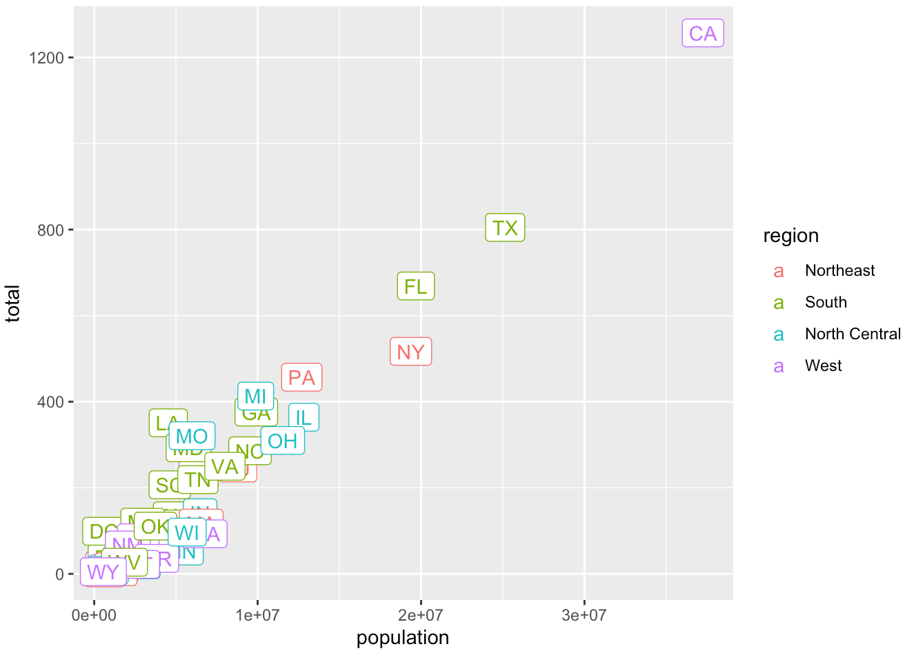
- Use the object
pin (2) and
- Change both axes to be in the \(\log_{10}\) scale using
scale_x_log10()andscale_y_log10() - Add a title “Gun murder data”
- Use the wall street journal theme in ggthemes.
## code2.2 mpg
Use mpg to make plots.
- What’s gone wrong with this code? Why are the points not blue? Change it so that the points are colored in blue.
mpg |> ggplot(mapping = aes(x = displ, y = hwy, colour = "blue")) +
    geom_point()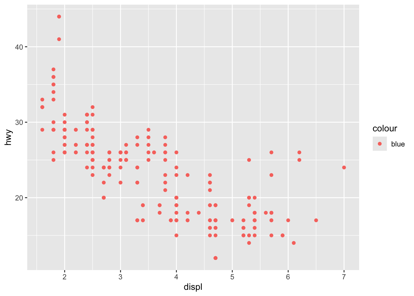
- Generate the bar chart below.
## code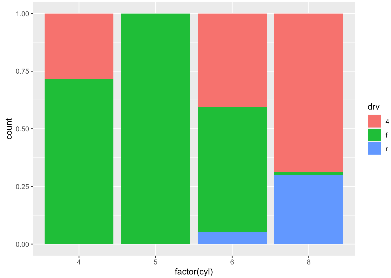
- Complete the code to generate the boxplot below. Note that
x = classandy = hwy, so the coordinates need to be flipped.
## code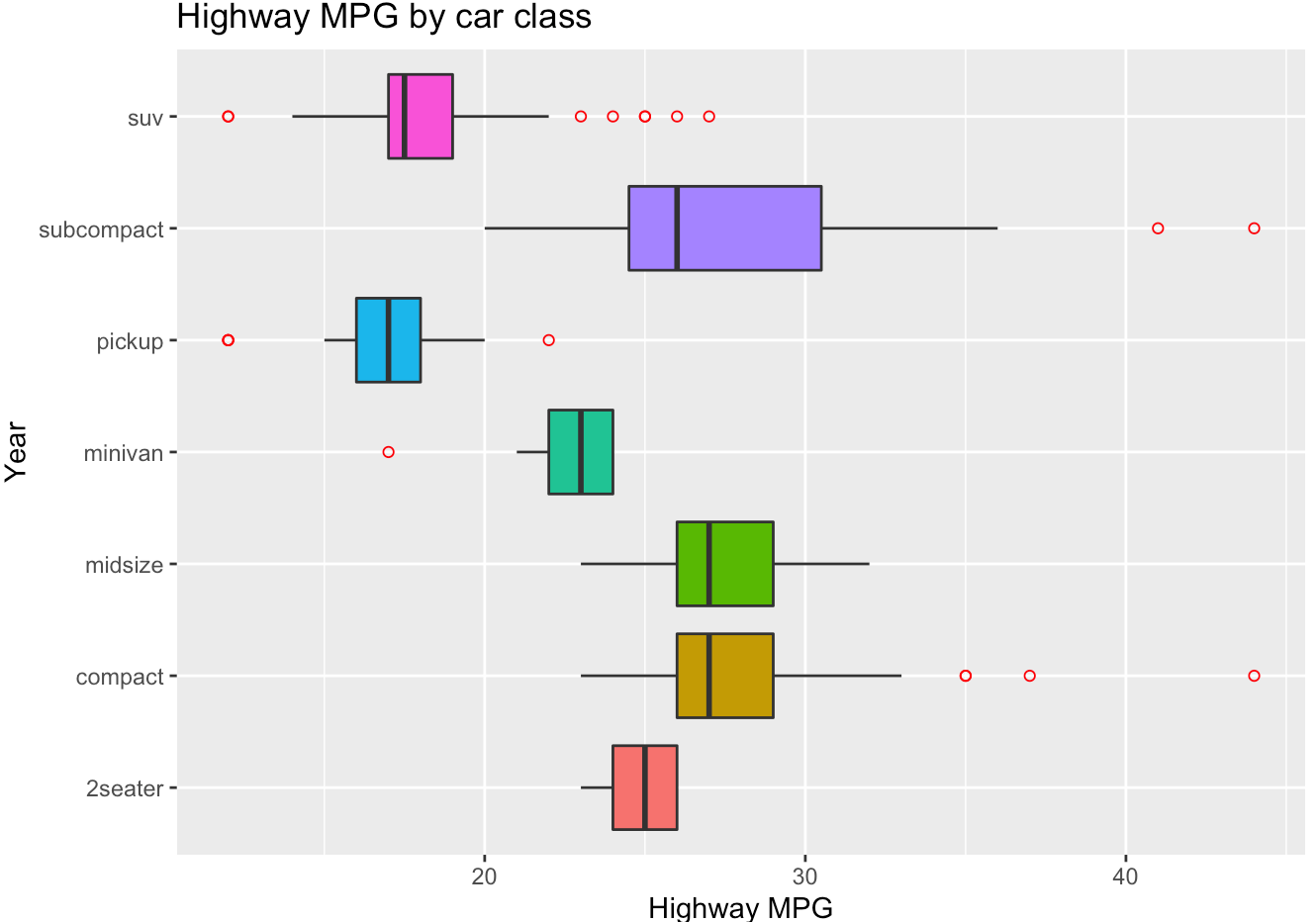
- Generate the histogram below with density scale. Map
yto the internal variable..density..(after_stat(density)) to show density values. Put the legend inside the plot atc(0.9, 0.15). (check ?theme help page)
## code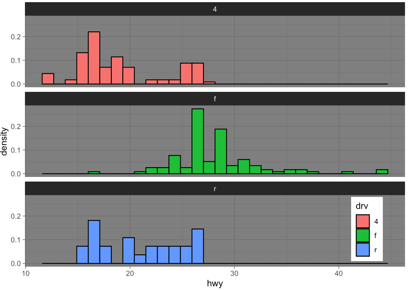
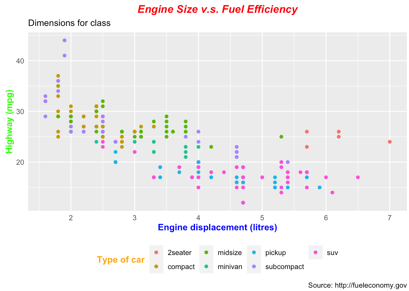
- Generate the scatter plot below.
## code